HOME | DD
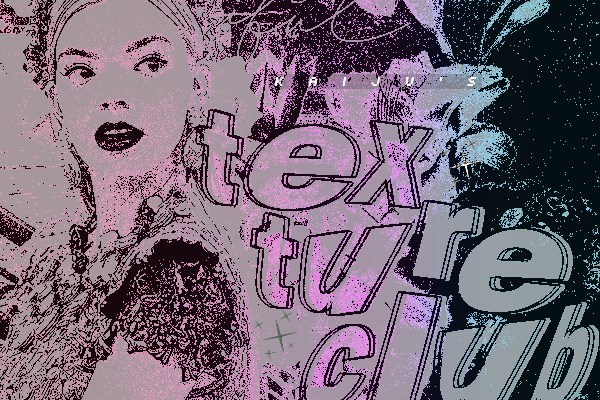
 Demen1 — LOLLIPOP LOVE 5 POSTER

Published: 2008-02-13 09:13:39 +0000 UTC; Views: 50764; Favourites: 661; Downloads: 113
Redirect to original
Description
Poster Design for a local party.Related content


Comments: 58

Hi Very impressive! Sorry for the noob question. Could u tell me what software you used? I'm interested in studying graphic design and I'm wondering if I should learn photoshop and fireworks.. I'd really appreciate it
👍: 0 ⏩: 1


awesome work ")
>>>>>>>>>>>>
Go see my artworks,explore my gallery !
👍: 0 ⏩: 0


Nice work but only prob. some of types (whites) couldnt read.
👍: 0 ⏩: 0


Awsome! Hey, im studying grapich design. And I see this swirls in typo apparing here and there. Like Si scott, I know he is drawing by hand. But If you know please help!
Tnx a million!
👍: 0 ⏩: 0


The way you use textures with typography is really amazing
👍: 0 ⏩: 0


Dude... u need to stop, where u get these crazy idea from... this shit is beyond great yow id love to meet u man... its designers like u inspire me alot... nice job dude
👍: 0 ⏩: 0


wow, great work. you never seize to amaze me.
im in digital heaven.
👍: 0 ⏩: 0

Nice one man.... I like the wood and lollys.... the depsth is very nice as usual. Props
👍: 0 ⏩: 0

I have featured you for the week in my Journal. Thanks for sharing your art with us!
[link]
👍: 0 ⏩: 1

OHH.. Thanks a lot, It's and honor...
👍: 0 ⏩: 0


Thank you very much... where is this featured? the link in your comment is broken.
👍: 0 ⏩: 1


Looks super and original! GJ on that.
On the critique side, I would've seen the letters (specially the white ones) more powerful, like fresh paint over the wood. Right now they are a bit weird, washed out but very sharp on the edges at the same time (usually washed out paint-on-wood is also garbled at the edges). It would also help the clarity of the written text.
Kudos on a nice job anyway, hope you have fun at the party
👍: 0 ⏩: 0


Thanks man!!! Hope Oak-town is reprezentin!!!
👍: 0 ⏩: 1

Oh Oak-Town is most definitely REPREZENTIN!
👍: 0 ⏩: 0


ohh damn ... this is veeery veery nice.... i hate you  (Smile)")
👍: 0 ⏩: 0


| Next =>