HOME | DD
 demix — Newtype

Published: 2005-07-08 16:23:24 +0000 UTC; Views: 6098; Favourites: 88; Downloads: 2254
Redirect to original
Description
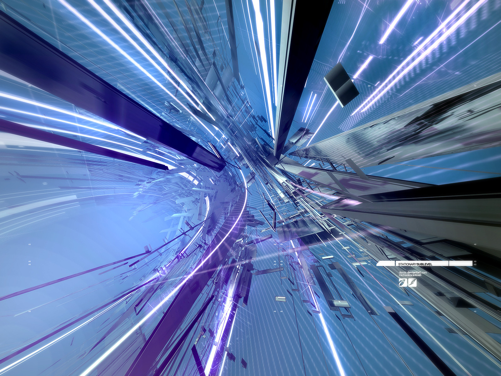
inspiration sources cubadust.com /dstrukt.compulled out the c4d again
Related content


Comments: 55


in preview, it looked blurry and simple, but i clicked anyway, and wow, fullview was awesome. awesome textures/materials.
👍: 0 ⏩: 0


nice work bro, material is very nice and the 2d is encorporated well.
👍: 0 ⏩: 0


I saw the thumbnail, and I knew it'd be another 
👍: 0 ⏩: 0

this is so awesome looking.. +FAV! nice job buddy
👍: 0 ⏩: 0

very very very nice colors i liked so much, and this 2dwork some pieces, great!
👍: 0 ⏩: 0

very very nice,, i'm gonna join in on ur lil project (just release everything u make), if u don't mind that is
")
👍: 0 ⏩: 1

no problem, i want more ppl to join in
👍: 0 ⏩: 1
too bad most of my friends are only into functional webdesign, not cg-art... some of em are really good actually, i'm gonna have another go at talkin them into it i think
👍: 0 ⏩: 0

Jjonas strandberg-ringh and chris james hewitt is beautiful, so are you.
👍: 0 ⏩: 0


 (Wink)")


really something new
i mean...its so....sexy
i can´t discribe ma thoughts
great job
👍: 0 ⏩: 0


I haven't seen that kind of 3d for ages & this makes me happier now. Great material & reflections + subtle glows. 2d play great with the rest.
👍: 0 ⏩: 0


i agree with faros on the logo, but the overall composition and depth of the piece makes up for everything - fantastic work! sweet textures on the cubes, by the way.
👍: 0 ⏩: 0


damn hot
👍: 0 ⏩: 0

i don't want to sound too homosexual but, man, i love you!
this is fantastic work.
though the render itself is not too complex, the material makes it look very detailed.
i just think the objects end a bit harshly towards the background. some more smaller and slightly blurred cubes mabye?#
anyways this is high-quality superb work as always.
👍: 0 ⏩: 1
saw your comment yesterday and i laughed my a** off. thnx for the comment
👍: 0 ⏩: 1


not too keen on the composition, but man, that material is awsome.. the render is very tasty. love the depth to the glass.. looks like there is so much to find inside the objects. very nice :]
👍: 0 ⏩: 0

beautiful work man, although the lighting is a bit saturated...
👍: 0 ⏩: 1
tru, more color would be better. thnx sir, long time no talk
👍: 0 ⏩: 1
yeah, that's because you never come on MSN!
👍: 0 ⏩: 0

and thru this image i am inspired. beautifully crafted, the details are really alluring. great work.
👍: 0 ⏩: 0

I havent commented on an image in my dev watch for the last 6 months, but this one needs to be a daily dev, great work man, I always get excited when I see a new image fromyou, its never a dissapointment, great work, demix
👍: 0 ⏩: 1
i try not to let flattery get to my head, but that hit the bullseye. thnx
👍: 0 ⏩: 0

Nice, the 2d is really well integrated, but it is blurry. Although that's not surprising considering the amount of distorting it probably needed to get in place. Colours are really intriguing too, very different. The 2d layed over the top is cool too, nice and simple.
👍: 0 ⏩: 0


Ah man >_< Took my idea hehe, i was gonna do somthing like this tonite hehe
Great job, nice reflectivity
👍: 0 ⏩: 0

Dynamic. I love the way 2D is intergrated into the render and the round edges really catch my eye. I'm completely intrigued by this piece.
It seems like this is something we have seen before, but it is completely different from many. Great work Mike.
Hate the logo next to the type by the way.
👍: 0 ⏩: 1
finally a critique from faros, jks. much love to your comments and i'll get a logo more fitting next time. thnx dude
👍: 0 ⏩: 1
Previous comments followed this rule, I can't critique something I don't think needs changing in my opinion. Most comments express my admiration for what I saw. With this one I saw something I didn't like. Like liquae said, your art is never a dissappointment.
👍: 0 ⏩: 0

Nice work  (Smile)")
👍: 0 ⏩: 0


Brilliant!! +fav ")
👍: 0 ⏩: 1
| Next =>