HOME | DD
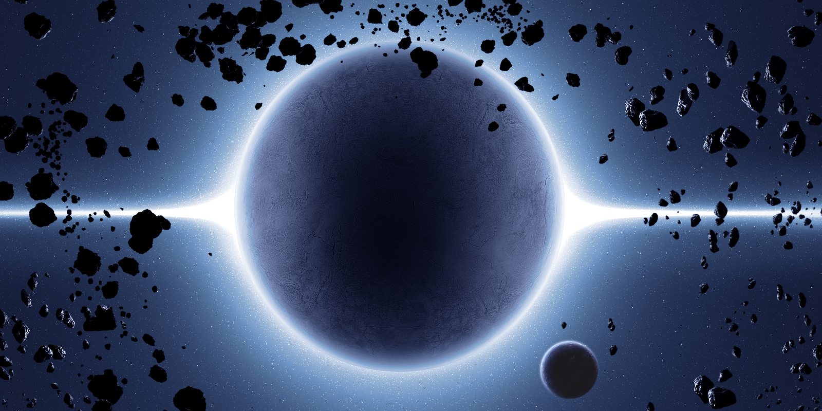
 DemosthenesVoice — Zephyr

Published: 2008-07-24 00:48:55 +0000 UTC; Views: 3919; Favourites: 57; Downloads: 187
Redirect to original
Description
just some fun.inspired by *JoeJesus and =kire1987
'roids from `hameed
Related content


Comments: 28


Hey buddy,
Your wonderful art, has been featured in this news article right here, [link] . So would be cool to see you there  (Smile)")

Kind Regards,
Sangiev,
👍: 0 ⏩: 0

that sounds acceptable.
 (Wink)")
👍: 0 ⏩: 1

Jejeje! Really?? Can you teach me? I'd love it, i really mean it! I'm an advance-expert photoshop user, so you won't have to give A LOT of info...
Thanks!
👍: 0 ⏩: 1
yea, ofcourse man. just send me a note with all your questions and ill see what i can to do help. no problem
👍: 0 ⏩: 0

i love it! fucking sweet win faved goodness
heart!
👍: 0 ⏩: 0

Okay, first off, by "roids" at first I totally thought you meant hemroids. Second...while this is a beautiful piece, you BEST not be spendin all your time up north on photoshop. You should be out telling everyone I love them.
Oh, and Missy misses you
And I love you
👍: 0 ⏩: 0

Ha, I was gonna say - this reminds me of JoeJesus and kire xD
Neat work
👍: 0 ⏩: 1
thanks bro.
and sense is for pussys.
")
👍: 0 ⏩: 0

Pretty cool! ")
👍: 0 ⏩: 1
it was meant to be behind the planet
👍: 0 ⏩: 0

inspired by me? 
Looks good already. I really like the strong contrast here and the nebula is sick as well. Just try to extend the nebula to the sides slightly. Imo the transition to black is too sudden, that was something most people criticised about my latest piece as well.
👍: 0 ⏩: 1
yes indeed it was.
and cool, ill work on it. i really appreciate the feed back!
👍: 0 ⏩: 0

I think it is quite oversharpeneded and you could a little bit more colorized the background with starfield, but I like the Nebulae and asteroids.
 (Cool)")
👍: 0 ⏩: 1
cool man, thanks for the feedback
👍: 0 ⏩: 0


<5 I LOOOOOOVE IT!!
And you know what? The text really fits this and doesn't de-tract from it. Some people who do this wrecks the picture...ALOT!!!!!
👍: 0 ⏩: 1


