HOME | DD
 denghao — Full-page magazine ad design
Published: 2007-01-03 05:01:01 +0000 UTC; Views: 18318; Favourites: 102; Downloads: 1869
Redirect to original
Description
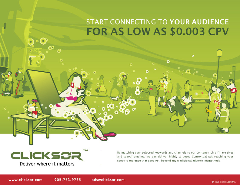
A full-page magazine ad design for Clicksor.com, the company i currently work for. Honestly, this design was rejected, But I just like it much more than the one that has been eventually approved by... who cares by who.Related content


Comments: 18


Get the girl and the photographer out, replace the sky with the (objective of purpose) in the add.
Like (a server?) or a TV series (?) whatever suit the company. I´m a broadcaster...how would I benefit from it?
btw cool style.
👍: 0 ⏩: 1

I agree the objective does not match the graphic very much.
LOL, let's just play with them.
👍: 0 ⏩: 0


I agree! Who cares?! This is great! Great use of the logo!
👍: 0 ⏩: 0


it looks great, but i definately agree with liquisoft, i mean who would think of a girl on a bikini drinking some drink when talking about specific target audience if you would take her out it would be better in my oppinion.
👍: 0 ⏩: 0


yes, it's a very candy eye and stylish design! looks great! but i agree with liquisoft, although i really like it (even as a commercial ad ")

👍: 0 ⏩: 0

I imagine it wasn't used because the image makes no sense alongside the copy inserted in it. Granted it looks very stylish, but in this case the "communication" aspect is failing miserably. If the purpose of an ad is to communicate, then it must do so quickly and effectively. In the case of this ad, however, you are occupying space with a lovely but useless image. This ad could work better if you simply removed the picture; it wouldn't lack any messaging but would instead allow the headline to grab more attention.
👍: 0 ⏩: 1
Very good comment and suggestion!!! I really appreciate it.
I spent 2 days to finish this ad and as soon as i finished it i realized that the over-eyecatching characters and the over-stylish illustration would possibly lead a result of rejection on this design. And then it happened.
But in terms of aesthetics, I am pretty satisfied with every single element in this image. Taking no account of commercial purpose, that is why I would rather to upload this one instead the final design.
👍: 0 ⏩: 1


hey man, great design.... and thanks for the fave...
👍: 0 ⏩: 0
