HOME | DD
 Dennis-Pulido — Anime Cel Coloring Guide
Published: 2008-05-07 03:55:18 +0000 UTC; Views: 15293; Favourites: 190; Downloads: 0
Redirect to original
Description
A tutorial?From me!?
I'm not really sure I should call this a tutorial.
But using the image above as a reference, I put together a cel coloring guide that you might be interested in^^
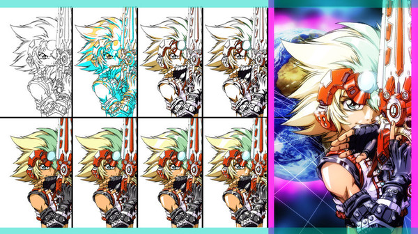
1> The first image is obviously the line art. Cel artworks are, from my observation, have generally thin lines. Unless it's something like 70s anime "sketchy" style (used on most Go Nagai anime, and recently Gurren Lagann), you don't need too much line weight variation and shading you would normally do if you're drawing manga (which their quality are really dependent on your inking). The line art is there to "contain" the colors, so you don't want them competing too much with your paint.
2> Next, I make 2 layers with single colors showing a plan on how I'm going to apply shading and highlights. By using single colors, you would focus more on planning how the light source would hit your figure. I find this more efficient than deciding the lighting by how you shade the first body part you decide to color. Also note that you don't need to strictly follow the guide (I know I didn't) but it's better that you made the guide anyway.
3> And now that I have the highlights and shading guide done, I create a new layer containing the first layer of shading - that is the basic shading that shows which parts of the model are hit by light, and which aren't.
4> I create a new layer for the second layer of shading. That is, applying a darker shade of color on certain areas that are hit by too little amount of light. Also, I use this layer to apply core shadows (using the same shade of color). Just in case you don't know, core shadows are the dark areas in between the part that is hit by light, and the part that's not hit by light. You still can see the part that's not hit by light because it is hit by reflected light. The core shadow, in comparison with the area hit by reflected light, is a little darker. Try observing stuff from real life to see what I mean.
5> Now with the shadings done, I'll hide those layers, and make a new layer containing the base colors. I apply shadings first because there are times when you would use a base color that's very light. These light colors are more visible when they're juxtaposed (ooooh juxtapose) with darker shades of color. It just makes coloring a bit easier for me, but if you feel you want to apply base colors first, it's up to you.
6> Now I make a new layer, place it below the shadings layer, and apply the first layer of highlights. these highlights can be very light versions of your base color, or they could be the color of the light source blending with your base color. Keep in mind that surfaces absorb light and reflects them back as color.
Also, pointed out to me that the edges/corners of objects are a little brighter because of reflected light.
7> Create a new layer above the first highlight to apply white highlights. They are basically the brightest part of he highlight, which is why they're white. Use them in moderation though. I made a couple of erasures because I'm white highlight happy.
8> And finally, do whatever you wish with the image. You could make a third highlight layer and use a large soft brush to manually add glows on some of the highlights. And from what you can see, I kinda overdid it.... again T_T
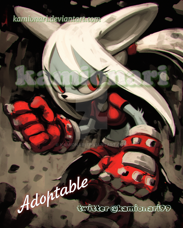
The artwork I used is from an unused planned illustration showing Astral and his mother-complexed counterpart which I can't go into more detail about just yet. I didn't finish the illustration because I kind didn't like how Astral's gun turned out.
Related content


Comments: 14

Your picture is soooo cool! Nice on the tutorial guide. Its very nice.
👍: 0 ⏩: 0


This is excellent and very useful! It is so very professional...I aspire to get this standard of high quality of work.  (Smile)")
I do have a question though and perhaps you can help.
I am most interested in Step 2 - the planning of your shading and highlights. I've seen this everywhere when looking at the process of professional Cels and I've always wondered if the colours used have a specific meaning - such as yellow for skin and blue for hair - or if it is just the artists choice and you can use whatever colours you want. I've tried Googling for the information but I'm not sure exactly what I'm looking for...
Thank you for making this~! Definitely 

👍: 0 ⏩: 1

You can pretty much use any color you like for the planning.
When looking at the artbooks I got here, some artists even use a color close to what's going to be used in the final artwork when planning their shadings with a col-erase pencil. This also means that it's not them who get to paint the cels themselves (In Nobuteru Yuuki's artbook Phantasien for example, you'll see that it's a different person who painted the cels, the backgrounds, and even did the airbrush).
However, no matter what method you choose, it will all mean nothing if you don't know the foundations such as form, and basic color theory.
Which reminds me - this tutorial artwork is old and I should make an update. I've learned a lot of new tricks since this tutorial and I'm not sure if there are outdated stuff here.
👍: 0 ⏩: 1
Thank you for clearing that up for me
I think this tutorial itself is still very good, all the steps are there and clearly written out. Though I suppose an update with some of your new tricks would be very interesting!
")
👍: 0 ⏩: 0


Psh yes this is a tutorial, and it's an awesome one. It's very helpful and I'm going to use it. <3
👍: 0 ⏩: 0


Ducking cool!
I like the character design und those litle shiny bits.
MMmmm... shiny...
👍: 0 ⏩: 0


I have nothing to add to this piece! It's a feast for the eyes.
I apply my colours in reverse order though, from base to highlight.
👍: 0 ⏩: 0


