HOME | DD
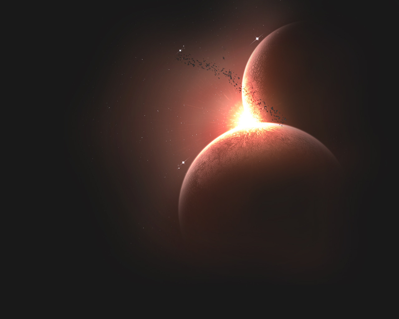
 DerecV2 — GLORY
Published: 2006-10-02 17:40:07 +0000 UTC; Views: 2318; Favourites: 15; Downloads: 15
Redirect to original
Description
-something dark and simple-Related content
Comments: 22

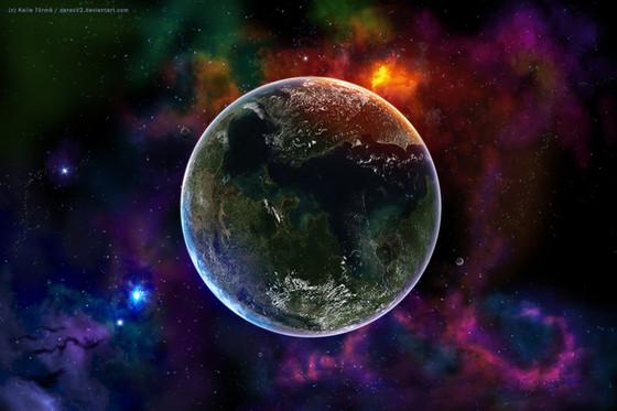
This would be the best of your space work because it makes alittle sense!
This piece is not over clustered
Has a main lighting theme
Main color theme
and no flowless nebulas
Good work! Keep up the good compisition with your newer pieces.
👍: 0 ⏩: 0

much better now, since you fixed the several problems.. I know someone like you, who isn't able to tell the difference between dark and mid-dark things, thanks to his monitor
I don't like the asteroids in that picture, the perspective isn't realistic enough for me, but maybe I'm alone with that opinion
anyway, worth a 
👍: 0 ⏩: 1

hey thanks for the favs and watch, I will try to put more realistic features into my next pieces..
thanks again
👍: 0 ⏩: 0

It looks very cool.
I like the sun and asteroids. Unlike the others i don't see any borders at all 

👍: 0 ⏩: 1

that is because I fixed it :] thanks for the fav my friend
👍: 0 ⏩: 1

Man, that pic makes me wanna do some space art 
If I only had more time......
👍: 0 ⏩: 1

too bad, maybe someday you will find time =]
👍: 0 ⏩: 1

Yeah, I hope next weekend will be enough 
👍: 0 ⏩: 0

I think it would be cool with just more contrast, so the color is defined...
👍: 0 ⏩: 1

you think so, ok I will test it
👍: 0 ⏩: 0

Oooh great atmosphere.
But as MJ00 said there's a bit of a problem with the transition from red-shine to pure black. Mostly at the top of the image.
👍: 0 ⏩: 2

Wait a minute!!! You solved the transition problem, BUT now the pure black area no longer has stars... which is a bit strange for a space scene.
Would you like me to shut up now?
👍: 0 ⏩: 1


my screen shows all colours too light, tried to fix it once but didnt work...for example some photographs are silhuettes but not on my screen
👍: 0 ⏩: 1

thanks for the fav and good tips ;]
👍: 0 ⏩: 0

Yeah, WAY better.
How come youd didn't see it? Was it a problem with exporting the file?
👍: 0 ⏩: 0


thanks though
👍: 0 ⏩: 0

nice work.
but what is that black border on the left side?
it looks a little bit cut off...
👍: 0 ⏩: 2

dont know what you mean, there isnt anything I could call border, atleast on my screen :/
👍: 0 ⏩: 0
