HOME | DD
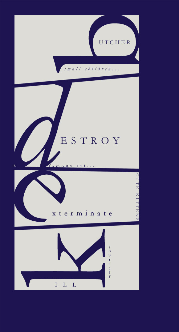
 derghaust — Typography Exercise
Published: 2002-10-09 03:53:22 +0000 UTC; Views: 250; Favourites: 3; Downloads: 13
Redirect to original
Description
Just some practice...Related content


Comments: 12

as a friend of typocrap i´ve to confess i like that,the message seems to be a bit
to me...but i like how you lead the viewer to break the neck to finally get a bit of information...
yeah,thats what typo is all about isn´t it?
the only thing which bothers me are the different font-types,but thats just me,on some places this can work,but by a plain and clear layout like this i prefer a homogenic font usage,eventually 2 different for this thingie,but as you describe it as an exercise,i see there is hope
👍: 0 ⏩: 0

Your name is Nathan? Mine is Nathaniel...We are practically brothers in that case.
As far as the piece, it is a project mayhem project that you replace a busstop perfume ad with.
I will violate the first rule of Project Mayhem and say "Fuckin' A". Fuckin' A I like it. Best is, "Destroy famous art". Reminds me of the beautiful chaotic scene in the Batman movie where The Joker walks through the museum listening to Prince defacing the art.
👍: 0 ⏩: 0

This is very cool -- I especially like the placement of the larger letters, it gives the piece a fluidity and focus.
One suggestion would be to maybe taking the phrase "famous art" and slant it a little so it's parallel with the line beneath it -- maybe if it was at a stronger angle it would work, but being so slightly off looks a little odd. Unless that was your original purpose.
I looooove typography. Nice job.
~warble
👍: 0 ⏩: 0

LMAO i like the words, This is a great typography excercise keep it up Later!
👍: 0 ⏩: 0


cool idea, i think the main fonts our slightly out of position though
👍: 0 ⏩: 0

Oh, I never thought of that, I should really try something along these lines.
Good practice material derg.
👍: 0 ⏩: 0

took you long enough to put this up....the top b still kinda resembles a Q to me, not sure why though, nice cheery piece though still.................
👍: 0 ⏩: 0

LOL. I like it Nathan, a sign of things to come perhaps? I can't wait.
👍: 0 ⏩: 0
