HOME | DD
 deserthaze — Arttrade Crackpairing Comic p9
Published: 2008-07-05 22:37:43 +0000 UTC; Views: 769; Favourites: 6; Downloads: 7
Redirect to original
Description
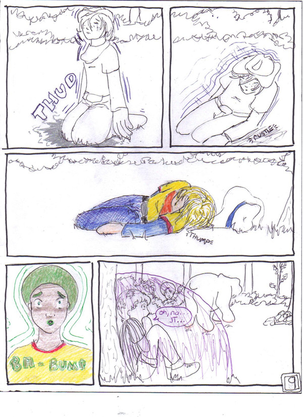
Page 9 of 11 of part 1 of 2 of my trade with .the perspective i was going for on panel 1 was tricky...i wanted to kind of have the perspective of being low to the ground a few feet away looking up at JT; hence the exaggerated size of his hands and knees and the (attempted) receding size of his torso, shoulders, and head.
I also like how Maloof's position, hair, and expression turned out in panel 5...
So, the bear has dropped JT; who falls hard to his knees and keels right over; loosing his hat in the process. I'm pretty pleased with pannel 3; though the position is very tricky and still looks a bit off; but hey, i gave it my best shot.
Chops looks on, paralyzed with horror as his best friend lies helpless and vulnerable on the ground after a brutal blow from the bear's psi-palm; we zoom out to Maloof, who is still backed up against a tree with his shield engaged. he too is horrified by what he has just witnessed; and his attention is locked on JT...
Psychonauts aint mine. I love not coloring
 ~! enjoy page 9; and oh, i keep forgetting to wish all my fellow americans (and anyone else who just feels like celebrating with us
  ) a belated HAPPY INDEPENDENCE DAY~!
Page 1: [link]
Previous:[link]
Next: [link]
Related content


Comments: 9

👍: 0 ⏩: 0

Oooh, very nice. Poor Chops looks so worried... and again, love the perspective with Maloof.
👍: 0 ⏩: 1

Thanks ")
thanks as always for the kind words and polite constructive criticism

👍: 0 ⏩: 0

I really like JT in the first panel. Poor thing...
Chops looks so cute with his "HOMG MAH BIATCH IS GONNA BE DEADIFIED" expression.
The "partially coloured" approach with this comic really works.
")
👍: 0 ⏩: 1


though my first 3 colored pages turned out nicely, I much prefer the selective coloring; cause i'm lazy like that
I'm just a litte peeved at my scanner for muting the bright orange gel pen I used for the bear's powers
")
👍: 0 ⏩: 1
Scanners do that! Mine doesn't seem to like the colour yellow, because it always makes it look dirty and dark, even if it's bright yellow. ")
👍: 0 ⏩: 1
I'm thinking that it's just picking up a bad refraction because i used a neon orange gelpen....i'll bet it'd look better if i went back over it in an orange colored pencil
👍: 0 ⏩: 1
Probably! Like when you use gold or silver pens and you think they look really awesome and then you scan the picture and it looks awful because the sheen doesn't work at all.
👍: 0 ⏩: 1