HOME | DD
 designerscouch —
dC Official Logo
designerscouch —
dC Official Logo
Published: 2007-02-16 03:14:55 +0000 UTC; Views: 57646; Favourites: 384; Downloads: 2281
Redirect to original
Description
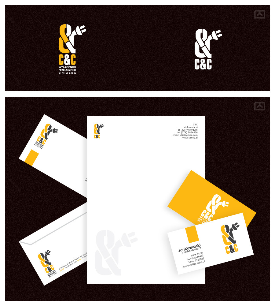
Dear friends, members, visitors,On the journey to establish our own identity and our own presence in the design community we come to a final design for our logo identity. I'm sure many of you thought that the first logo concept was awesome and we'd stop there. While the first one was indeed awesome, it wasn't quite functional as a logo.
So °liquisoft , =russoturisto and the rest of the dC Core Team embarked on the journey together to decide dC's final logo design. In the presentation, you'll see 3 stages.
Ryan's Concept:
His concept was the backbone to our final design. Ryan managed to design the 'couch' in a simple, iconic and stylish manner with wings to represent designers'COUCH. We loved this. It was a great concept and well executed. However, we wanted more. We also thought the wings was somewhat cliche' even though it was stylishly executed.
Igor's Concept:
^depthskins came up with the idea of merging style. =russoturisto has a very unique style to his design and so does Ryan. So we thought we'd give it a shot. Igor played on Ryan's idea of the simple iconic couch. He built upon it and did what we call, 'a reinvention' of Ryan's brilliant concept. His style added to it just made it shit in our opinion and he losed the wing.
In addition to the 'couch' symbol, Igor wanted to give the typography a shot designing a font from scratch in a simple stylish manner. It's very different from his usual work and shows he can work outside his usual style. We loved the font and Igor is currently working on developing the entire typeface. Wicked huh? Yes, dC's very own custom font.
However, we made a mistake with this entire project, a mistake that was hard to work around but had to be done. Given we already had a winning site design, we had to use a font that works best with it so the site design constrained our choice a bit. So we went with Ryan's simple, elegant look for the typography.
Igor's presentation:
[link]
Symbol Breakdown:
One reason we loved this was Igor's rationale to his design. He simply thought to be a design king one must grow like a flower. Both a 'crown' and a 'flower' is represented in the logo to make up the 'couch' symbol. We all know that's Igor's style he's famous for and he pulled it off nicely.
So there you have it, 1 step forward into dC's future and guess what, it looks BRIGHT.
Related content


Comments: 111

I'm really not sure if that's a cool thing, lol.
👍: 0 ⏩: 1

Well it looks pretty cool...
👍: 0 ⏩: 1
ok, I think it's cool now. I stared at it and after looking away, it's like the logo is just imprinted in my mind. Just can't forget it and that's awesome.
👍: 0 ⏩: 1
")


 (Wink)")

I like the old version with the new logo FOO SHO!!!
GREAT SUCCESS!!
👍: 0 ⏩: 0

He's more interested in style than function. It's okay, everybody has their personal tastes.
👍: 0 ⏩: 1
Yes, I'd understand that. I never expected everyone to love the logo as much as I do. Apart from this logo being functional I also believe it's stylish but what makes me love it alot more is the process it went through. I'm sure you'd agree it went through a really great process. I don't believe one person can walk up and say, 'hey, i design dC's logo' because that's not the case and that alone is a representation of community spirit, right there in the logo and the website will be a testimony also.
People need to start looking at things on a deeper level.
👍: 0 ⏩: 1
Collaboration oftentimes leads to unexpected and enjoyable results in any situation. What a lot of people don't seem to understand is that design, as an umbrella term, really evolved out of the need for function. The Bauhaus, being a huge proponent of contemporary design, did everything with the purpose of function in mind. A lot of modern-day "designers" don't understand this, and focus only on style out of some belief that style is everything. Unfortunately it's not. Communication is important, and I think our final result is easy to read, easy to apply to a wide array of mediums, has a plethora of concepts behind it, and also has enough style to appease our userbase. It's a rather complete package. It's easy for anyone to say how they'd do it differently, but the reality is that we're the ones who put all the effort into it and we're the only people we need to please ("we" being the club). As long as the majority of our members are happy with it, then it's a success in my opinion. The viewpoints of a 3d gallery director are moot. If Jan Tschichold told me it needed work, well hell I'd believe him because he has a right to critique it. But in this situation, some people have no right to critique.
👍: 0 ⏩: 1
Yea, I'm beginning to learn that it's all about functionality as well as pleasing the client. Being a team, all of us voted it as final design and you're right, the club is the client in this case and once they are pleased, we're good.
Also, wanted to ask you, did you notice the effect the logo has when you stare at it for a while? The gray dot illusion thing? See it? Man, I looked at it and I swear it imprinted the logo in my mind and I really can't forget it if I wanted to. That a good thing? I think it is
👍: 0 ⏩: 1
Yes, I've been aware of the gray dot illusion for a while. It is an effect of having dark rectangular shapes aligned closely together like we're doing. Fun stuff.
👍: 0 ⏩: 0

I'm not saying I'd have chosen any of the ones presented, but the type on the chosen one is hideous. The "old version new symbol on top" is a million times better than the lossy type one.
👍: 0 ⏩: 1
I see. With the 'old version' while cool, there was too much going on for a wordmark. Wanted something much simpler and preferred an iconic logo hence combining logotype and logo for the identity. Whether it's hideous or awesome is a matter of opinon but at the end of the day, you easily read, 'designersCOUCH'.
👍: 0 ⏩: 0

great concept! Stylish, proffesional, eye-catching, and most important - it really stays in your memory. One question, can you tell me the name of the font that Ryian used on "Designers couch" title ?
👍: 0 ⏩: 2
Helvetica Neue, actually.
👍: 0 ⏩: 0


excellent logo by two of the greatest designers out there

👍: 0 ⏩: 0


This first one is very nice, i like it a lot. Good job.
👍: 0 ⏩: 0


It took a long time to get a final design, but it was well worth it.
👍: 0 ⏩: 0


Love the concept behind the final designs, the description was an intersting read.
Great design.
👍: 0 ⏩: 0


logos are difficult to make, and when you look at them they are really simple, I commend you for your efforts ^_^
👍: 0 ⏩: 0

great concepts and the finished logo is awesome. nice job!
👍: 0 ⏩: 0
that's what we thought hence the combination of type and logo. We will have igor's dC font developed though and have it as a functional font.
👍: 0 ⏩: 1

well, the ryan's typo will stay in official logo and you'll use igor's typo in other possibilities? That what you meant?
👍: 0 ⏩: 1
See the logo at the bottom, that's final so Ryan's type and igor's symbol is final.
The type he did, yes, we're working on a custom font, well he is, exclusively for dC.
👍: 0 ⏩: 0


great job ryan and igor...i want to see this in action...
👍: 0 ⏩: 0

That is awesome, so clean. The couch almost looks gothic in a way.
Very well done people!
👍: 0 ⏩: 1

looks gothic cause with crown like king have on a playin' cards
thanx
👍: 0 ⏩: 1
hehe sweet  (Smile)")
")
👍: 0 ⏩: 0

Just remove the little writings bellow the main thing from the old one and move it to the center of the circle, it's the best in my opinion... Ryan's also great in fact...
👍: 0 ⏩: 0

amazing work!
Is the right choice for this community

👍: 0 ⏩: 0

I love both of the concepts and I'm glad we've got two such talented designers collaborating on the logo. Nicely done.
👍: 0 ⏩: 0


This is how it should be.
Awesome work to both of you.

👍: 0 ⏩: 0

awsome
__
נαмιє нєωιтт
gяαρнι¢ ∂єѕιgηєя
∂єѕιgηєяѕ ¢συ¢н
👍: 0 ⏩: 0

Good idea guys, logo looks good. Cheers
👍: 0 ⏩: 0

didnt know you were creating a logo... It turned out very sexy
👍: 0 ⏩: 0
| Next =>