HOME | DD
 Designokee — the money shot

Published: 2006-10-17 01:15:49 +0000 UTC; Views: 186; Favourites: 0; Downloads: 2
Redirect to original
Description
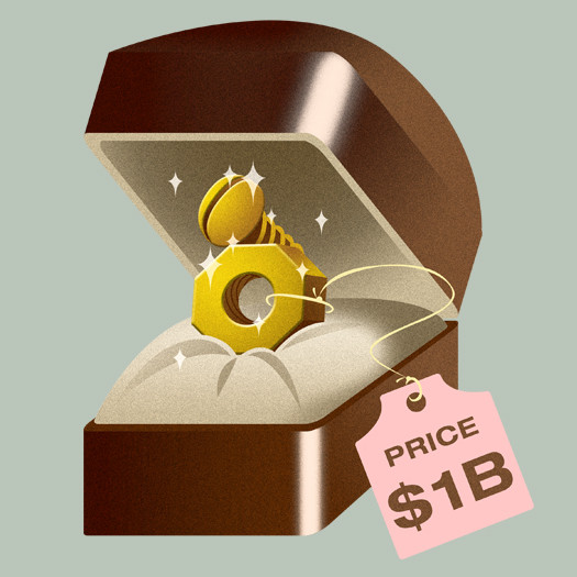
i did this for an editorial. work stuff. so this really doesn't seem like me, but it looks nifty to me, especially the hi-res version where you can see the grainy finish... anyway, expect more of these.Related content
Comments: 3

The top part of the box is fine, but the bottom half seems slightly out of perspective, is that just me or is it meant to be like that?
I like the colour usage (you know, making it all western and the like).
👍: 0 ⏩: 1

you're right, in a way, coz i just inverted the bottom to be the cover. so for me, the cover is not at the right perspective. 
👍: 0 ⏩: 0


