HOME | DD
 despawnerer — Desktop VS: English-oriented

Published: 2006-06-01 13:37:23 +0000 UTC; Views: 19898; Favourites: 34; Downloads: 11060
Redirect to original
Description
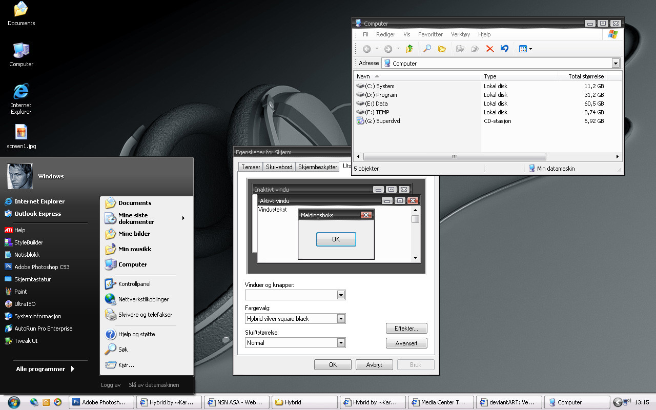
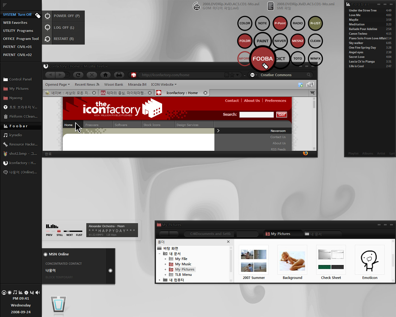
Some people asked to make english-oriented version (with english start button), so i made this one.. I've also added no-logo versions to both of Red & Gray versions...Enjoy :\
Related content


Comments: 19

I've been using the skin for a few months now, I was just browsing dA for an updated one and found this. I can't change my theme ever! Everything else looks too cluttered in comparison, I don't think I'd want to change anyway though.
Great job on this, it's something very unique and easy to use!
👍: 0 ⏩: 0
Dude, you have a nice VS going here. I like the buttons - kinda futuristic. There is still alot you can do with this VS. Adding a matching shellsyle would be nice, and maybe by adding more of a futuristic color scheme to it too. I'd keep the buttons though, like I said I love those.
👍: 0 ⏩: 1

Maybe... but there is no way for me to develop this further cause i switched to linux recently.. feel free to make something out of this yourself, just keep my name in credits.
👍: 0 ⏩: 0

Excellent work!
Thank u~~
BTW, where did u get the ICL in totalcmd?
👍: 0 ⏩: 0

Really really nice, keep it up
It was only one thing that i didnt like, and that is the start button, could have been better.
 (Wink)")
👍: 0 ⏩: 0

I don't like the Start Menu button at all. I would use this theme if it wasn't for that.
👍: 0 ⏩: 0

мне нравятся твои иконки, где берёшь?
кстати отличные темы делаешь ))
👍: 0 ⏩: 1
Пасиб.. Иконки Puft -> [link]
👍: 0 ⏩: 0

I really like this theme... but i happen to agree with the compact menu, it would make this perfect.
👍: 0 ⏩: 0

I like using the non-english one better. The start button just looks cooler.
👍: 0 ⏩: 0

Excellent work, comrade!
just one question: if I want to put shellstyles for all versions, which names should I use? (besides "NormalColor" for the default style).
Thanks for your great work
👍: 0 ⏩: 1
OrigNL (Original no-logo), Gray (for Gray one ")
👍: 0 ⏩: 0

nice!! i juist do not like how big the start menu is and i do not like the start button.
👍: 0 ⏩: 0


")
No, i won't
👍: 0 ⏩: 1

please!!!!!!
this one looks so brilliant in it's minimal style. the only thing that's left to make it one of the best minimal styles around is a compact start menu even without the username on top of it.
and of course i would'nt call it another re-release. i would call it an update. and useable updates are always good.
please think about it again!
// iceman.x


👍: 0 ⏩: 1