HOME | DD
Published: 2011-02-06 07:45:57 +0000 UTC; Views: 74357; Favourites: 567; Downloads: 4123
Redirect to original
Description
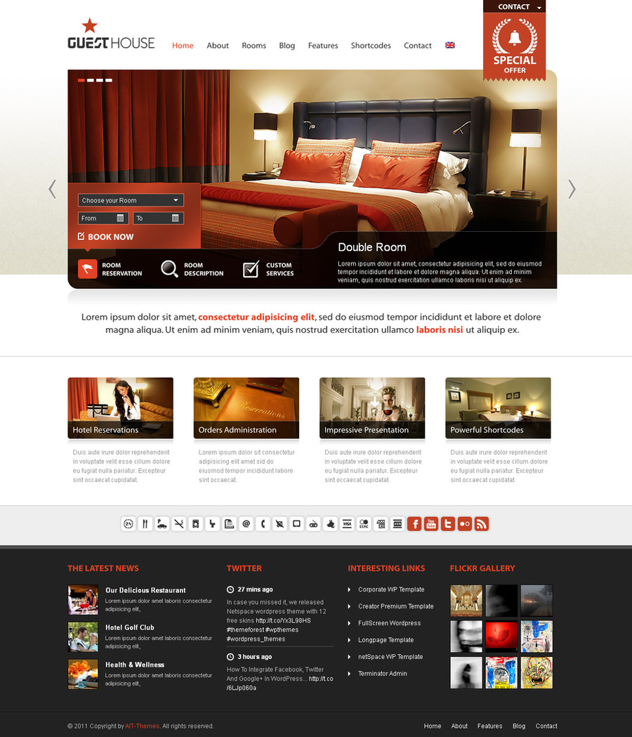
Web layout for a travel / turism site.Click "Download Image" for better visual experience
...
Related content


Comments: 152


I like the red arrow buttons a lot, the overall design is really great!
👍: 0 ⏩: 1

nice work
it's great and wonderful colours..
👍: 0 ⏩: 1


")


That's good work, but I think the website's title isn't enough big to see it.
👍: 0 ⏩: 1
detrans In reply to koskoz [2011-02-12 13:22:54 +0000 UTC]
thanks,
what do you mean title? the logo?
have you tried to see it full-size (using "download image")?
👍: 0 ⏩: 1
I mean the "FLY2, FLY2HOLIDAYS" logo. I saw it in full size.
👍: 0 ⏩: 1
detrans In reply to koskoz [2011-02-13 15:27:28 +0000 UTC]
ah that one! ... don't worry about that,
since I had no logo provided yet,
I created & used quickly something as a placeholder
👍: 0 ⏩: 0


Very gorgeous work.
Love the colors and details are sharp and shiny.
Red alike brought a nice contrast to the layout, excellent choise
 (Smile)")
👍: 0 ⏩: 1
detrans In reply to dA-aml [2011-02-11 17:24:36 +0000 UTC]
thanks for explaining why you liked it
👍: 0 ⏩: 0

really nice work. the red drop down menu seems a bit distracting though
👍: 0 ⏩: 2

also you wont see the drop menu unless you seeking whats in the menu. which puts focus on the other links..
I think its a brilliant design
👍: 0 ⏩: 0
detrans In reply to savvass [2011-02-11 17:29:49 +0000 UTC]
why makes you think this?
it has the same: color (red), gloss, inner shadow, font type, etc...
// please don't missunderstand my answer:
// I really appriciate and respect your critique and really want to know your point
👍: 0 ⏩: 1
what I mean is that it would be better if the red menu went under the "find a holiday" instead of on the right side of it, because it hides the rest of the main menu items.
👍: 0 ⏩: 1
detrans In reply to savvass [2011-02-12 16:48:59 +0000 UTC]
... that one?
it only opens on mouse over
👍: 0 ⏩: 1

i need sky backgorund like this design, where can i find ?
👍: 0 ⏩: 1
detrans In reply to privatevision [2012-02-29 08:57:54 +0000 UTC]
self made:
- you just need to find a good (stock) photo with sky and clouds (with lots of clouds around the edges)
- then you play with color adjustments - PS: Image/Adjustments/Selective Color
- choose blue and cyan colors from the palette (C Y M B draggers) and mix a nice blue sky
- choose white color and set the first three (C Y M) sliders to -100% - this will give you very nice white clouds
- erase the borders of your photo with a soft round erase tool ~ 500-600px (on a white background canvas of course)
you can try with this, if you want: [link]
👍: 0 ⏩: 0


This is fantastic! You are so talented! Great colors and details. Bravo!
👍: 0 ⏩: 1


Really great composition and use of colors. You did this for a client?
👍: 0 ⏩: 1


looks simple yet grand... ")
👍: 0 ⏩: 1


Great Design - can you drop me an invite to designerscouch.org? - my email is tom@uniquestreak.com
👍: 0 ⏩: 1


| Next =>