HOME | DD
 devgear — Dragon Lady Inks 2.0

Published: 2011-12-20 08:24:22 +0000 UTC; Views: 12142; Favourites: 204; Downloads: 583
Redirect to original
Description
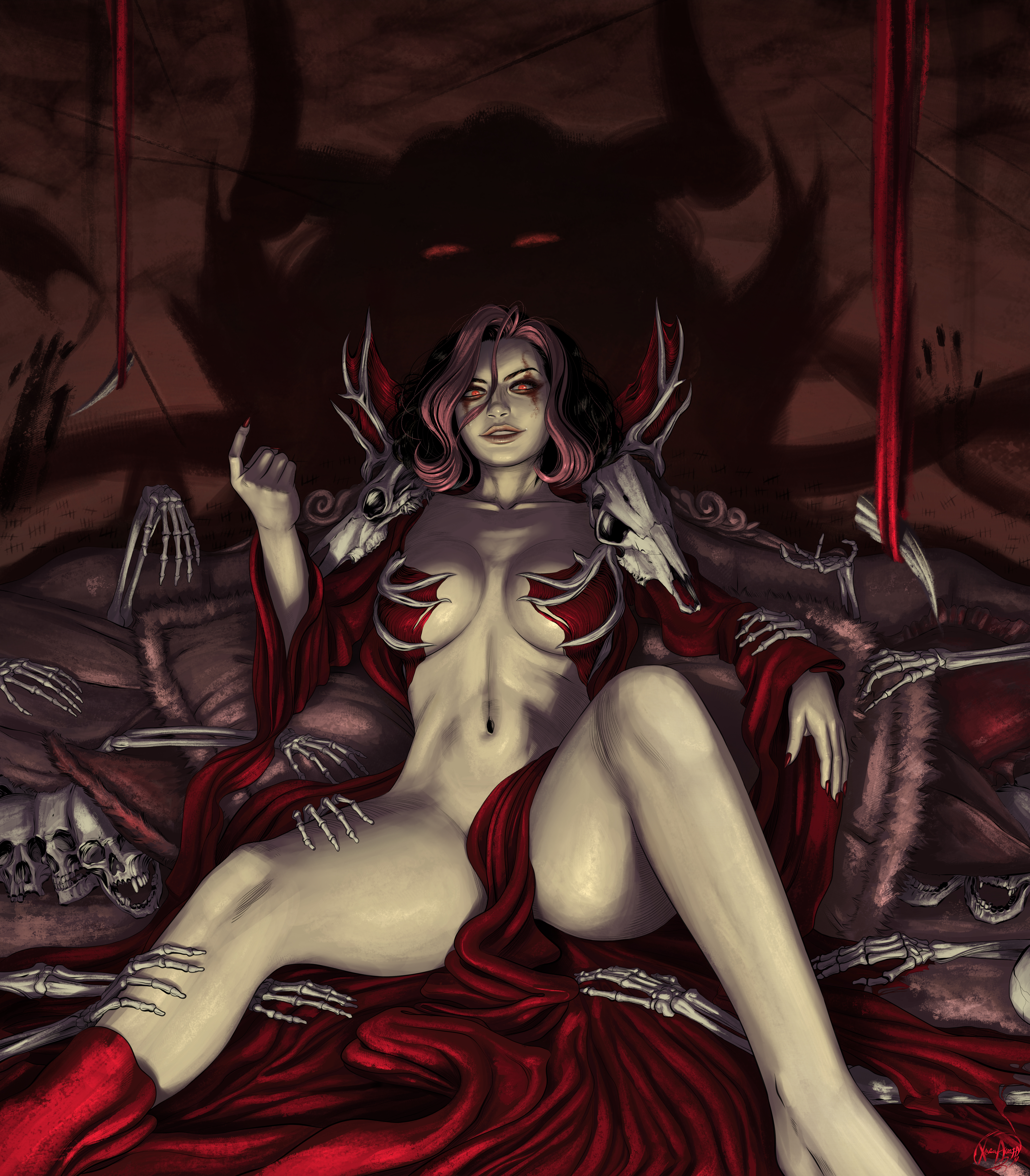
As most may know, I absolutely love Kenneth Rocafort's art...he probably was the biggest influence in shaping my inking.I have learned a lot since I started down this road...so am interested in revisiting previous work I have done. I always have enjoyed this one. It is available on his blog...
I had inked this a year ago with a crowquill here:
The first time it was a 30min ink, this time around it was about 45min. with a .3 Staedtler pen and brush for weight.
This was the last of my good pens, but it was still pretty mashed up, so the thinner lines I was hoping to create still ended up a bit thick.
It was never up for hi-res, so this version is!
Download for 300dpi *Please read my terms of use* Thanks!
She is begging for someone to color her!
 (Wink)")
Related content


Comments: 32


I need to get on some more soon!
👍: 0 ⏩: 0
Well... it's really tough to get that that sexy look.
👍: 0 ⏩: 1
Ken makes it look so easy tho!
👍: 0 ⏩: 0


I can see a progression in your work. Your style was already distinctive and good and you are getting better all the time.
👍: 0 ⏩: 1
Very kind words! Thank you (Smile)")
👍: 0 ⏩: 0


")


Gonna try later on to give this one some color. See how I do.
👍: 0 ⏩: 0

much better! especially in the face, when you calm down on the amount of lines used to construct the face, it makes people look younger and more symmetrical, especially women.
👍: 0 ⏩: 1
Thanks! And yes, that does make sense
👍: 0 ⏩: 0

Nice, man. Rocafort builds up shapes in such an offbeat way. You seem to be getting pretty fluid with the style.
👍: 0 ⏩: 1
Thanks bro! Ya he does, I think that's why I need to keep his work as part of my inking diet
👍: 0 ⏩: 0

I think her eyes (and eye brows) came out better this time around, though I like the dragon candle of the previous version.
👍: 0 ⏩: 1
I was thinking the exact same thing. My pen this time was to mashed from use to give me the clean smaller line I was looking for on the details.
👍: 0 ⏩: 0


Of course
👍: 0 ⏩: 0