HOME | DD
 deviantdark — In Two Minds
by-nc-nd
deviantdark — In Two Minds
by-nc-nd
Published: 2007-12-13 17:04:43 +0000 UTC; Views: 3942; Favourites: 17; Downloads: 808
Redirect to original
Description
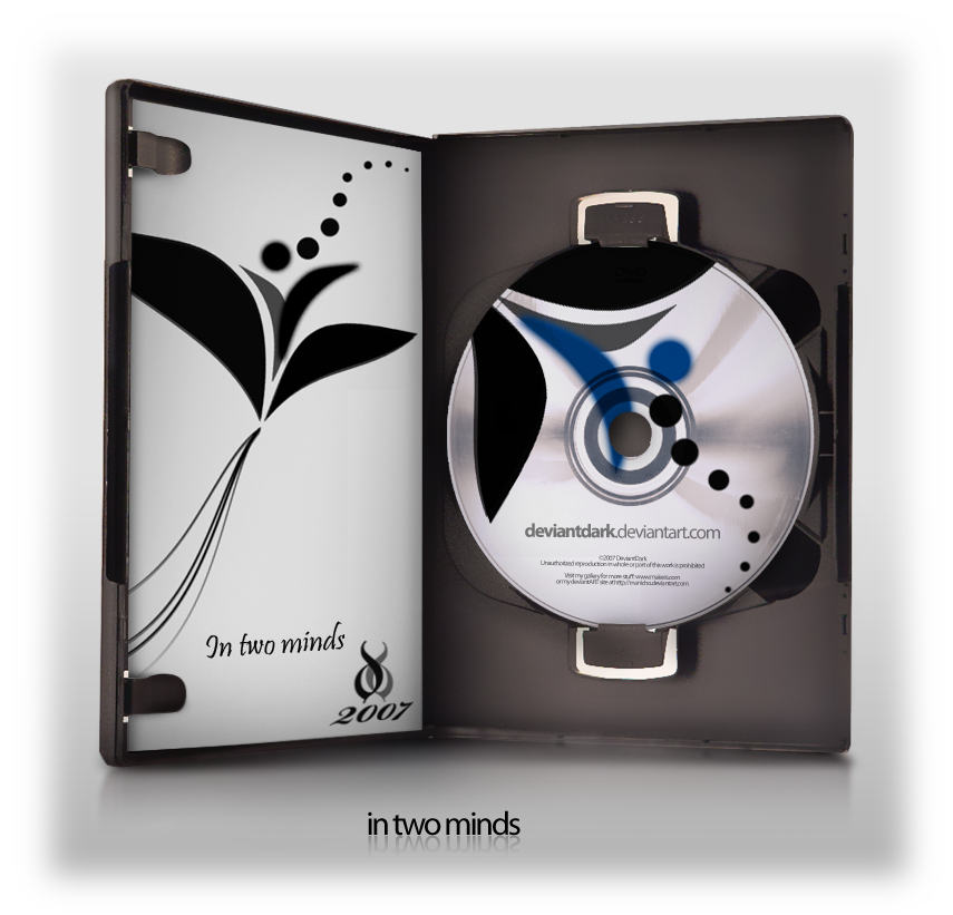
subject: abstractsoftware: adobe photoshop CS3
Yet another minimalistic wallpaper.
The image above is only a preview of the wallpaper inside the zip archive.
There are 6 little different colours images:
- black
- green
- red
- blue
- yellow
- violet
Only 1650x1050 pixels resolution
I also used some brushes from IHEA and the DVD preview PSD by Manicho .
Please click here to download.
EDIT:
As adviced by dougstewart , I just changed some gradients within the colorized parts of the deviation.
As you can see in the preview, something has changed.
Maybe you'd like to download the new 2.0 version pack.. so just click HERE !!
[©Riverside - In two minds]
Related content


Comments: 11


 (Smile)")


Oh yes
I simply love the DVD PSD done by manicho... I like to do the preview of my wallpapers in this way.
Glad you think the same.
Thank you and see you soon!
👍: 0 ⏩: 1

Nice piece, I really like the simplicity of it. Though out of the colours I think only the black truly works. My suggestion would be, if you're going to put in more colours like that, try to work them in a few other places as well, say in the background a very light hint of it. Or make the main black a very dark version of the colour, say a very dark purple for the purple version.
👍: 0 ⏩: 2
Done!
Make me know if you like it this way...
👍: 0 ⏩: 1
Haha nice but not quite what I meant. I like the solid edges of the shapes, but I meant for a gradient or something along the back of the image.
What's nice about the black one is that all the shapes are so similar. Softening up the edges of the colour sections calls a lot of extra attention to them, I just don't see the need for that.
Sorry for the misunderstanding!
👍: 0 ⏩: 0
First of all, thank you very much for expressing your opinion and giving me some advices.
I'm glad you liked so much my work.
About the colours...
I am pretty unsatisfied like you about the gradient colourations within the image.
And, surely, just the B/W version is homogenic.
I'll try to add some colour effets around, then compare the results with the old ones and decide if submit the new ones or not.
I'll let you know if I'll update this deviation with a second version
Stay tuned!
See you soon...
👍: 0 ⏩: 0