HOME | DD
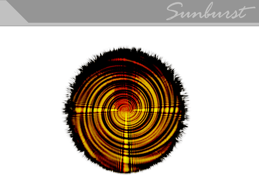
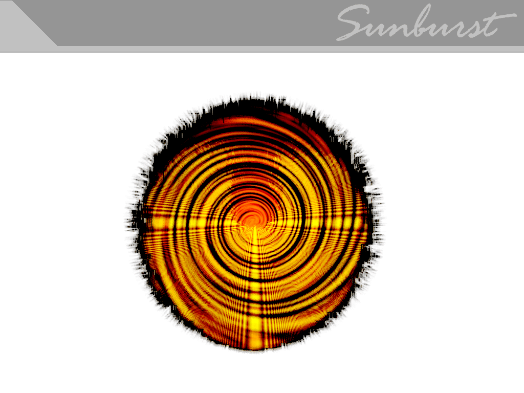
 devolution — digital e-motion

Published: 2000-11-17 14:54:09 +0000 UTC; Views: 701; Favourites: 1; Downloads: 184
Redirect to original
Description
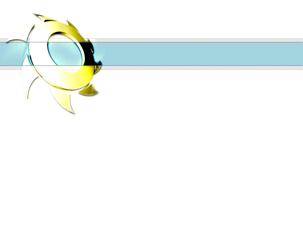
Hey, I'm hoping to get this as a daily dev but i doubt it ;\ Please check this out and rate it! I'd love a comment or two!!!!!!!Related content


Comments: 11

brisk bright colorful style, I like it.
Flesh
obliviousflesh.virtualeweb.com
👍: 0 ⏩: 0


hmm, this is interesting looking. howevere not enough stuff is going on in it. the colors are a bit wierd but that could just be your style . its still a cool start though.
👍: 0 ⏩: 0

the center horizontal frame looks great. the top and bottom could use some subtle images in the whitespace. other than that, as a whole, not bad at all!
--[ jark ]--
👍: 0 ⏩: 0


This is cool. And I don't think it's as centered as it looks. With the boxes you used to give it that blatant gradient effect, they're a bit off to the left in the middle, with gives the eye a bit of a contrast to enjoy and take it with the rest of the image. It's nice and clean, and the colors used to go from cool to warm to cool mix nicely as well and aren't too harsh. I also like the seperation of the middle from that of the strips on the top and bottom of it. Cool looking.
👍: 0 ⏩: 0

thats pretty cool there man. Its different but I like it.
Jackdirt its called THE ELEMENTS OF DESIGN
👍: 0 ⏩: 0

Why does everyone here always center everything?!!! nice explosion?
Jack Dirt
Keen B***h Keen!
👍: 0 ⏩: 0

Nice...though I think the top and bottom bars are a bit blotchy. Very good layout otherwise
👍: 0 ⏩: 0