HOME | DD
 dexx27 — T - mobile operator

Published: 2011-06-05 21:30:50 +0000 UTC; Views: 8066; Favourites: 61; Downloads: 327
Redirect to original
Description
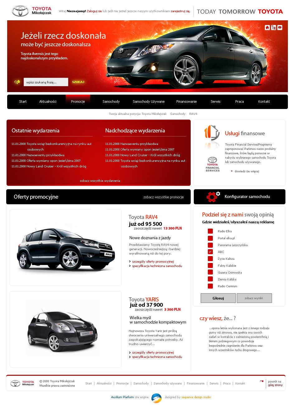
Redesign of the Polish mobile operator ERA connected with t-mobilethis is only training project
Related content


Comments: 18


This is a very interesting overview about iPhone iPhone.com
👍: 0 ⏩: 0

Cool work man, I think Tmobile really should remake the entire profile. Logo stores yeah everything and they should hire you to make the new brand
👍: 0 ⏩: 0

 (Wink)")


nice work is it for ladies, as you have used pink color
👍: 0 ⏩: 1

ahsanpervaiz you do not know the brand t-mobile?
pink is the color of their brand  (Smile)")
👍: 0 ⏩: 1
oh i also thinking that after i posted the commnets my mistake, great design then
👍: 0 ⏩: 0

This is very good. The banner gradient behind the main images should be dropped but other than that I think T-mobile should use this website. Looks much better than their current one.
👍: 0 ⏩: 1

ładnie, ale za okrągło biorąc pod uwagę logotyp... ja bym widział na ich stronie raczej ostre rogi.
👍: 0 ⏩: 1
dzięki. chciałem uciec od ostrych kątów jak tylko się dało
👍: 0 ⏩: 0


Bardzo mi się podoba. Na pewno lepsze niż obecna strona, o co nie trudno.
👍: 0 ⏩: 2

Co jest złego wg. Ciebie w obecnej stronie T-mobile? Może nie grzeszy ładnością, ale jest spójne i użyteczne.
👍: 0 ⏩: 0
No mogliby zmienić tą stronę. Dlatego dla treningu postanowiłem ją lekko dostosować.
Ciesze, że się podoba
👍: 0 ⏩: 0
