HOME | DD
 DEZIN — boxed
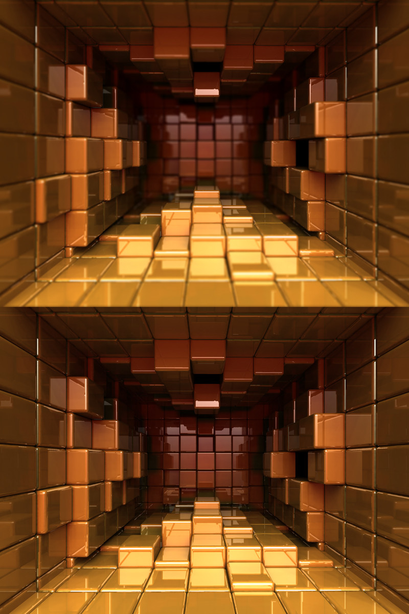
Published: 2006-02-27 18:05:57 +0000 UTC; Views: 2992; Favourites: 34; Downloads: 818
Redirect to original
Description
2 version included, one with DOF and the other without. 3 size included for each.Related content


Comments: 42


like the concept man, it's sure different without dof...
 (Smile)")
👍: 0 ⏩: 1


nicely done... one with dof looks more realistic, but they both are great.
how was it rendered?
👍: 0 ⏩: 0

The lighting is what I really like here.
The DOF makes it look tiney. But thats ok, even though I perfer the plain one.
👍: 0 ⏩: 0

very cool.. it'd make a really wild desktop image i think
👍: 0 ⏩: 0

ragingpixels [2006-02-28 22:51:24 +0000 UTC]
holy moly, that a lot of polygons......what?.....were you expecting me to say cubes?......anyway good stuff.
👍: 0 ⏩: 0
ragingpixels [2006-02-28 22:50:56 +0000 UTC]
holy moly, that a lot of polygons......what?.....were you expecting me to say cubes?......anyway good stuff.
👍: 0 ⏩: 0

")

I just started my render for my version of this deviation.. and your's is like 9304857 times better... I don't think mine is even good enough to post... I'll prolly just use it on my other monitor (main reason I wanted to do it so I could have two different colors) Your settings are sooo much better than mine.. Great work
👍: 0 ⏩: 1

post it, i would like to see it. Im sure yours have your own unique look.
👍: 0 ⏩: 2
I'm going to post it soon... Just letting you know that I put you in my discription.
👍: 0 ⏩: 0
Still rendering (at about 45 mins right now) What kind of GI settings did you use? Your image looks fantastic! I made a complete room instead of one open wall.. and my DOF doesn't look as good as yours... Not to mention I used square cubes instead of the rectangles that you used... yours is like 9357 times better than mine... Can you hit a brotha up with the GI settings and DoF setting you used!!? or maybe even let me get my hands on your .c4d file so I can just take a poke around?
👍: 0 ⏩: 0


Awsome, It's very well textured and lit. The rendering is of fine quality
👍: 0 ⏩: 0


This is great, definately one of the best of it's kind that I have seen. The one without the dof looks better. What kind of lighting did you use for the scene?
👍: 0 ⏩: 1


very cool, i like the color and sharpness! i also like the one without the DOF. nice work!
👍: 0 ⏩: 0

Sweet, The bottom one looks better, if you changed the focal length of the top one closer to catch the first boxes in focus instead of just the middle ones it might look better. I just like the clarity of the bottom. That is one of the better versions of the stacked box themes people do.
👍: 0 ⏩: 0

this is very cool dude
however I like it better without DOF
I especially like that "density" in the image
👍: 0 ⏩: 0
Wow.. That is awesome looking... great color choices! Now you know I'm going to have to try a spin off of it... Of course I'll give you all credit for the idea.. But I think yours will undoubtfully be better... Great job!!
👍: 0 ⏩: 0


No matter how simple the images seems, it always comes out amazing.
👍: 0 ⏩: 0