HOME | DD
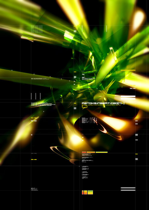
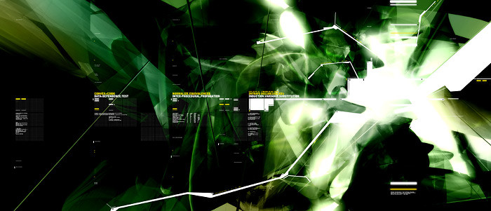
 dform1 — Retoks Insert C20
Published: 2002-05-27 17:00:27 +0000 UTC; Views: 1568; Favourites: 15; Downloads: 112
Redirect to original
Description
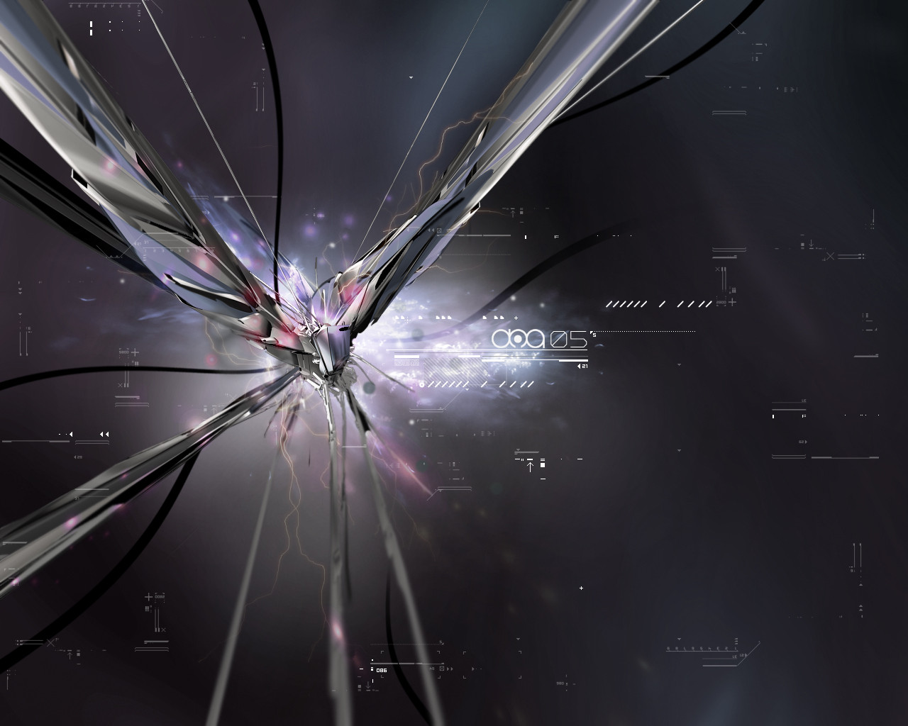
Copyright 2001 Anders SchroederRelated content


Comments: 23


Great work! I like the colors the typo the shapes... It's sweet!
👍: 0 ⏩: 0

OH MY GOD!
I wanna add every pic I see from you...!!!!!!!!!!!!!!!!!!!!!!
Astonished!
👍: 0 ⏩: 0

the 3d texture looks soooo real... and a nice shade of green....+favs
-----
BIN LADEN SUCKS [link]
👍: 0 ⏩: 0

sweet work dude.. keep it up
-----
visit my site [link]
or Visually Infected Designing Community
[link]
👍: 0 ⏩: 0

I am not big fanat of 3d and abstrakt...but your work is perfekt...i like it...
-----
========================++
No Design Without People MIND...
(c)gipoz
👍: 0 ⏩: 0

trendyness in perfection. ²
the most gorgeous plus-factor is the cool combo of the 3D work and the title. fits goddamn well, pal. the lil coloured boxes and their transitions are quite cool as well. but i don't really like the text elements, because /methinks they overload the pic... so, just a suggestion.
keep it rockin'
*shoutin'.for.higher.resolution*
-----
-tHra N-
.................OnlyAttitudeCounts.
👍: 0 ⏩: 0


noce work, a bit blurry in a few places, but overall composition is great
-----
-
++ WastedYouth Programmer - [link] ++
++ deviantMAG Staff (Software Reviews) - [link] ++
👍: 0 ⏩: 0


BAH! Its ok.... not without its charm but im better :rolleyes:
👍: 0 ⏩: 0

fuckingw00t!
-----
»» cokine
· the eqate project
· #eq8 on EFNet
👍: 0 ⏩: 0


this is great. and i love the typography. you seem to have quite a skill with using darkness and light.
-----
.:
👍: 0 ⏩: 0

very cool, not overwhelming, but not too simple...the right balance.
👍: 0 ⏩: 0

whoa, I love the colours. The design is awesome and I totally love the typography. Great skill, good work on this
-----
Zeta B
+ Instead of thanking me for the comment, why not comment back
+ To be upset over what you dont have is to waste what you do have
👍: 0 ⏩: 0

Yeah, I'm going to have to go with THAT ROCKS HARDCORE! I'm lovin' the colors and the typo
👍: 0 ⏩: 0

Love the way the colors work together, great movement. Want bigger resolution!!!
👍: 0 ⏩: 0

you´ve gat some really nice flowing reflections here!
👍: 0 ⏩: 0

images is very neat .. but the typo destroys your great image
-----
------------------------
|| f34r th3 nigh7mare ||
------------------------
👍: 0 ⏩: 0

see now that is cool, good use of green (2nd fav color) and nice layout of typography... visually nice. *thumbs up*
-----
Comments are contagious
- se55
gallery: [link]
website: [link]
👍: 0 ⏩: 0