HOME | DD

di-ck β€” Confusion of Abstract

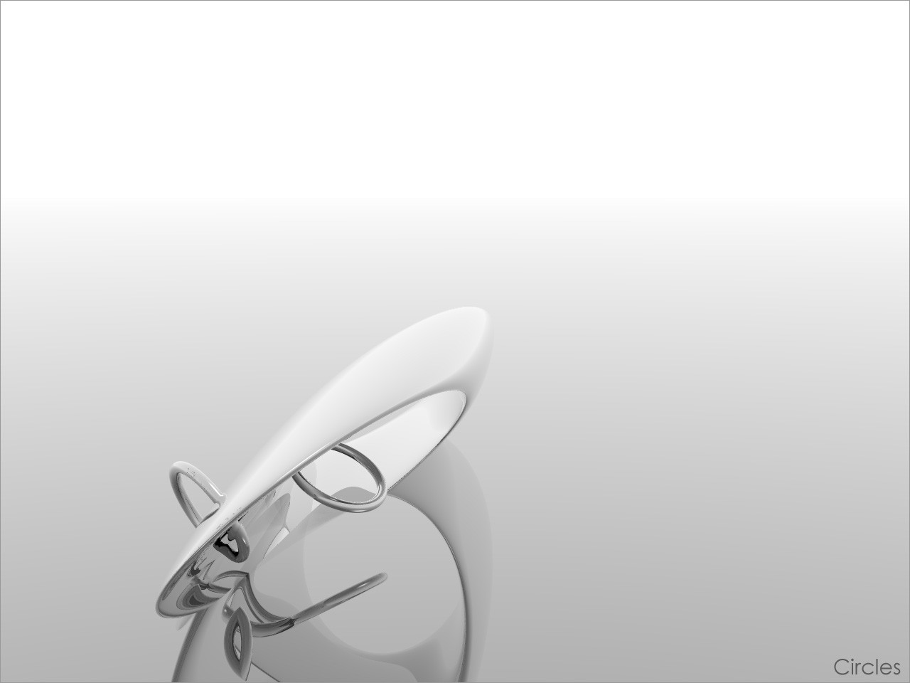
Published: 2005-11-10 22:19:34 +0000 UTC; Views: 380; Favourites: 2; Downloads: 154
Redirect to original
Description love that title

Original size : 2048x1536

Lot of time spent on this, i would really aprecciate comments and sure i wonΒ΄t kill ya for fav
Related content
Comments: 38

Raven30412 [2008-03-06 22:11:26 +0000 UTC]

to typo je tam hodne necitlivy...

πŸ‘: 0 ⏩: 0

not-sleeping [2006-02-10 14:37:48 +0000 UTC]

NO

πŸ‘: 0 ⏩: 0

sarahcarter [2006-01-07 20:07:15 +0000 UTC]

Orange is such a cool color!
I really like the way you've arranged this! And the different shades of orange and black are really cool!

πŸ‘: 0 ⏩: 1

di-ck In reply to sarahcarter [2006-01-07 21:20:08 +0000 UTC]

thankssss, and orange is Best COlor!!!

πŸ‘: 0 ⏩: 1

sarahcarter In reply to di-ck [2006-01-07 22:09:25 +0000 UTC]

no prob

πŸ‘: 0 ⏩: 0

ronette [2006-01-05 04:21:15 +0000 UTC]

Great abstract! Perfect!

πŸ‘: 0 ⏩: 1

di-ck In reply to ronette [2006-01-05 20:49:16 +0000 UTC]

thanks!

πŸ‘: 0 ⏩: 0

NDE [2005-11-30 23:42:59 +0000 UTC]

wow, nice effect! keep up the good work!

πŸ‘: 0 ⏩: 1

di-ck In reply to NDE [2005-12-01 15:29:30 +0000 UTC]

thanks

πŸ‘: 0 ⏩: 0

damaskangel [2005-11-30 14:29:43 +0000 UTC]

great job ... nice colors ...

πŸ‘: 0 ⏩: 1

di-ck In reply to damaskangel [2005-11-30 16:52:07 +0000 UTC]

thanks

πŸ‘: 0 ⏩: 1

damaskangel In reply to di-ck [2005-11-30 18:30:48 +0000 UTC]

welcome ...

πŸ‘: 0 ⏩: 0

rustypaulin [2005-11-29 21:35:21 +0000 UTC]

it looks great i love the colours and the way its so abstract

πŸ‘: 0 ⏩: 1

di-ck In reply to rustypaulin [2005-11-30 16:51:55 +0000 UTC]

its ment to be ypei know thank you :BIGHUG:

πŸ‘: 0 ⏩: 0

Supercrofty [2005-11-20 10:33:01 +0000 UTC]

This is truly awesome. I love it Only thing is the gradient on the text, but i love the angle of the white section and just the style

πŸ‘: 0 ⏩: 1

di-ck In reply to Supercrofty [2005-11-20 12:06:47 +0000 UTC]

hehe thankies, and yeah ill soon upload version 2, with improved text and so

πŸ‘: 0 ⏩: 0

exper1ence [2005-11-19 09:11:37 +0000 UTC]

nice one, really like this

πŸ‘: 0 ⏩: 1

di-ck In reply to exper1ence [2005-11-19 11:22:28 +0000 UTC]

thank yaaaaaaaaaaaaaaaaaaaaaaaaaaaaaaaaaa

πŸ‘: 0 ⏩: 0

masser [2005-11-13 09:48:01 +0000 UTC]

Realy nice colors

πŸ‘: 0 ⏩: 1

di-ck In reply to masser [2005-11-13 12:40:14 +0000 UTC]

thx

πŸ‘: 0 ⏩: 0

shricory [2005-11-13 08:15:00 +0000 UTC]

thats awsum! brillaint work!

πŸ‘: 0 ⏩: 1

di-ck In reply to shricory [2005-11-13 12:40:03 +0000 UTC]

thank you

πŸ‘: 0 ⏩: 0

the-negative [2005-11-13 06:53:26 +0000 UTC]

Am I imagining?
Add a Hypernurb modifier and retry it- I SWEAR it'll look better- it is creative, and that's what abstract should be (originally), but this piece is poking me (to death)!

πŸ‘: 0 ⏩: 1

di-ck In reply to the-negative [2005-11-13 12:39:46 +0000 UTC]

and how? this is Bryce render .... how can i open it with c4d?

πŸ‘: 0 ⏩: 1

the-negative In reply to di-ck [2005-11-13 13:19:15 +0000 UTC]

Seriously. You gotta be kidding me.
I thought you can't mdel in bryce...
Well, export it to 3DS, open in C4D, add HyperNurbs, export to OBJ, and reimport into bryce.

πŸ‘: 0 ⏩: 1

di-ck In reply to the-negative [2005-11-13 15:23:43 +0000 UTC]

lol ok , ill try and post it later, and yeah you can modell if you know how ^^

πŸ‘: 0 ⏩: 1

the-negative In reply to di-ck [2005-11-13 15:32:59 +0000 UTC]

No, no plz plz spare me, I'm INNOCENT!

πŸ‘: 0 ⏩: 1

di-ck In reply to the-negative [2005-11-13 19:58:00 +0000 UTC]

lol i think i dont get it

πŸ‘: 0 ⏩: 1

the-negative In reply to di-ck [2005-11-14 01:41:43 +0000 UTC]

Just kidding.

πŸ‘: 0 ⏩: 0

XtremeRunnerARS [2005-11-12 17:23:11 +0000 UTC]

That's pretty sweet....althought i don't think it's a vectored render.


What's your secret?

πŸ‘: 0 ⏩: 1

di-ck In reply to XtremeRunnerARS [2005-11-12 17:47:41 +0000 UTC]

i never said its vectored render, its normal render, only think i wasmakin in photoshop was changin/addin colors

πŸ‘: 0 ⏩: 0

DarbySniper [2005-11-12 15:42:36 +0000 UTC]

How could someone who made that use a gradient font... And a basic gradient at that...

πŸ‘: 0 ⏩: 1

di-ck In reply to DarbySniper [2005-11-12 16:15:13 +0000 UTC]

why not? imo it looks good

πŸ‘: 0 ⏩: 1

DarbySniper In reply to di-ck [2005-11-12 17:44:41 +0000 UTC]

:/

Overall the thing looks good, but not the gradient text.

πŸ‘: 0 ⏩: 0

x0blivi0nx [2005-11-11 16:17:17 +0000 UTC]

Look nice, ive never really seen a vectored render before. I just dont like the fonts, or maybe where they are.

πŸ‘: 0 ⏩: 0

NosferatuGFX [2005-11-11 13:13:18 +0000 UTC]

really niceee dude like itt
:thubsup: it obvious u spent long time

πŸ‘: 0 ⏩: 0

Quickdust [2005-11-11 07:19:19 +0000 UTC]

That is so extremely good man. I always love vector-abstract style. Amazing

πŸ‘: 0 ⏩: 0

Indo-Silver [2005-11-11 03:05:50 +0000 UTC]

great work bro! really trippy

πŸ‘: 0 ⏩: 0