HOME | DD
 diablo2003 — Spidey Cover- step by step

Published: 2006-12-13 00:34:33 +0000 UTC; Views: 126992; Favourites: 2704; Downloads: 3409
Redirect to original
Description
Hey Guys,Thought I would put up a little step by step detailing how to create a cover for Marvel. You don't have to read the whole thing if you don't want but, if you do, I hope you find it helpful. The piece was penciled by me with inks by Jaime Mendoza and colors by Danimation. The file is bit large but I wanted you to be able to see all the little deails I bring up in the step by step. ENJOY!
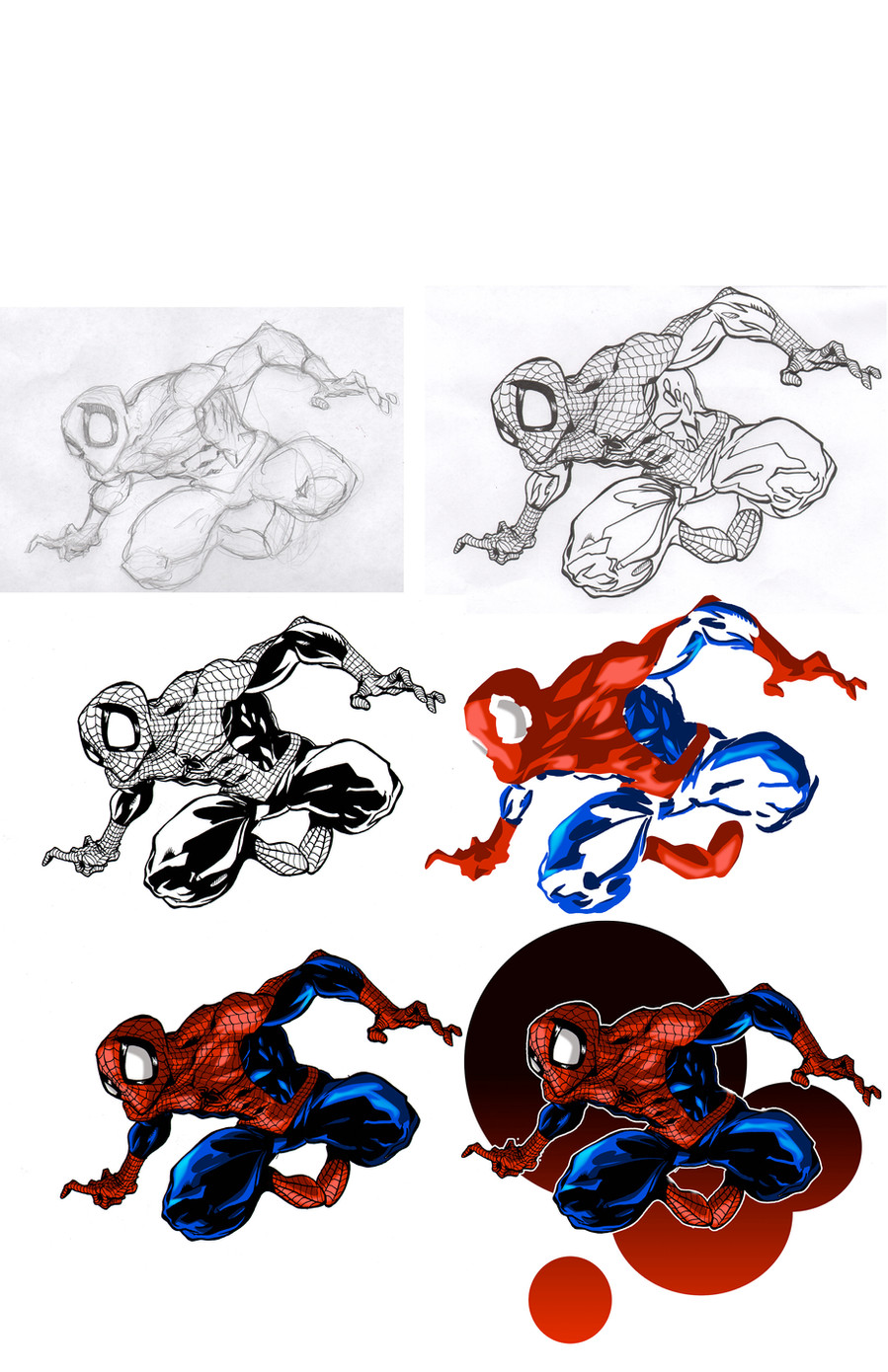
Step 1- PRELIM- This, to me, is the most important part because you’re setting the groundwork for everything else after this. You have to realize that there will be over 100 comics that come out the same month as your issue so you want to do all you can to jump off the shelf and separate yourself from the rest of the books. A few factors have to be kept in mind of course. You have to leave room at the top for your title and remember that the company logo is most likely going to be at the top left with a smaller logo at the bottom right/left as well as the UPC code also at the bottom right/left. This can be dicey to try and find a good image to display while working in such tight confines but you get used to it after a few tries. Remember that your image needs to be easy seen from 5 feet away since this is the general distance a reader will stand from the shelf deciding what and what not to buy. In this case, the editors at Marvel wanted a cover for a book that will come out around the same time as Spider-man 3 so it had to feature the main villain and, of course, Spider-man very prominently. I chose to slightly homage a scene from the movie’s preview where Sandman come up out of a dump truck and makes himself into a sandstorm to sweep away police and pedestrians. I added Spider-man in there framing him prominently in the center of the cover drawing maximum attention to our hero. Framing him almost completely surrounded by sand would also help pop him off the cover since his red and blue costume would show very well against an all tan background.
Step 2- PENCILS- In this case I scanned the layout into my computer and blew it up to the size of standard Marvel board in photoshop which is 10.5” X 15.75”. I then print it out and lightbox trace the image onto my comic board using a non-photo blue pencil. Once I have the rough placement of the characters on my board I get to the main task at hand which is making sure my anatomy is correct and adding all the little details that will make this cover pop. This includes the webbing on Spider-man, all the contour lines defining the musculature on each character, the sand and blast effects, as well as all the little background elements like the taxi cab and each window of the buildings. I’ll also look at myself in the mirror to make sure I have all the little details of the faces correct. In this case, I spent some time looking at myself make a screaming face in order to get Sandman’s face like I want it. Once the non-photo blue drawing is the way I want it I start penciling it with regular lead pencils ranging from size H to size 2B leads. I normally work front to back so I start penciling the web line first and then move on to Spidey, then Sandman, and then the background. I’ll use a variety of templates for each cover depending on what I need them for. On this cover I used a straight edge ruler for the blast effect and all the buildings. Circle and oval templates came in very handy on stuff like the wheels of the taxi.
Step 3- INKS- Once I’m done the cover is sent off to Jaime Mendoza to work his magic. Jaime uses a variety of tools including sable hair brushes, crow quill, and rapidiograph pens to get the look he wants. Inking is far more than tracing and involves Jaime adding depth and weight to lines tat might have appeared flat in the pencil drawing. Lines are inked thick to thin to give the look of dimension to a character. For examples of this simply look at Spider-man’s foot and calf in the pencil drawing and then look at the weight and depth added to the inked version. Also notice the line weight on Spider-man is much thicker than the line weight on Sandman as well as the background. This gives the illusion of depth since things in the foreground will have thicker out lines while things further in the distance loose line weight. Lastly, Jaime will go in with a tooth brush or stiff haired brush and use either white or black ink to add those fine little splatter effects of sand adding to the emotion and energy of the piece. Once finished Jaime scans the cover into his computer and, using photoshop, sizes the image to 10.5” X 7” at 400DPI which is standard sizing for Marvel comics to print from.
Step 4- COLORING- If penciling and inking is the cake, then this is the icing! After all, who wants to eat plain cake right? For this cover, Danimation stepped in and knocked this one out of the park. Using photoshop and a Wacom tablet Dan goes in and initially blacks out all the separate areas by doing what’s called ‘flatting’ the image. This just means he adds flat colors to each area like Spider-man’s suit, Sandman, and all the background elements so they all appear as their primary colors. Dan then uses a variety of photoshop tools like paint brushes(both standard and ones he makes custom), lassos, and gradients to give the piece more dimension and depth. He’ll even add shadows and highlights showing the light direction. For example, see the shadow being cast by Sandman’s head falling across his chest. It details like this that make the image look truly convincing. As the colorist, Dan is the last person to touch the cover before it’s printed and responsible for setting the mood of the entire piece because his colors are going to be the first thing the viewer sees. Because of this a colorist can be the pencilers best friend or worst enemy and can really make or break a cover. Dan decided to have a little fun with this piece and did a version with Spidey in his black costume from the movie as well!
Hope you found this enjoyable! If so, let me know and I’ll try and do more of these in the future. I plan to do a color tutorial as soon as I find the time but, in the meantime, let me know if there’s anything else you’d like to know.
Best!
-Mark
Myspace: [link]
Yahoo group: [link]
Sketchbook ordering details: [link]
Related content


Comments: 509

Love it!
I'd have gone further on the black costume, and actually added areas of straight black to really communicate that the cos is black. (But not solid bl;ack, of course, cause even black isn't black, right?)
As it is, it looks kind of blue. At first glance, I thought it was a different lighting scheme.
That's some sweet color, thoguh. I like how the background has a painterly look, I'd have liked to seen Spidey more like the BG.
Love your work, even though I'm being a crit machine. I faved ya, because that Cheeks fanart was too much!
👍: 0 ⏩: 0

I gotta question, on average, how long does it usually take you to finish a final penciled version (the copy you send to Jamie)? I know every picture is probably different, but just an estimate?
👍: 0 ⏩: 0

HOLY SH*t...u are amazing man!! a truly filipino pride!
👍: 0 ⏩: 0

thank you for posting the step by step you have givin me a ton invaluable information, unfortunatly i still 10,000 questions so it would be great to have another one added if you would be so gracious
👍: 0 ⏩: 0


Holy crap that's good...like the skinnier interpretations of Spider-man.....
👍: 0 ⏩: 0


")


Oh man, your pencils made my stomach turn. Not because they're sickcrazygood or anything, but I can see your perspective lines. Reminds me of one of the proffessors here. Ex-Marvel guy. Tom Lyle. nice guy. Perspective lines boggle me regardless. I'll learn one of these days, I know. Shoulda changed majors years ago.
👍: 0 ⏩: 0

i love uncoloring comic images my frindes thenk that weard sam times i see cover so bad but whean i see the uncoloring one i thenk it cool i realy do not knoe whay
👍: 0 ⏩: 0


Thanks, Mark! I love it when you walk us through these things. It always inspires me to get off my butt and start drawing. I started playing around with digital coloring when you did your Black Cat pic, so I can't wait for a new coloring tutorial.
👍: 0 ⏩: 0

I loved the walkthrough of how this cover came to be. Thanks for that. More would be awesome.
Cheers,
Bradley

👍: 0 ⏩: 0

 (Smile)")

Thanks a bunch Mark....for us aspiring pencilers out there....it's REALLY helpful!
👍: 0 ⏩: 0

Hey, love your spidey!
And check this out: [link]
👍: 0 ⏩: 0

It's Really Cool!! I admire you a lot man! though, I dunno... I don't really feel it. It's like you could have done it even better than it is already. It's like that between the prelim and the pencils the urgency that the prelim transmit was lost. In the prelim sandman is in rage (body language) and spiderman is more active, like really escaping. In the pencils Sandman just looks angry and spiderman just looks like he's avoiding the attack not escaping. Great job anyways. Keep up the good work, I really hoped you would take over Ultimate SM. I'm don't like Immonen that much.
👍: 0 ⏩: 0


MAN!!!how i wish i was this good...and that is how much i love this
👍: 0 ⏩: 0

Mark, thank you so much for putting this up. It's amazing to see the processes at work! I just *devour* everything you put up here. (Keep it coming!)
👍: 0 ⏩: 0


do you use a ruler? how do you keep everything on the buildings so... parallel?
👍: 0 ⏩: 0

I just stumbled upon your gallery today and I've already learned so much! This tutorial is amazing, I love seeing the process it goes through before it hits the shelves... it's one thing to have step-by-step instructions from my "draw comics the marvel way" refrence book, but to me it just feels more personal and "real" to have someone who does this for a living type up a tutorial and explain things.
Thanks for sharing your gorgeous work and taking the time to make this tutorial.
👍: 0 ⏩: 0

Hey Mark!
Love the piece. You and Danimation look sick together. One request, would you take a peek at a piece I did and let me know what you think? It's similar subject matter and I would love to hear what you have to say, good or bad!
[link]
Thanks Mark, hope to see you at Chicago next year!
👍: 0 ⏩: 0


Awesoma as always..the comment was educational to say the least..
👍: 0 ⏩: 0

No matter which step I look at...they are all wonderful...one without the other would still be a masterpiece of each step to me.....
Nice to experience each look....-"t"

👍: 0 ⏩: 0


Heheh. Damn, I really admire your work. o.O It inspires me.
Favourite+
Best Regards
The Judge
👍: 0 ⏩: 0


Great stuff thanks a lot for this! Great to see the work flow.
👍: 0 ⏩: 0

Somehow the grey spidey looks more interesting and catchy
👍: 0 ⏩: 0

YES PLEASE CONTINUE TO DO TUTORIALS PLEASE OMG!!!!!!!!!!!
👍: 0 ⏩: 0

Wow, you are simply amazing, my friend. I hope to be half as good an artist as you by the time I grad from an art school.
👍: 0 ⏩: 0


I wouldn't even know where to begin. But first off, thank you. I want to be a comic book artist, and I don't know the first thing about where to begin. This has been more helpful than you know(or maybe you do ")
👍: 0 ⏩: 0


Make me remember the trailer of the Spider-man 3.
Very very good!
👍: 0 ⏩: 0

Awesome, I didnt knew danimation was still coloring!
you guys make a great team, congrats to you, the inker and the colorist!
greets Soulrailer
👍: 0 ⏩: 0


please...
👍: 0 ⏩: 0
<= Prev | | Next =>