HOME | DD
 dibenitez — Step-by-Step Coloring
by-nc-sa
dibenitez — Step-by-Step Coloring
by-nc-sa

#coloringtutorial #stepbystep #shadingtutorial #artguide #arttutorial
Published: 2016-08-19 08:51:24 +0000 UTC; Views: 8062; Favourites: 80; Downloads: 43
Redirect to original
Description
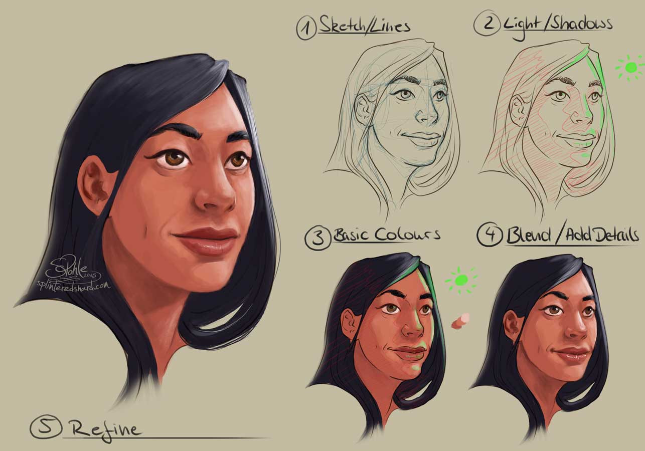
Some people have been asking about my art process and honestly i’ve never really thought much about it but I put together this basic step-by-step thing (featuring Laura Hollis) just to give everyone an idea of what it is I do.
PSA: this is only one of my coloring styles so I will make separate guides for my other styles as well.
1. Sketch: pretty straight forward, I start with a quick pencil sketch, take a picture, put it into my program and go from there. This is also the stage which I choose dimensions and such (generally I work with a larger canvas and a high dpi if I plan on selling the piece on redbubble)
2. Lineart: My lineart style changes sometimes but I use just the basic pen tool (with pressure sensitivity disabled) and the fade pen tool for minor details.
3. Flats: Basic colors, no real details just yet. Not-so-Pro tip: I draw a lot of the same characters over and over so I have color palette’s saved for every character which is very convenient for me cause I’m lazy and I suck at color matching. another not-so-pro tip: double and triple check that you are coloring the right layer. NAME YOUR LAYERS dont make the same mistakes i make quite often.
4. Details: At this point its just major details such as clothing patterns (which I do on the same layer as the base color for that clothing item. I just lock the pixels for that layer and work directly on that layer, all my patterns are done by hand cause I dont like using textures and stuff) At this point I also add details in the hair using the watercolor tool to get the blending just right. Cause we all know that hair isnt just one flat color and really Laura’s hair in this case is a jumble of browns and blondes.
5. Highlights + Shading: For this style of shading I use different values of reds and pinks (only cause I love warm colors its good stuff). I use the pen tool and I set the layer to multiply then play with the opacity until I like the way it looks. Sometimes I add more depth by adding multiple layers of shading but I dont do that often. For highlights I set a layer to screen at low opacity and use the pen tool to add any extra highlights on the hair and face (people are shiny and oily and thats just life) in terms of what color I use for highlights I generally just use the base colors from earlier. At this point I also add any other minor details like the shine on the eyes or lips, also any freckles or beauty marks.
6. Overlay: This step is really optional but I like the effect it has. Above all layers (including lineart) I color fill a layer with any solid color (again I use a coral/pink ish color cause I like warm colors, but if you prefer cold colors you could use blue tones) Then I set the layer to overlay and play with the opacity until Im happy with it. Basically it’s just a way to blend all the colors, make sure they all have the same basic tone. I also sometimes add a thicker outline just for aesthetic purposes. Again this step isn’t particularly needed but sometimes it just looks good.
so I hope this curbs people’s curiosity and maybe even helps some of you with coloring stuff.
again I have a few other styles in terms of shading and lines so I’ll do breakdowns for those styles on a later date. And then an entirely different process for realism and backgrounds.
Anyway, hope this helps and I hope I get the chance to make an actual in depth tutorial on my full drawing process and maybe some drawing tips? I dunno.
Enjoy.
My tools of the trade:
- mechanical pencil
- Wacom Bamboo Create
- FireAlpaca