HOME | DD
 dierat —
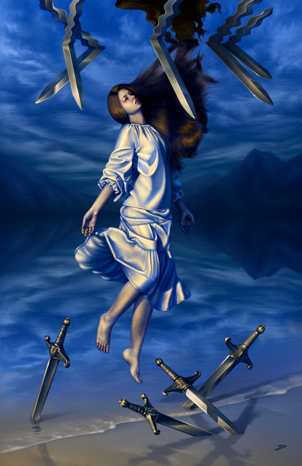
Nine of Swords
dierat —
Nine of Swords
Published: 2012-09-29 13:02:16 +0000 UTC; Views: 20167; Favourites: 663; Downloads: 0
Redirect to original
Description
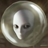
This is an illustration of the tarot card Nine of Swords .From Wikipedia: "If this card is shown in an upright position, it can mean deception, premonitions and bad dreams, suffering and depression, cruelty, disappointment, violence, loss and scandal. However, all of these may be overcome through faith and calculated inaction. This is the card of the martyr and with it comes new life out of suffering.
If the card is shown in an ill-dignified or reversed manner then it has a different meaning. When turned this way it means distrust, suspicion, despair, misery or malice. Total isolation away from comfort and help: institutionalization, suicide, imprisonment and isolation."
My idea was to create an image that illustrated both of the card's meanings - the woman hangs in the balance between life and death, waiting to find out how the card falls. If the card is laid right-side up, she hangs over dry land, feet first, and the four swords are harmlessly hilt-up beneath her. If the card is laid upside down, she hangs head-first over deep water with five swords blade-up below.
Photoshop CS2.
Related content


Comments: 159

You're very welcome! I meant it!
👍: 0 ⏩: 0

This is the best digital art ever!
👍: 0 ⏩: 1

Thank you so much! Your comments really made my day! 
👍: 0 ⏩: 0


Hi there!
You've been featured here for this week's Feature Friday
Have a nice day

")
👍: 0 ⏩: 1


This piece is so nicely colored, you definitely deserve more attention for this!
You've been featured!
[link]
👍: 0 ⏩: 1

wow very interesting piece!! i do love art with meanings!! also beautifully done, how long did it take to draw the whole piece??
👍: 0 ⏩: 1
Thank you very much! I'm afraid I don't keep track of how long I spend on a piece, but it took a while  (Smile)")
👍: 0 ⏩: 0


Great piece of work!!
Thanks for sharing...
Featured in Daily Inspirations at [link]
👍: 0 ⏩: 1


hello there; I just wanted you to know I think your work is lovely, so I've featured it here .

👍: 0 ⏩: 1


Wow, this is lovely! I love the idea, and I really love the colors! Since orange and blue are complementary colors this makes a nice color theme. I love the way the swords are drawn too! Great job.
👍: 0 ⏩: 1

I love tarot cards. not that I especially believe they mean anything, but they're a design classic, and this is a nice one
👍: 0 ⏩: 1
I feel the same way! I don't believe in tarot reading and such, but the metaphors and visual imagery of the cards are just awesome.
👍: 0 ⏩: 1


Those colors are so good! I just love this.
👍: 0 ⏩: 1


WOW! This is soo cool I font want to understand wats going
on! It's so awe inspiring and mysterious looking... so amazing!!!!
👍: 0 ⏩: 1

I think this is one of the best concepts I've seen yet for this piece, absolutely brilliant. First things first, I absolutely love the lighting on this, it's so well done. A lot of people are so afraid to get such bright lights then it dulls an image, but you've done so well. I love the contrast between the yellow and blue, especially when you look at both hands, you can really tell that one is in the light and the other in pure shadow. The proportions of the woman is very well done, I think what bothers me is either the head is a little too small or maybe just the neck to thick? Love love love the hair, very well done. I agree with ~Hixateez though on the hair touching the top surface, it does make it feel like shes closer to dying then living. and like you said in the description, shes still waiting. I do like the reflection off the water on the top though, and the ripples in the water as well, thats a lovely touch.
Overall, very very well done (and I'm even considering suggesting this for a DD because it has such a strong concept behind it)
~Nikki
👍: 0 ⏩: 1
Thank you so much for the detailed feedback, I really appreciate it! 
👍: 0 ⏩: 0

That's an excellent depiction of the card in my opinion (Wink)")
The background has a nice balance, too, being basically the same upside down and the right way up as well, but the "line" between them is blurred in a nice way so it doesn't disturb. In fact, I think the entire blue, cloudy background is suitably simple not to draw attention from where it should be.
Also, it creates an awesome contrast to that yellow and orange!
The woman is beautiful
The wrinkles of her clothes are just marvelous... I'd like to point out, though, that I think her left sleeve could use just a couple more wrinkles because the right has so much more and it looks a little hunny in my opinion. Also, the underside of he skirt's hem looks somehow very odd to me but I probably just fail to understand it.
I just love that hair... It looks so real and has a beautiful color
I'd also personally prefer it if her hair didn't touch the surface of that water, because it makes me feel like she's closer to dying than living. And I believe there's an equal chance of both.
But overall, this is a lovely piece with great symbolism, fantastic light and color and a beautiful, realistic style
And that ground down there looks like wet sand. Was it supposed to look like it? Oh well, I still think it's just fantastic that you managed to make it look like that!
👍: 0 ⏩: 1
Wow, thank you so much for the detailed and thoughtful critique!
I didn't realize there was a problem with the part in the hair, so thank you very much for pointing that out to me. I'll also work on that back sleeve more; I totally see what you mean there. The problem with the underside of the skirt is I basically had to make that part up. I tried to make it consistent with the rest of the skirt and obviously failed, but I'll see if I can fix it up a little so it's a little less distracting. For the hair meeting the water, what if I pull the hair down so there's, like, an inch between her and the reflection - would that be enough to make it feel more balanced?
Thanks again!
👍: 0 ⏩: 1
I'm happy if I can help
Yeah, even a little bit of space there would make a world of difference in my opinion
Oooh, cool


👍: 0 ⏩: 0

Awesome picture, and definitely an awesome concept. Good job with the lighting too.
👍: 0 ⏩: 1

Oooooh, very nice. I love the stark vibrancy to the complimentary colours and the surreal elements sure make it interesting.
👍: 0 ⏩: 1
<= Prev | | Next =>