HOME | DD
 diffusion — back 2 my roots

Published: 2004-03-10 14:06:58 +0000 UTC; Views: 3376; Favourites: 22; Downloads: 815
Redirect to original
Description
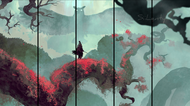
Typo assignment to reflect one’s personality or an aspect about yourself.Related content


Comments: 39

wow cool, i hope im not wrong but are the tree roots Australia???
👍: 0 ⏩: 0


")


very technical, i like it, the handprint looks great. well done
👍: 0 ⏩: 0


It would be century gothic, awesome font hey!
👍: 0 ⏩: 0

Hmmm KillJoy's designs are popular
You're good with the pen tool though.
👍: 0 ⏩: 0

The dripping M is really nice. I admire the mixture of vector and texture!
👍: 0 ⏩: 0

everything fits in just right on this

👍: 0 ⏩: 0

Wow, man your stuff is awesome! I love the vector look! Very inspiring designs!
👍: 0 ⏩: 1
Thanks you so much, I am glad I’m inspiring someone
 (Wink)")
👍: 0 ⏩: 0

You have a defining style adam, and its one of your best features in your graphic design talents.
Like usual... love the work
👍: 0 ⏩: 0


you go boi
i was thinking of having a rather rooty tree for my webapge but i ended up surrendering to the chicken. nice to see someone with similar ideas has put it to good use. plus love how you presented your name with the extended shadow + handprint + back to my roots where i belong is very tribally reminds me of them tribally beats and some african guy with a bongo drum.
a very original piece where every element of it compliments with reason
you have my high respects ^_^
👍: 0 ⏩: 1
aww thanks heaps tegan!!!
I can see why you went with the chicken though, no one can resist the temptations of the chicken...mmmm chicken

👍: 0 ⏩: 0

'Best typo Assignment I have seen on DA so far' award goes to you, great job
👍: 0 ⏩: 1

Thanks for pointing that out man!
And you’re right it does look very simular, but was no way intentional though.
I didn’t think it was the most original idea when I first came up with it, but being pressed for time I went with it anyway.
Thanks for the comment too
👍: 0 ⏩: 0

hmmm, id give you the benefit of the doubt but it reminds me an awful lot of : this bitchin illustrative work though. the roots have a good sense of weight and 'droopiness' (i make up words  (Smile)")
👍: 0 ⏩: 1

I agrree with escapepodone... this is very similar to the link he left.. I thought that you were maby the same artist and did both, but i guess its just similar... I still think its very very good.
👍: 0 ⏩: 0

This is seriously fkn cool!!! Excellent work, you are very talented Adam!

👍: 0 ⏩: 1
Why thankyou!...at least I'm good at something
👍: 0 ⏩: 0


That's very nice. I like the tree and it's root. An the colors are very nice too.
👍: 0 ⏩: 0

Very cool looking. I like the letter styling, and the far east sort of theme.
👍: 0 ⏩: 0


Very clever and looks great! Nice font choice too! I never knew your roots were in Japan though...I was under the impression you were from Australia/England/Australia.
I hate you Gormleys
")
👍: 0 ⏩: 1
haha...I was that guy from the karate kid movies!

👍: 0 ⏩: 0

thats fucking cool
looks like you put a lot of thought into this
great work, that asutralia roots thing is ingenious
👍: 0 ⏩: 1


beautiful. i love the handprint, makes a great touch to an excellent piece.
awesome work

👍: 0 ⏩: 0