HOME | DD
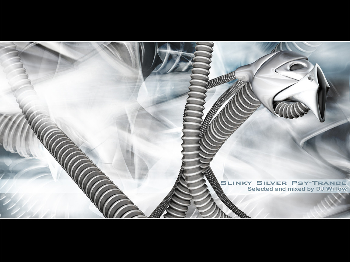
 digi — 72dpi killa v2

Published: 2001-06-18 15:08:24 +0000 UTC; Views: 5595; Favourites: 9; Downloads: 913
Redirect to original
Description
oimfewoewfRelated content


Comments: 56


Very nice work
Going back to, Kali Kali.
-Daze in, days out-
👍: 0 ⏩: 0

mmmmm more DIGI goodness ... i like the flowing in this but the white does take away from it. but you still my CT god of the arts
-=[iMike]=-
👍: 0 ⏩: 0

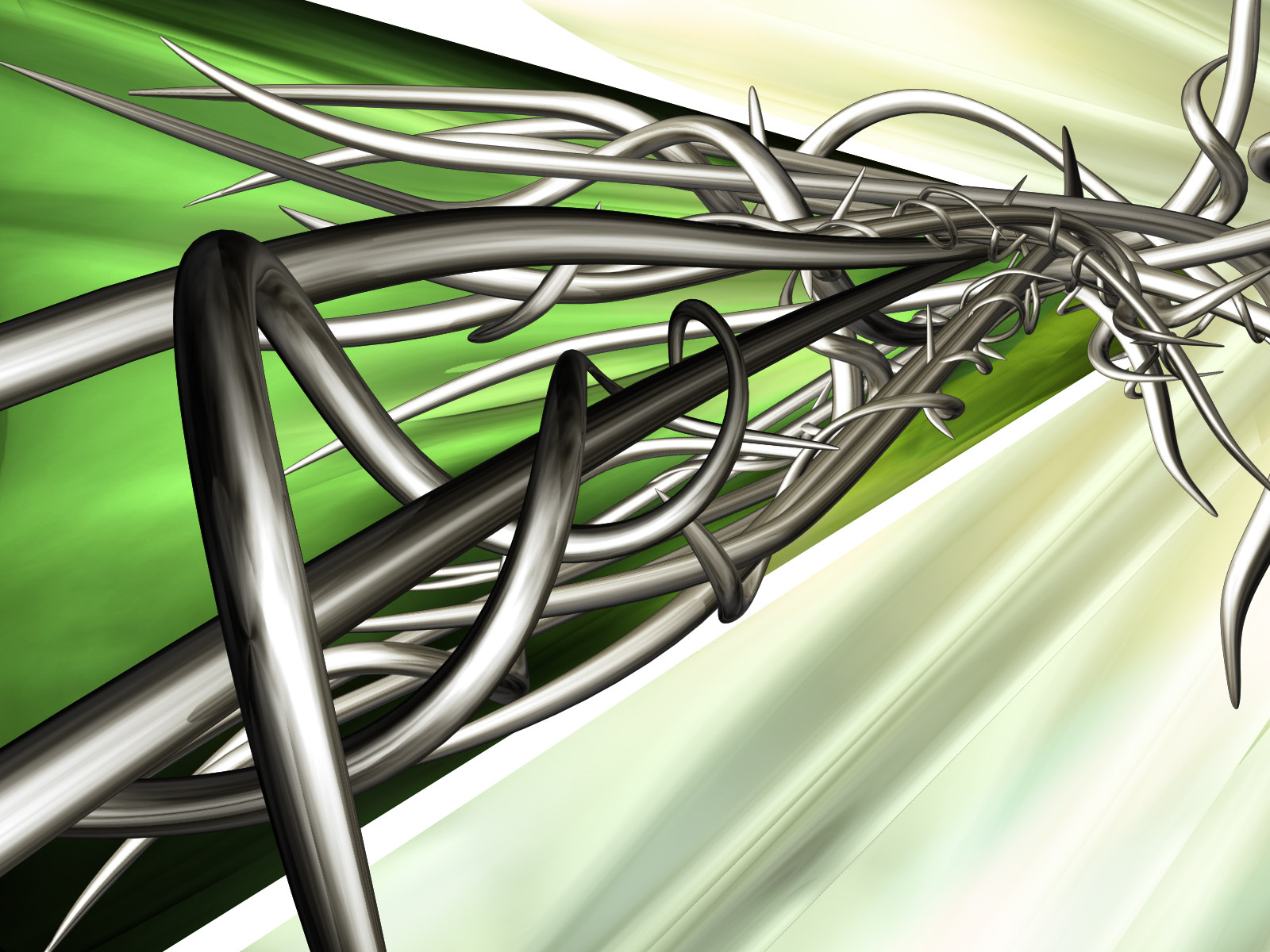
Exceptional........ how ever what is it. it crossed my mind as a cocks head at first, the chicken male. But thn agian it looks a bnit like the computerized image of hair like in ads. But it's cool . ^_~
Life is hard and cruel for the young - Craxxi (Omertà)
👍: 0 ⏩: 0


hey, digi.
Alcatraz
https://alcatraz.deviantart.com
👍: 0 ⏩: 0

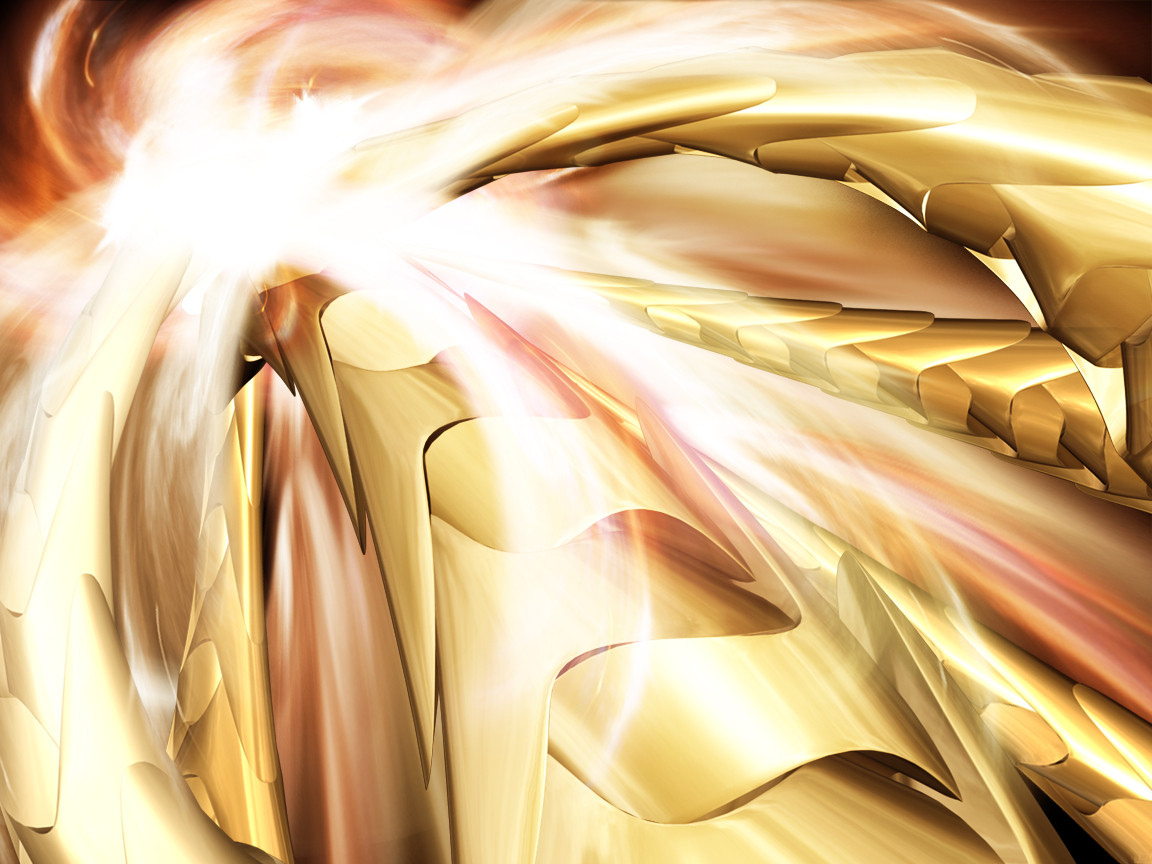
Personally, I think it's beautiful. The red compliments the gold nicely. Congrats on the DD.
http://www.avalonsector.com/
👍: 0 ⏩: 0

brilliant work, the shapes you come up with in your walls are awesome. Do you have a background in grafitti? ..Awesome.
👍: 0 ⏩: 0


whoahahaha i thought you had left, wonderful piece, congrats on the DD man, the color and lighting on this is perfect, i love how you blended the red and yellow, two colors that dont go together easily. nice work
-Call me a TREND WHORE if you must, but at least im a WHORE-
👍: 0 ⏩: 0

whats everyones problem with the white part? i like it. *shrug*
-=[HaGeShiKu]=-
http://www.hageshiku.com
👍: 0 ⏩: 0

If you don't like the white, simply visit the other version. There's a reason why different versions are created - so people who don't like a specific element in one wallpaper (ie the white) can go to the other version and grab the non-white version.
👍: 0 ⏩: 0


Not the best one Ive seen , The only thing that is the light effect
that u Have with 3d studio max or even Photoshop but the originallity'
is purely proffesional keep it up and upper
I Kinda of FOLLOW melkoir Because everything he says is kinda true
Trancergfx
👍: 0 ⏩: 0

Your originality is great, techinique awesome.. but as a whole this peice clashes with itself enough that I end up not liking it it. The red and gold was a great combo, the white blew it for me (and apparently others).
Not trying to jump on their bandwagon ..but the white definitely hits you in the face and makes you think 'what is this doing here?' In my opinion its the fact that the rest is made of very 'warm' colors that builds a heat and mood .. and the splash of white .. a cold color if I ever saw one breaks the heat, the mood .. and ultimately the peice for me.
Anyways.. not everyone sees the same thing when they look at art so obviously from the feedbacks you've done well in general and appealed to one taste more than other.
Laters
-Melkior
👍: 0 ⏩: 0


Breathtaking
Mold Me, Shape Me, Create Me, Destroy Me.
👍: 0 ⏩: 0

dont know what it is, but it looks sweet! fantastic work once again.
º¤~tùñä~¤º
👍: 0 ⏩: 0

i like the wp just the way it is. the white adds a nice effect to it... don't listen to anyone
inhale past. exhale future.
👍: 0 ⏩: 0

damn .. the texturing on this is wicked. exceptional work digi! nice to see mah boy back in action! to add this this comment, though, i really love the red background on this one. seems to display the beauty of the picture must better.
--[ jark ]--
👍: 0 ⏩: 0

first off...aerosole was ok about it...
but kalimon dont TELL me it doesnt fit.. say in your opinion dammit
in my opinion the white DOES fit
digi
http://www.awedigi.com
👍: 0 ⏩: 0


I must agree with almost everything above...
The image itself is very cool but this thing about the white area is very true... You should ad something there, its missing some diffuse forms or something or why didn´t the red stuff go all the way over the white area?
Its still a very good pic but yes do something about... duh the white... am I anoying or what... Now I´ll stop harrasing you about the... Oh my god aerosole STOP!!!
👍: 0 ⏩: 0

great going man. love the change in your style, while keeping your now famous technique. v.cool .
:: paroxysm ::
👍: 0 ⏩: 0

some abstract work but the texturing and 3d modeling is done hella nice gj bro
👍: 0 ⏩: 0

great work digi, like always
i like this one as well as the original
-kyle
mailto://saturn@abstractdream.com - e-mail
http://www.abstractdream.com/saturn - [saturn]co
http://www.bkaro.net/me/saturn.html - bkaro saturn
👍: 0 ⏩: 0

wow man thats awesome! heh how do you dooooooooooooooo that?! me be a newbie, dont know how to do anything cool. oh well... congrats on the DD
-- PrEeNz SnUpEe || http://www.princesnoopy.com?page=main&am p;ID=gbook
👍: 0 ⏩: 0

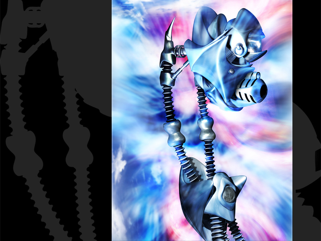
To me it looks like the white part is what the robotic beast is leaving it its wake. Emptiness. Nice concept. Great execution.
👍: 0 ⏩: 0

wow...awesome work! love the colors and that burst...everything, very cool...
[ trodden ]
👍: 0 ⏩: 0
wow...awesome work! love the colors and that burst...everything, very cool...
[ trodden ]
👍: 0 ⏩: 0

Jesus christ, If only I had the talent and experience to dish out a kickass wallpaper like this one. I especially like those colors and all the effects going on, very motivating, stay cool digi.
Nicolas (Cype)
nicolas@dmusic.com
👍: 0 ⏩: 0

*gasps*
-lex
-io (dyslexia strikes lonely punk rockers yet again)
👍: 0 ⏩: 0

Fucking wicked. reminds me of these armors of the gallo-roman empire. A period of grandeur. But you pic is also grand
::zk::
👍: 0 ⏩: 0

pixelhunter [2001-06-18 17:05:57 +0000 UTC]
crazy art again !!
digi i love your work !!
again awesome job !
---------------
*Pixelhunter
optimize your eyes + http://www.oweapon.f2s.com
👍: 0 ⏩: 0

Digi, gotta love it! i accually like the white on it, its got a place on my desktop, Nice work man!
.:schrunk:.
Where news and graphics connect!- http://www.PerfectCircleDesign.net
Please comment on this- https://www.deviantart.com/deviation.php? id=40940
👍: 0 ⏩: 0

*looks at digi* hey slut, that white thing takes away from the rest of it. fix it ya h0.
*looks at eks* shaddup fo0.. i will go nowhere for another version! hush. ;x
👍: 0 ⏩: 0

This one is dope. Mah dawg digi can't play cs for shit but he can draw . For all of you that are saying that the white part doesn't go or makes it feel incomplete. There is a different version at his site without it. Ya should go there.
[::eKs::]
👍: 0 ⏩: 0

ehe... I think I know what you mean by '72 Dpi Killa' ...nice one!
👍: 0 ⏩: 0

nice work. great thought put into that. . . i know.
keep them coming. congradulations.
leticia
//... the world is a vampire. set to drain. . .// s.p.
👍: 0 ⏩: 0

this is intense.
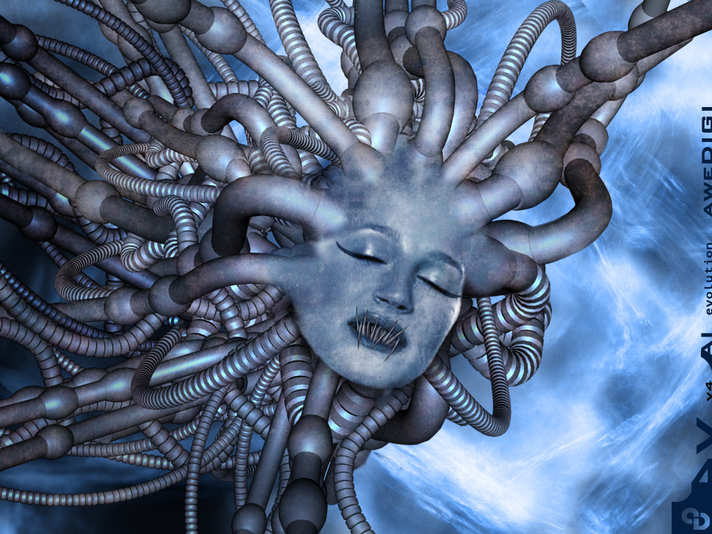
i like the multi-layered shapes top right, excellent.
...orestes
👍: 0 ⏩: 0

Digi, this is shweet! You're such a trend whore
::[ regener8ed ]::
has anyone seen my chicken?
👍: 0 ⏩: 0

Digi,
Amazing piece of work. However, I must ask you a question about this piece. Too me, the white areas make the work feel a bit incomplete. Like it was meant to be "colored" but forgot to do it. I'm curious on your motivation behind this. Perhaps I'm just talkin' out of my ass...
w00master
👍: 0 ⏩: 0

digi my bitch!
Hehe, great wall man, very breedish ;D
👍: 0 ⏩: 0


nice one eric
i knew you would have it
congrats! you still 0wn hehe!
•••••••••••••••••••••••••••••••••
+t e k n o l e d g e
+the power of knowledge.
•••••••••••••••••••••••••••••••••
👍: 0 ⏩: 0

i love jo0 eric! ;D
heh oh an the wps still great.
[ idlejam ] [ iji ] [ elle ] [ tha pimp slave ]
👍: 0 ⏩: 0
| Next =>