HOME | DD
 digital-z3ro — No Style [edited]

Published: 2004-09-05 11:34:43 +0000 UTC; Views: 2751; Favourites: 66; Downloads: 363
Redirect to original
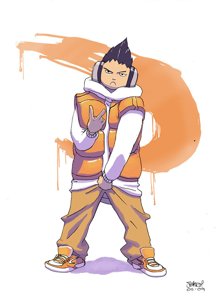
Description
Yeah. From something Bruce Lee said about Fighter's should have "No Style", instead they should adapt themselves to the situation at hand...or something like that..
anyway. i got a couple of stereotypes which were cloating in my head and tried to slam them into one person.
[EDIT] i rescanned, recolored, reworked this picture to a bigger resolution, fixed the text, fixed the eyes, fixed the lineart.. fixed.. like.. fucking.. CAPTAIN PLANET.
Related content


Comments: 48

i wanna see a close up of that sword!!! ooooh looks hot
👍: 0 ⏩: 1

GLAD YOU DIG IT BRO! check out the rest of my gallery. you'll see more swords and cooler swords in more recent posts... and coming sooooooon! haha
👍: 0 ⏩: 1
yeah bro your Miss Jacks looks hot!!!
👍: 0 ⏩: 0

Are you, by chance, taking requests? I have a character who would be rendered perfectly into living color through your particular style.
👍: 0 ⏩: 1
i'm up for a challenge. i do comission really cheap too. email me~ zombierock[at]gmail[dot]com
👍: 0 ⏩: 1
I don't have…any money.
Do you only do commission work?
That would be unfortunate.
👍: 0 ⏩: 0


That's awesome~ the flow looks so natural yet there is something intense about the figure's posture... that and the entire style of the drawing is just funkypants X3 must fave.
👍: 0 ⏩: 1


man, it reminds me of my spinfunkyseries. check it out! if you want to, of course...
👍: 0 ⏩: 0

That is great!
I like his pose and the details. I really like his outfit. Nice expression too.
👍: 0 ⏩: 1

Bloody hell ..man ...this is like ...damn ..its goood. Detail in line art is just damn ....i atualy whant to draw like that.
you when a long way since i saw you stuff last time.
👍: 0 ⏩: 0

oo great pic!
really like the pose.
contrast between the background and the figure is what drew me to it..
👍: 0 ⏩: 0

Damn, you're really getting lots better and um..what they said.
👍: 0 ⏩: 1
thanks.. you..disgruntled poring..you
👍: 0 ⏩: 0

hehe, kickarse design. all the small stuff makes it even better
👍: 0 ⏩: 0

it's very cool
... great position
the position is perfect
looks just like i do when going for some stairs...
but i don't have any cool clothes or way groovy hair
👍: 0 ⏩: 1
haha thank you. i like your avatar ")
👍: 0 ⏩: 1
yus it is
it's a very poor one at that
... but i like it
(aww)
👍: 0 ⏩: 1


Awesome concept, great pose, great outfit design and details. I love the dice on the end of the sword there, and the way the orange looks with all the grays. There are a few spots in the coloring on the scarf that could be cleaned up.
👍: 0 ⏩: 1
aye, i'm gunna re-scan and redo it slightly after i submit my next pic
👍: 0 ⏩: 0

Wow dude! Totally awesome!
have you got a feature "anti-alias" when you insert your text? You might want to turn it on because your lettering is a tad pixelated.  (Smile)")
But onto the character itself... It's an EXCELLENT pose/motion shot. He looks so cool... The dice on the Katana is a very nice touch.

👍: 0 ⏩: 2
Oh, And thanks for the comment
👍: 0 ⏩: 1

it's actually the fucking screen i was using when i was slapping the colors on. you see.. firstly it's 640x480. secondly it's missing a few pins from the port so it's blurry. lastly i only just got my laptop back and can see a lot of things that i dislike about the pic now.. for example.. the eyes aren't even colored in the lines, various parts of the grey shading doesn't goto the edge. the antialiasing was off when i did the text as you mentioned. for some reason the lineart has white soft blodges on it.. ugh. i'm gunna redo it slightly and re upload on my laptop bigger resolution too
👍: 0 ⏩: 0

and you slammed them quite well into this character, man...I really agree with Bruce's philosophy on fighting there
👍: 0 ⏩: 1
He was and always will be an icon and a genius. although he wouldn't say he's a genius, he'd say it's common sense
👍: 0 ⏩: 0


omg you really get better and better .. that's so amazing love the colorsheme and the pose and the whole pic is really cool!! keep it up man!!
👍: 0 ⏩: 1
ahh thank you 
👍: 0 ⏩: 1

Dude, this is fucking AWESOME, one of ur best drawings by far, the perspective, the concept, the use of flat color... well done man <3
👍: 0 ⏩: 1
thanks man. i found a new way to ink my stuff so i've been using it.. it makes the lineart a little more defined
👍: 0 ⏩: 0

actually...
I hate it!!! you completely suck ass!!! I can't stand this shite!!!
heheh just kidding, it rawks!
ninja-border dude...
👍: 0 ⏩: 1
haha i don't mind if you hate it
👍: 0 ⏩: 1
Nar...
It ish teh koolness!!!
I R lieks irt vebby muchas!~
*pets*
👍: 0 ⏩: 1


looks so cool with the flat colors! like his pants!
👍: 0 ⏩: 1
thank you ")
👍: 0 ⏩: 0