HOME | DD
 digitalninja — Devil May Cry: Nero

Published: 2009-11-11 07:21:27 +0000 UTC; Views: 82649; Favourites: 2108; Downloads: 13416
Redirect to original
Description
Edits 11/14:Updated background, old background had to much noise and took focus away from Nero.
Full View for details.
Created Using:
Mechanical Pencils
Photoshop
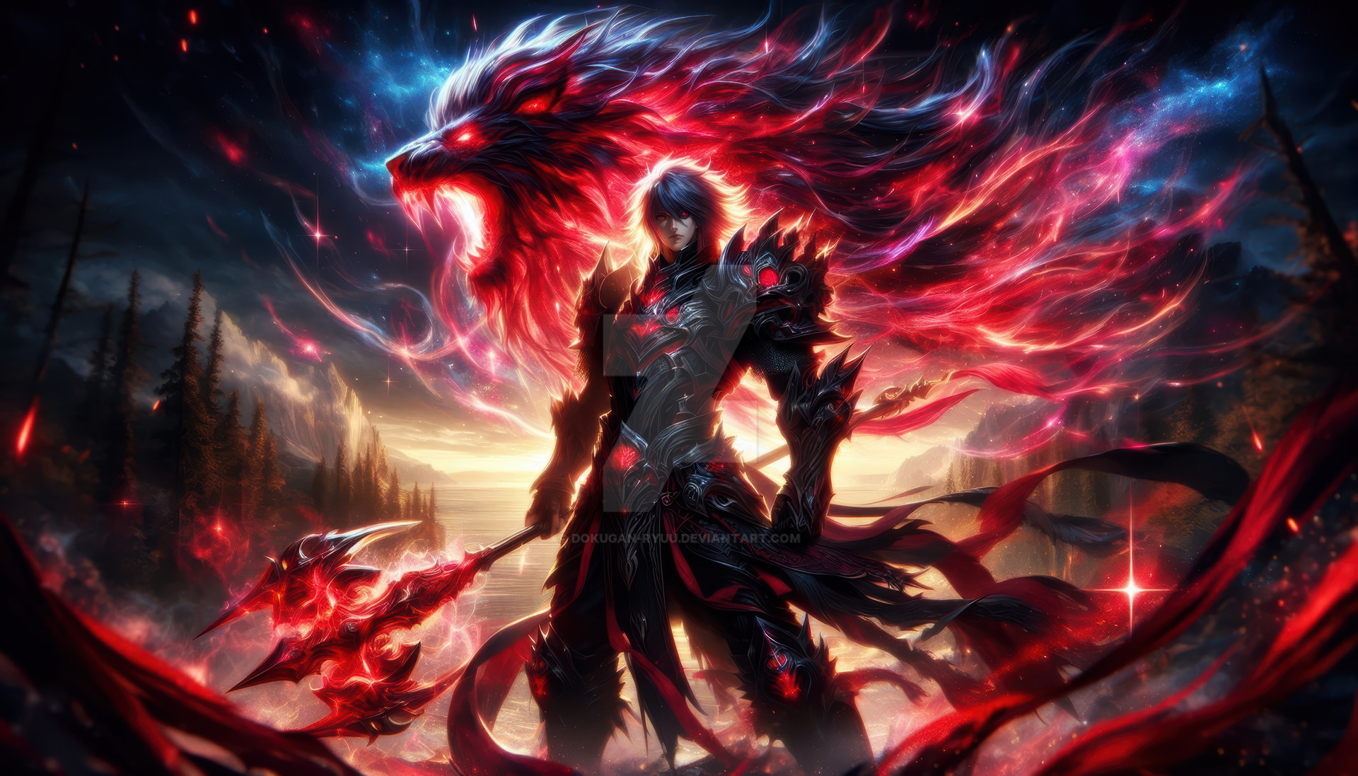
Nero from Devil may cry 4 and the winner of my latest Fanart poll.
When I originally saw Nero in magazines previews before the game was released I wasn't really to hot on the idea, I guess I was afraid he was gonna steal the show from Dante. However once I was able to play it and see how different Nero really was in both attitude and play style the character really grew on me. He seems like more of a authentic hero character than Dante, not to say Dante isn't still awesome or anything, but different.
 (Smile)") .
.I didn't really have any specific idea in mind when drawing this, just sat down, put pencil to paper and this is what I got. Then did all my color work in Photoshop of course
") .
.Hope you like it
.If you want to help me decide which game/comic/anime I do a fanart of next, drop by my main page and vote in my DNFF poll
.-DN
Related content


Comments: 140


Mother(Bleep)in EPIC!!!! Nice job with this, how'd ya do it?
👍: 0 ⏩: 1

Lucky for you I have it all documented
👍: 0 ⏩: 1
Thanks man. I appreciate it.
👍: 0 ⏩: 0

*__* WOW
This is awesome. Great detail and I love the expression
👍: 0 ⏩: 1


Holy crap, this is awesome! I love the style & the colouring really sticks out!
👍: 0 ⏩: 0

Nero was a pretty hard shock in comparison to Dante I remember when playing him. More of a straight man to Dante's over the top I-surf-on-rockets behavior.
Anyone besides me think that he's really Virgil?
👍: 0 ⏩: 1
No way, vergil is way cooler than nero. hehe
👍: 0 ⏩: 0


very badass looks brilliant all the glowing and detail gives it a really good effect.
👍: 0 ⏩: 0

Hmm... I really love the lights gere
I was also afraid that Nero will be more important than Dante... Fortunatelly, they share their fame fairly.
👍: 0 ⏩: 0


I've always wondered if nero would do double damage if he swinged his sword with his Devilbringer.
👍: 0 ⏩: 0

Damn! Nero looks buff as hell in this pic!
👍: 0 ⏩: 0

Terrific work as usual -- fav'd both the original and the tutorial. But I was wondering about one other tool: the scanner. Did you scan in the pencil work using just 8.5x11 images (stitched) or did you get a slightly bigger scanner which can handle 11x17?
👍: 0 ⏩: 1
All the work I do I use an 8.5 x 14 scanner and stitch together in photoshop. Not the best way I know, but I work with what I got  (Wink)")
👍: 0 ⏩: 1


awesome! i liked how you colored it. very good
👍: 0 ⏩: 0

this is a nice one of nero i like it
👍: 0 ⏩: 0


Very nice job here. Good to see that you didn´t write him as another Dante wannabe as so many others have. Nice details on everything such as his Devil brigner,Blue rose and so on.
Man does he ever looks pissed. The pose he´s in as me thinking of a young Anakin Skywalker aka Darth Vader. Wil his fate be the same as the young one?
Yeah nice start on Devil May Cry artwork. And sadly it´s the only attention it´s getting these days.
👍: 0 ⏩: 0


INCREDABLE! Nero looks slightly pissed wouldn't ya say?
👍: 0 ⏩: 0


the lighting is very nice, character looks spot on too
👍: 0 ⏩: 0

Glad I spotted this on the new deviations thing on the first page, stunning piece of work here, I love the use of textures on this, it looks especially nice on Nero's normal arm. I also love how clean the lineart looks, do you have the lineart uploaded anywhere cos I'd love to see it C:
👍: 0 ⏩: 0

This is so BADASS! Great drawing of Nero, just AWESOME! Check out my work to please.
👍: 0 ⏩: 0

wow! This is very good! I Adore the detail, the colours are great, and His pose is awesome!! This is wonderful!
👍: 0 ⏩: 0
<= Prev |