HOME | DD
 dinmoney — Captain Action Issue 4 - vote
Published: 2010-05-13 19:57:28 +0000 UTC; Views: 4596; Favourites: 19; Downloads: 235
Redirect to original
Description
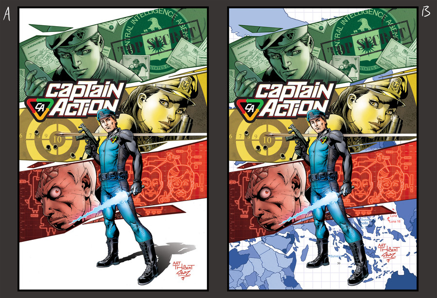
one version the studio likes and one the editors like....which one do you think looks best?
lines- Art Thibert (hack shack studios)
colours- Geoff Trebs (me!)
Captain Action © moonstone books 2010
Related content


Comments: 28

i feel B would take up more cover space for a comic, and A would make an awesome shirt
👍: 0 ⏩: 0


Lots of people here seem to be easily distracted 
")
")
👍: 0 ⏩: 0

A,
less comfusing
more clear/clean
Puts the focus on the right things.
👍: 0 ⏩: 0

Seems the only difference is the map background...
I vote for A. Much cleaner.
👍: 0 ⏩: 0


A reads better, but B catches my eye better. Assuming there was marketing stuff in the bottom left corner of A, it would be perfect, but right now it's too empty. I'd still go with A though.
👍: 0 ⏩: 0

although it looks a little unfinished i think i say "A". which i am sure is the studio pick as well (am i right?). At first glance "B" looks a little odd, it took me minute to realize it was a map.... it is late though.. so...
👍: 0 ⏩: 0

I like B so much better, much less negative space and it flows better
👍: 0 ⏩: 0


Yeah the one on the left is much gooder my friend lol. The foreground really jumps out, which is what I like about it.
👍: 0 ⏩: 0


 (Smile)")


I like A because having the white backing makes it classy and less distracting.
👍: 0 ⏩: 0

I prefer A due to it being cleaner and free of clutter. B is still great but it almost feels too busy.
👍: 0 ⏩: 0

I think a mixture of both would be nice. Just take the right ones map background and bring down the opacity and then place it with the left side and the cast shadow from the standing man.
Maybe a nice overlay effect on that blue map too would help blend in with the guys shadow.
👍: 0 ⏩: 1

Yeah, I agree here. Perhaps only a 10-20% opacity would work.
👍: 0 ⏩: 0

I agree with , it could benefit from some type of background, but the 2nd one just has too much going on that the character just gets lost in it all.
Plus white is a lot cheaper to print then color
")
👍: 0 ⏩: 0

Any chance for a third background? Something less distracting. But not white. Some texture or something... Hmmm?
👍: 0 ⏩: 0

yeah, the one at left is better;
too much b/g in B, it's surprising how detracting just that little extra can be ~
👍: 0 ⏩: 0

I like A better, because the background does not distract so much.
👍: 0 ⏩: 0