HOME | DD
 disguy2k — TRANSPORT
Published: 2004-06-21 14:16:44 +0000 UTC; Views: 814; Favourites: 14; Downloads: 301
Redirect to original
Description
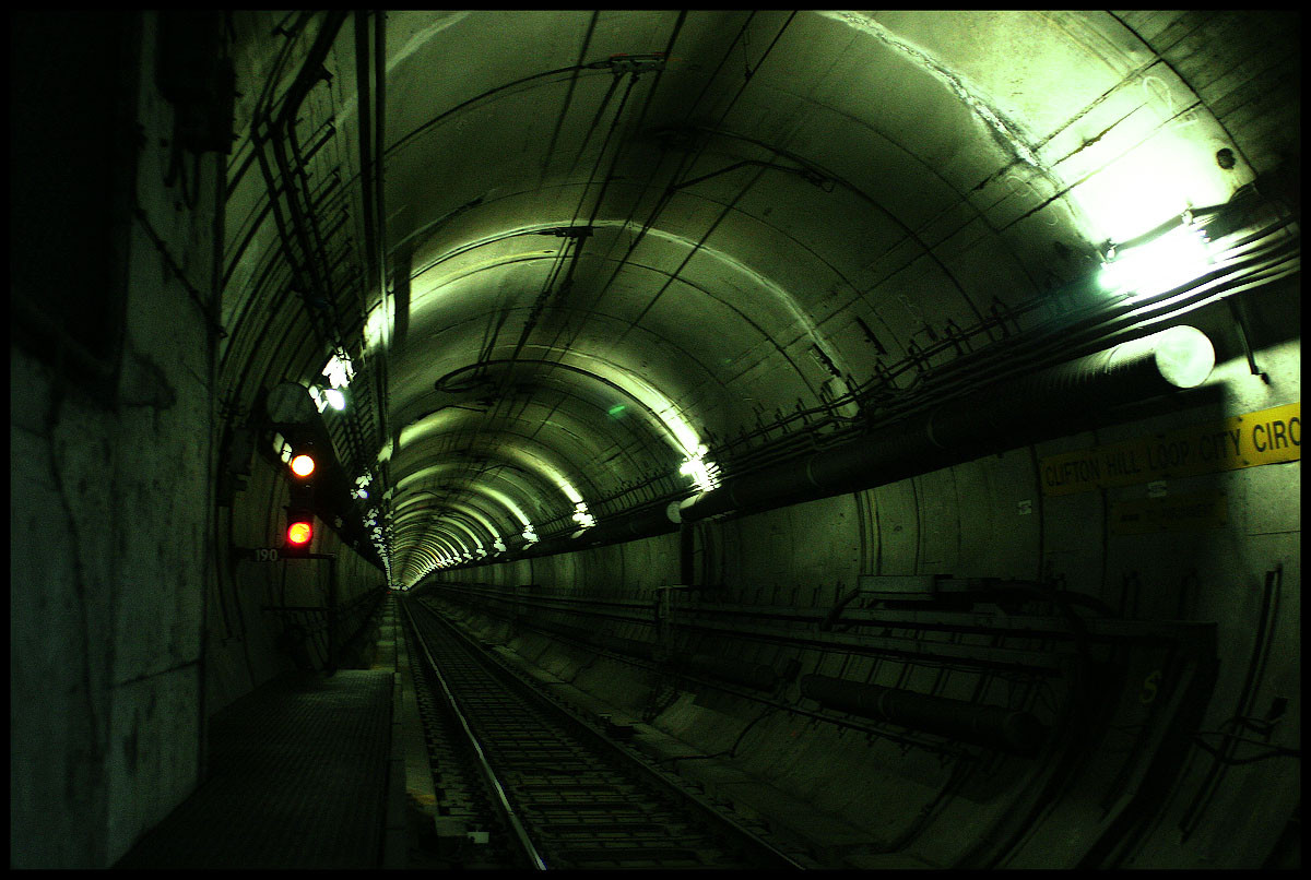
Transport Public Bar at F²Related content


Comments: 21


federation square. i love the cam settings. the lights come out nicely. not too bright. the framing is a little off, though. i think if you took it from a little bit of a higher vantage point, you would've got a better framing. as it is now, it kind of runs away from the parallel of the sides, if you get what i mean.
👍: 0 ⏩: 0

You live in a great city, i think that i would make 1000 photos at night there
👍: 0 ⏩: 0

nice fucking shot man!!!
There is something about taking photographs at night that is crazy....it's like drugs almost...go out with some music in the headphones...joints....your light meter....crazy time!
👍: 0 ⏩: 0


what a F'n awsome lookin building!! Great clarity and awwwwwsome colors!
👍: 0 ⏩: 0

Love the intensity and clarity of the colours and edges in this one; beautiful.
👍: 0 ⏩: 0

Very good. Once again the colors are very awesome. I love the lights!

👍: 0 ⏩: 0

another super clean, super cool nightshot. Your colors are amazing!
and how on earth did you get a font to match the font on the building? is it a trick?
👍: 0 ⏩: 1

I made the writing by hand, with 25 dots for each letter in a 5 x 5 group... then deleted the dots that weren't needed to make each letter... it didn't take too long, and thought it would help the presentation a bit
👍: 0 ⏩: 1
wow -- i applaud you. what great idea...
the work payed off because it looks amazing!!!!
👍: 0 ⏩: 0

greatly titled picture since the light splits the two color themes into two as the translater for each. one side is blue and the other green, each in its own style.
👍: 0 ⏩: 0

brilliant nightshot, perfect settings
looks like something out of bladerunner

👍: 0 ⏩: 0

Very nice. I love how the bright, glowing sign sits smack in the center of the image and all of the darker imagery revovles around it.
Jay
👍: 0 ⏩: 0


Looks a lot like a shot a mate of mine took of that place, but yours is a lot clearer, Ill put that down to skill or a better camera.
Nice shot
👍: 0 ⏩: 0

wah! your title kicks asssssssssssssssss! love the dots ")

they don't look weird at all! wow.
I actually do like how the T yellow sign has been blown out like that, looks cool  (Smile)")
awesome archi as always love it!!!
👍: 0 ⏩: 0
