HOME | DD
 Disoriented — Bacterium

Published: 2004-09-06 08:13:46 +0000 UTC; Views: 395; Favourites: 0; Downloads: 164
Redirect to original
Description
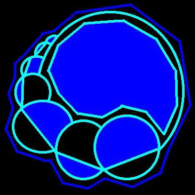
Im getting better at using curved lines I think") I used thin lines for the 1st time too... adds a nice effect.
I used thin lines for the 1st time too... adds a nice effect.There are 2 details that are hard to see in the preview pic...
Hope you all enjoy it!
Comments and
 s are very appreciated!!
Related content


Comments: 11

Yes, the colors you've used here are very well incorporated. This just looks fantastic. Good job.
👍: 0 ⏩: 1

I like the colors and variation in this one. Very nice and well put together.
👍: 0 ⏩: 0

Looks like something that belongs on the cover of a science textbook.

👍: 0 ⏩: 1

haha, I think your right
👍: 0 ⏩: 1
Like, a high school biology book or something. Lol. You should try selling that to a textbook company!
👍: 0 ⏩: 0

nice, i like the gradient and how its over and behind layers
👍: 0 ⏩: 0

hm, still kinda cool and v. accoumplished but not my favourite of all of your work.
👍: 0 ⏩: 0

Hey right on man, this is really cool, the layout is great and the colors you used are really cool.

👍: 0 ⏩: 0

 (Wink)")