HOME | DD
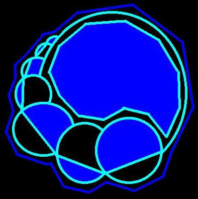
 Disoriented — Meltdown v2

Published: 2004-09-01 09:14:32 +0000 UTC; Views: 225; Favourites: 3; Downloads: 32
Redirect to original
Description
A remake of meltdown with added gradiants, textures, and color variation... Please tell me which one you like better") I'll move the other into my scraps.
I'll move the other into my scraps.Comments and Fav's are very appreciated!!
Related content


Comments: 15


AAAARRG! Right when I was writing this dA went into some matinence read only mode!
Good improvements, the texture adds a more finalized look and gives it more realism. It does matter what kind of look your going for, but I definatly like this one more. Keep up the good work!
That symbol reminds me of something but I can't think what... feels like deja vu.
👍: 0 ⏩: 1

haha... they go into matineance way to much. Oh well, as long as it still works its fine... thx very much for the comments!
👍: 0 ⏩: 0

I keep looking at this...and expect it to start spinning. Oddly hypnotic. I really enjoy this, well done.
 (Smile)")
👍: 0 ⏩: 0

really cool use of shapes here. circles and lines. so contradictory, yet look so cool together. nice work.
👍: 0 ⏩: 0

cant compare it with the other 'metldown' but this one is inspired. v. v. nice work
👍: 0 ⏩: 0

like how the circular and the bold lines drawn you into the center. well done
👍: 0 ⏩: 0

Kinky, i like the implications; plus circles are always good
👍: 0 ⏩: 0

Liked this one most! I think it's because of the colors, great work
👍: 0 ⏩: 1
Thx very much for takin the time to comment!
👍: 0 ⏩: 1