HOME | DD
 DisturbedEntity — Manip Practice
Published: 2004-04-02 23:42:58 +0000 UTC; Views: 580; Favourites: 9; Downloads: 105
Redirect to original
Description
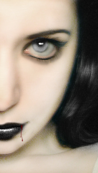
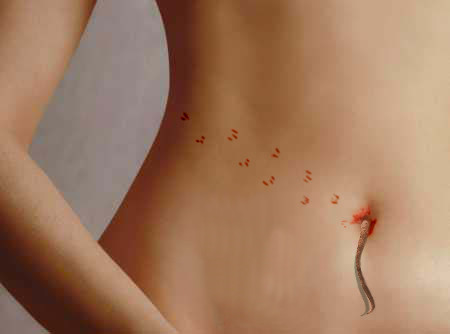
I'm trying to get better at photo manipulation, so here's one of my practice attempts. I'm quite happy with the general look of it, especially when you compare with the original. I'm not happy with the blood on her lip, and the graininess of the photo, but I guess that one is out of my control.*Ignore the blood. I've lost the PSD so I can't fix it*
Stock used: [link] from ~ liquid-venus-stock
Related content


Comments: 43


To avoid looking foolish I'm just gonna say this is really good ")
👍: 0 ⏩: 0

wow, looks really great (love the colour of the blood)... should do some more manips since you're quiet good at it (as well as your other work).
👍: 0 ⏩: 0

Very seductive. Love the understated aspect of it.
Tom
👍: 0 ⏩: 0

Nice work on the eye!
******************
My gallery -> * My stock ->
My blog -> [link]
*Member of: [link]
~ Venus lies star-struck in her wound
And the sensual ruins make
Seasons over the liquid world,
White springs in the Dark.~
(D.Thomas)
👍: 0 ⏩: 1


Thank you
👍: 0 ⏩: 0


👍: 0 ⏩: 1
Thank you so much!

👍: 0 ⏩: 0

did you ever get around to trying my tut?
looks great
👍: 0 ⏩: 1
Your tut describes basically the same techniques I use myself anyway ")
Thanks for the comment.
👍: 0 ⏩: 1
as long as it was actually helpful i'm glad
i wasn't sure of my wording...i think if someone else wrote it i would get confused
")
👍: 0 ⏩: 1
Wording was fine, understood every word  (Smile)")
Another useful thing in the tut was the eye brightening. I tried it on this but f'ed it up
👍: 0 ⏩: 1
heh...i think there's eye brushes you can download that's like...a thick ring you can adjust to any eye...
but i never found it...i've seen and heard people use it though
i'm surprised so many people told me they never used the level and desaturation tools before...dark manipulation is basically overall desaturation and increase of contrast...so what have they been doing? doing it manually? it takes forever...i went through that on my earlier works


👍: 0 ⏩: 1
I've always used desaturation and contrast. It's just the levels, I never quite understood them
👍: 0 ⏩: 1
if you're lazy...try autoadjust...that averages out all your layers to the same contrast...
👍: 0 ⏩: 1
I try not to be lazy. If you're gonna do something, try and do it properly. I spend ages agonizing over whether stuff looks ok
👍: 0 ⏩: 1
of course you have to perfect it afterwards...
but using autoadjust will set contrast to the same when you're working with it...afterwards, export your completed image as a bitmap or high resolution JPG and adjust the contrast manually on that picture.
👍: 0 ⏩: 1
Dude, that is a gooood idea. Exporting as jpg etc... Thanks for the tip
👍: 0 ⏩: 0

I like it alot. I dont know if it's my comp but the eye lookes a bit blurred?
👍: 0 ⏩: 1
Unfortunately, that's not your comp ")
👍: 0 ⏩: 0

very nice ^.^ i like it.
i think the original was from liquid-venus-stock
👍: 0 ⏩: 1
Oooh, I think it was actually! Thank you, I'll check now.
👍: 0 ⏩: 1
No problem
👍: 0 ⏩: 0

i like this a lot, you are very good with manipulatons...i too think it might have looked better minus the blood, although the blood looks good, it doesnt quite work right here...but none-the-less an excellent work or art
👍: 0 ⏩: 1
Thank you for your comment, and I agree about the blood, as I've also said in previous comments. It was just an afterthought really. But I'll bear all these nice ocmments in mind in the future
👍: 0 ⏩: 0

The eyes don't stand out enough, you should try adding a little more colour to them. Also try using the doge tool on a lower setting, that will make the skin look more skin like.
Not bad
👍: 0 ⏩: 1
Thanks
👍: 0 ⏩: 0

It looks very good, albeit I'm not exactly sure what you manipulated on it, except for the blood.
The graininess in my opinion adds a little something to it, and sort of sets the darker mood. FLickering in photos like this is interesting, so I believe it fits.
Keep working at it!
👍: 0 ⏩: 1
It is a lot different form the original, unfortunately I have lost the link though, and it would be a big boo boo to post it again under my name. But in summary, skin a lot lighter, darkened lips, brightened eyes, darker eyebrows, a little eyeshadow, darker hair, blood on lip. That's basically what's different.
👍: 0 ⏩: 0

Very nice! 
👍: 0 ⏩: 1
Thank you so much!
I hope you enjoy my gallery.
👍: 0 ⏩: 0

its not bad at all. The blood looks a little bit fake though.
👍: 0 ⏩: 1
I agree about the blood. I had never even planned the blood, it was more of an afterthought really. Thank you for your comment.
👍: 0 ⏩: 2

i did the same thing on my piece "untitled." [link] its most annoying when an action that was thought up and carried out in a matter of seconds ends up bothering u ALOT afterwards.
👍: 0 ⏩: 0
I actually think the photo would look better, sans the blood. Because other than the blood it looks truly excelent.
👍: 0 ⏩: 1
To be honest, I completely agree. Although it would look a little islly now if I edited after everyone has commented on the blood
👍: 0 ⏩: 1
I know what you mean, I have some old photomanips in my gallery that suck some serious ass...I mean im ashamed of it, but I keep it there so I can know where I came from.
👍: 0 ⏩: 1
I've only been here about 3 months (maybe 2, actually) and I'm already ashamed of some of my stuff. I've learnt so much since coming here.
👍: 0 ⏩: 1
it takes time bud, give it time.
👍: 0 ⏩: 0

I would have liked the white parts (albumen?) a little brighter, but yeah, I'm quite happy with how they turned out
👍: 0 ⏩: 0