HOME | DD
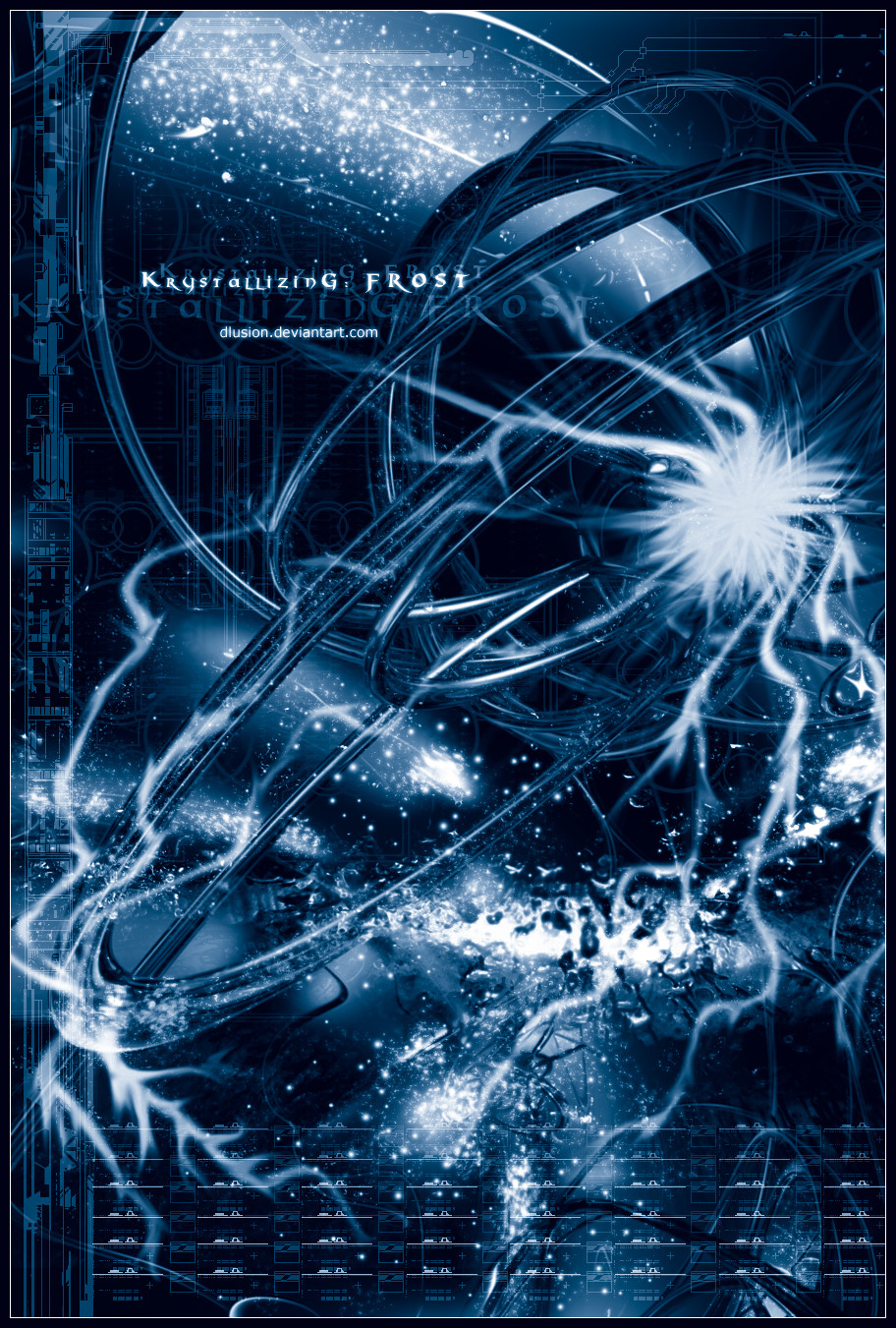
 dlusion — Krystallizing : F r o s t
Published: 2004-01-26 19:27:16 +0000 UTC; Views: 802; Favourites: 13; Downloads: 344
Redirect to original
Description
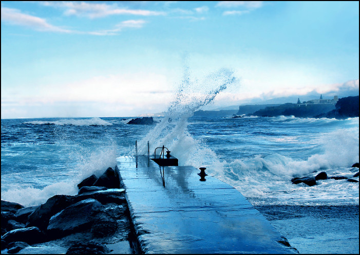
Started and finished yesterday, I want to keep teh descrip brief, I feel its my best work yet and w/ some new stuff I learned on my own with epxerimenting. My latest wallpaper that I submitted yesterday was using tutorials for some effects. Now w/ my knowledge from it I made my own. New particle effects I found out about, layer effects, oh and I also used aThanks to all who support me its greatly appreciated. Thanks to those who have been there w/ me watching me start from NOTHING except my mind. Enjoy everyone !
________________________/
I love this piece A LOT and took me this whole day. Hope you all enjoy, remeber to leave a comment and/or
 if you enjoyed it.
UPDATE** Found ice stock texture
 (Smile)") And they deserve credit. *resurgere
And they deserve credit. *resurgere Also, I might update this one day
Related content


Comments: 26

The detailing is mindblowing in this. Gives new meaning to the term eye candy. The font is killer.
👍: 0 ⏩: 0


The 2d work it's awesome. I like it.
Good journey in S.miguel, Azores.
I'm from Portugal btw, that's a great place.
👍: 0 ⏩: 0

nice nice ,now you guys see you don't need a lot of 3d shit in there this is fuckin 1337
👍: 0 ⏩: 0

-laughs- You've already gotten lots of comments on this... but I'll go ahead and add my own compliments.
Love the blue-- you chose gorgeous colors. The 2D work is amazing, and the render is great.
")
👍: 0 ⏩: 0

great piecce, respect. I'm n00b at 3D abstract and I was wondering, all those bright, wavy whiteish things, is brushed in after the render rite? What software did you use? What tutorial where you on about? o___O:; Very good piece ^^
👍: 0 ⏩: 1

Yup the white wavyness is post render stuff that you do on opt of it
Best of luck w/ the abstract scene and for tutorials just go through devart...click browse at the top ^^^ and sort it by
"tutorials"
then "photoshop" OR "bryce"
and then "favs" so you get the best ones. Search through Bryce for 3d and Photoshop for 2d and brushing tutorials
👍: 0 ⏩: 0

That is awsome. Nice typo man, and I love the blue.
👍: 0 ⏩: 0

Sorry for the double post, but my connection played a trick on me and at first it seemed as if my first post never made it.
👍: 0 ⏩: 1
Lol np dont worry sometimes da is glitchy like that ")
Thanks for teh

👍: 0 ⏩: 1
Hey without constructive critisism how could a designer ever evolve
👍: 0 ⏩: 0

nice work on this one man! really like how u combined all different kinds of styles.
keep on rockin
👍: 0 ⏩: 0
You sure have improved, I like it alot! Especially the white airbrushing parts are superb, and the main typing is great which is rare nowadays. Sadly the [link] typing looks out of place. Another detail that could be changed is the repetitive techy stuff at the bottom, but other then that its a cool image.
👍: 0 ⏩: 0
Not bad, not bad at all, in fact its pretty damn tight. I like the white airbrushed parts they look great. The only thing I would change is the techy stuff at the bottom that repeats itself, to much of it and the " dlusion.deviantart.com" text looks out of place. The other typing is however quite well done, which is rare on pictures. I think I have to
👍: 0 ⏩: 0


yeah its quite cool, some nice brushing and effects..
size is way too big tho (filewise) and could do with more colour, typo needs improving.
👍: 0 ⏩: 0

It is quite unique, feeling with the design type bg, with the render and tones, fantastic work my friend, really a fav

👍: 0 ⏩: 0

Fabulous.Tell me the secret.How did you made the star thingy in the middle? ")

👍: 0 ⏩: 1
Umm just a white blurred brush and the some work with the smudge tool in photoshop
👍: 0 ⏩: 0

Fantastic job. It looks amazing. Keep up the good work!
👍: 0 ⏩: 0


I WANT MOR ")
this is some great stuff (even i get tired of blue *lol*)
the lightining ( i know it isent but i just called it) effect is great...
you did get many amazing spots...
gonna

👍: 0 ⏩: 0

yo man this is 1337 shit guy, you went quite low on the 3d and mega overboard on the 2d and brushing which in my opinion is still pretty kick arse  (Cool)")
👍: 0 ⏩: 0

O_o cool realy, its just awesome, nice bg, cool colors, keep on!!!
👍: 0 ⏩: 0

dude... the 2d is fuckin awesome... and i love the font...
👍: 0 ⏩: 0

oooooh, I see what you mean by it only working in blue  (Wink)")

👍: 0 ⏩: 0