HOME | DD
 DocDan — Space Exercises 3

Published: 2007-05-02 20:35:41 +0000 UTC; Views: 1936; Favourites: 48; Downloads: 61
Redirect to original
Description
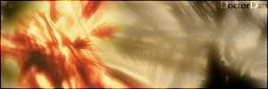
Here's some more practice! This is actually a bunch of practise work with planets and the Wacom over many weeks, all compiled into one mini-piece. Because it is from so many different practise sessions, I can't really give time/layer stats or anything. It did take several hours to put everything together, though. This time I naturally focused on learning to use the Wacom as well as developing some planet techniques. How do they look?Stocks (simply for texturing) credited to sxc.hu
Enjoy!
 (Smile)")
Related content


Comments: 22


Not bad at all ! I like how there are two completely different astro-phenomena on each side, each which demands attention. The rings on the top planet are very nice in that they have a strong variation in ring thickness, opacity and colour which is reminiscent of Saturn's rings. While the bottom at first looks like a nebula, but we see that part is in front of the planets which can also lead one to beleive that the gas is coming off the planet itself...perhaps it is a massive planet-sized comet?
The only thing that looks out of place is that asteroid belt. Perhaps it should either curve out more or have a starting point on the lower end of the ringed planet ( near the empty part )
But very nice overall, great detail !
👍: 0 ⏩: 1

Cool- I appreciate the constructive comment!
👍: 0 ⏩: 0


I do not understand how this kind of planet art in keep seeing is made, and i also think they all look awesome no matter what, sorry i cannot help you improve, but i still think it is awesome.
👍: 0 ⏩: 1
It just comes with time! Look through some tutorials to give you a start, then develop your own techniques and styles. Thanks much
-Dan
👍: 0 ⏩: 1
i dont have any of those programs, so i cant 8[
👍: 0 ⏩: 1
Go get the Gimp or Gimpshop for free!! It's essentially just as powerful as photoshop, and it's completely, legally free. Just google it.
-Dan
👍: 0 ⏩: 0

it looks great, i really like the ringed planet...if this were bigger, it would be an amazing piece!

👍: 0 ⏩: 1
Thanks
The 
-Dan
👍: 0 ⏩: 0

The starfield doesn't look finished and the bigger stars don't fit. The ring could also be improved a lot, but I must say, the nebula in the left corner with the planet looks just great!")
👍: 0 ⏩: 1
Yeah, the star field isn't finished. I think the monitor I made this on wither has greater contrast or is darker. There were actually relatively few stars visible how I saw it in Photoshop. On this monitor (most monitors, probably) it just looks silly, though. I think the bigger stars will seem to fit more once the star field is fixed (soon!).
Thanks much for the feedback- very much appreciated. I'm glad you like the nebula!!!
Be well!
-Dan
👍: 0 ⏩: 1
Yeah I have the same problems sometimes with my monitor. It happens to me all the time that I see the less stars but when I hit the 'ok' button, suddenly it looks ugly. Anyway, i'd love to see the fixed image (Wink)")
Anytime mate!
👍: 0 ⏩: 0

the starfield looks a bit weird and the bigger stars dont fit and hmm the planet rings also look a bit off =7 but I like the bottom left corner and its blue planets they look great
but the blue part is amazing
👍: 0 ⏩: 1
Thanks! Yep- some of the major problems will be fixed later today. The issue was that it simply did not look the same on the monitor that it was created on. I'll have to check my calibration. I think I agree about the ring- I'll have to tweak with it when I fix the stars later.
Thanks much!
-Dan
👍: 0 ⏩: 0

yea its overal good dude i love the nova and planet textures but yes the bg needs more work...i can see the dodge strokes lmao
👍: 0 ⏩: 1
Haha- the stars are pretty dumb looking here. I had no idea it looked like that on the screen it was created on. And, those aren't dodge strokes- but I do agree on this monitor they are very easy to see. It will all be fixed soon! I noticed a few more things too.
Thanks!!
-Dan
👍: 0 ⏩: 0