HOME | DD
 DocMelonhead — Sonic Emblem Custom
by-nc-sa
DocMelonhead — Sonic Emblem Custom
by-nc-sa

Published: 2010-11-18 02:23:57 +0000 UTC; Views: 1829; Favourites: 31; Downloads: 22
Redirect to original
Description
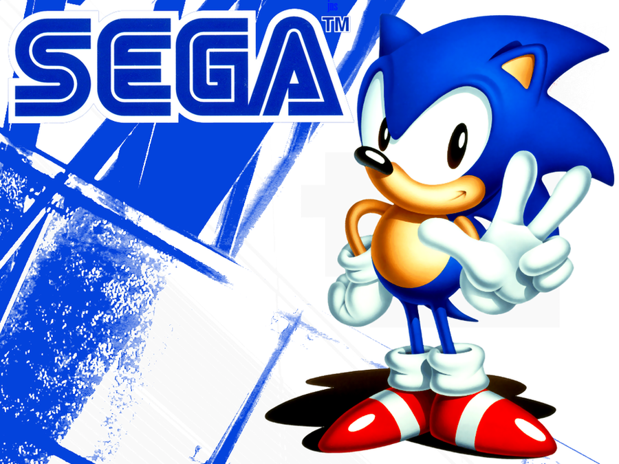
Just a custom model I made up. Dedicated to the first Sonic Game I played.Related content


Comments: 3

Overall

Vision
Originality
Technique

Impact
Listening to: Machinae Supremacy/JnG(2004) - Megascorcher
This time i managed to look at submission date first, so that i make sure it's not too late.
Originality
3d Sonic The Hedgehog logo, oyeah, what's could be more original? 3d Windows logo maybe? Though there is a bit, so it's not zero.
Vision
Sure, 3d-rendered pictures are always giving perfect gradient shading and shadowcasting, not to mention perfect perspective, but those are not enough to get the perfect vision.
Technique
For this kind of picture most important topic is a technique. First i'll mention good things: it's a pretty nice sonic logo meshes and decently looking materials, Sonic model is also pretty nice. Now let us discuss some cons.
First thing i noticed is broken shading on sonic's face. Especially for the case you could swap quad's split direction.
Another thing is, once again, low polygon count, though it's a lot higher than with those chao 4-year-old render. Yet the same advice for the case: either Smooth modifier or NURMS surfaces. Both giving extreme polygon count.
Another thing is texturing. I can see some kind of noise bump-map is applied all over Sonic's skin. But it's UV-mapping is skrewed up hardly on it's nails, and there some weird shadow casted onto logo. First of all, i'd suggest increase resolution for noise map, and second - apply it as actual bump-map, not just a texture.
Eyes shading is also pretty weird. Sure they supposed to reflect picture, but it seems that's this is not the case. And there's some kind of really weird line on the eye right on the middle of Sonic's face; no idea why it's there, thus no advices.
Some word about materials: sonic's glove is looks way too glossy and somehow even metallic, it supposed to be plain shaded and cloth textured. Bare skin areas - they're look bit too glossy.
Another thing is backlighting. It could give nice effects, but right here it's as strong as front light; backlights should be halved or even quartered - calibrated, in one word.
And the last thing is reflection-mapping. Polished metal areas are supposed to reflect environment, but they're apparently lack of it. Laying sphere/cube reflection map onto metal areas would help a lot. The brushed metal areas are supposed to look more metallic, thus i'd recommend lay a very small grained but strong noise bump-map onto it. Also make sure that gold light diffuse gradient goes in a way white -> light-yellow -> darken-orange -> dark-red -> black, this gradient path gives really nice gold look.
Impact
Well... hell yea, it's Sonic The Hedgehog classic logo! Awesome game, yeah, thus really nice impact is given, at least for me!
Overall
Pretty nice picture, with some cons but yet really decent one.
👍: 0 ⏩: 0

