HOME | DD
 DocRedfield — Farrell, Clay and Assoc.

Published: 2010-05-06 05:57:37 +0000 UTC; Views: 4635; Favourites: 50; Downloads: 0
Redirect to original
Description
Ok, I'll leave it up to you guys: does this suffice as-is, or do I really need to take the time to flesh out the colors on the characters..? I also originally had a sort of fog over the whole thing, but I like the solids here; the lace is more visable and the characters pop more.Anyway, lemme knowwhat you think and I'll decide from there, given how much time I have left before the Phoenix ComiCon this month.
Linework only: [link]
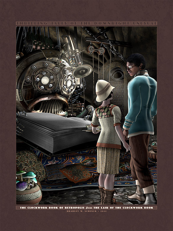
Characters: "Two-gun" William "Bill" Roberts. Carries a dream-catcher in his pocket for tracking and a watch, which tells time.
Elizabeth Farrell. Co-owner. Quad-barrel Deringer and supreme piloting skills.
Lord George Henry Clay. Co-owner. Double-barrel steam cannon, a sword in his cane (of course) and no small amount of mystery.
Gloria Embersmith. Mechanic with a giant wrench with which to bash you and some throwing knives to slow you down first.
Amlynn. Fairy for navigation and etheral co-habitation.
Bill was based on a pose by ~Cobweb-stock
ELizabeth was posed for and based on a costume by Joann Dimenstein, a pal o' mine.
George was based on this [link] by ~demoncherrystock
Gloria was an amagamation of several poses and costumes.
Amlynn is based on a pose [link] by *PirateQueen-Stock
Original Line work: each character created in micron pen on Strathmore. Combined, colored and textured in Adobe PS7
Related content


Comments: 16


Cool... I keep looking at it deciding if its 'done'
👍: 0 ⏩: 0

Your characters look amazing and don't need to be changed at all
👍: 0 ⏩: 1
Your Welcome!
just out of curiousity have you heard the steampunk song airship pirates by abney park?
👍: 0 ⏩: 1
...no! Where do I find it?
👍: 0 ⏩: 1
youtube any illegeal download site
my favourite steampunk band song
👍: 0 ⏩: 0

aw that's so cool! ")

👍: 0 ⏩: 1

OMG this is FREAKING FANTASTIC!!! Don't change a thing, its perfectly done. I love that deco feel it has, and just- wow- can't even- formulate - steampunk- awesomeness

👍: 0 ⏩: 1
hehehe... thanks very much!
👍: 0 ⏩: 0

The background looks awesome, it gives that western steam punk feel even before you get to the characters.
However, the characters, despite excellent costuming and color choices, look a little...flat.
👍: 0 ⏩: 1
Thanks... yeah, still trying to decide if that's what I was going for
👍: 0 ⏩: 0

I'd say the characters looks fine. I'd MAYBE spend some time looking at their placement on the page, they read as separate elements more-so then as a unified 'unit'. but if that's fine (or intended) with you, then that's fine with me. I'd also watch that font. It's not terribly legible at the top. Otherwise great work!
👍: 0 ⏩: 1
Remember when fonts were free...?
I need more fonts
 (Wink)")
👍: 0 ⏩: 0