HOME | DD
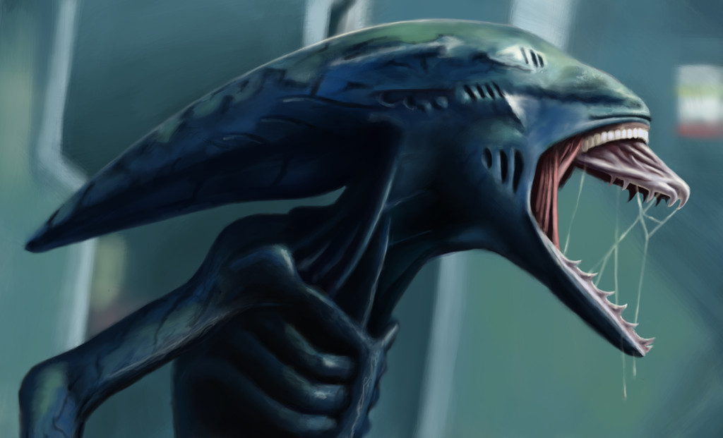
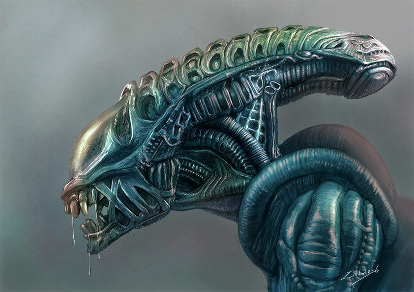
 doiron12 — Prometheus Deacon Repaint
Published: 2013-02-01 08:55:27 +0000 UTC; Views: 4163; Favourites: 40; Downloads: 115
Redirect to original
Description
I repainted this image because I wasn't all that happy with the first one I did. Hope everyone likes it. Comments and constructive criticism are greatly appreciated!Related content


Comments: 15


Very very nice, I like the smooth appearance to the overall image.
👍: 0 ⏩: 1

Thank you! I had alot of fun painting this!
👍: 0 ⏩: 0

I'm wishing the deacon...evolves between now and the 2nd film. Fantastic work!!!
👍: 0 ⏩: 1
Im pretty excited for the next film. Thanks for the comment!
👍: 0 ⏩: 0

Big roar for a sweet innocent baby!lol
👍: 0 ⏩: 0


Whoa, this is really good! I especially like the gill-like seems on the head!
👍: 0 ⏩: 1
mashime [2013-02-01 15:16:14 +0000 UTC]
Wow man... it's just soo much more defined and crisp. Those veins, on the arm, I mean...damn.
Definitely a more chiseled, slicker look to it, colors are much richer, the whitish glow has been toned down in favor of those richer colors yet still used to good effects at certain key places... really digging that ribcage even more now, u can just feel the roundness of the actual ribs, and u got awesome hues of blue going on in the head part.
I also think u did the right call with going with a much blurrier background, especially with an image like this where the character is the clear focus of the image, and u wanna have it pop out as much as possible.
I would still advocate going the more saturated route with the jaw because of the bluish theme u have going on, but that's more of a preference thing, "neither here nor there" as Matt would put it.
Awesome work !
👍: 0 ⏩: 1
Thanks a bunch for your feedback! I definately kicking those other blending options to the curb. Normal is really the way to go!
👍: 0 ⏩: 0