HOME | DD
 DolfD — Pulp Fiction Anime

Published: 2006-04-26 18:32:19 +0000 UTC; Views: 7455; Favourites: 25; Downloads: 58
Redirect to original
Description
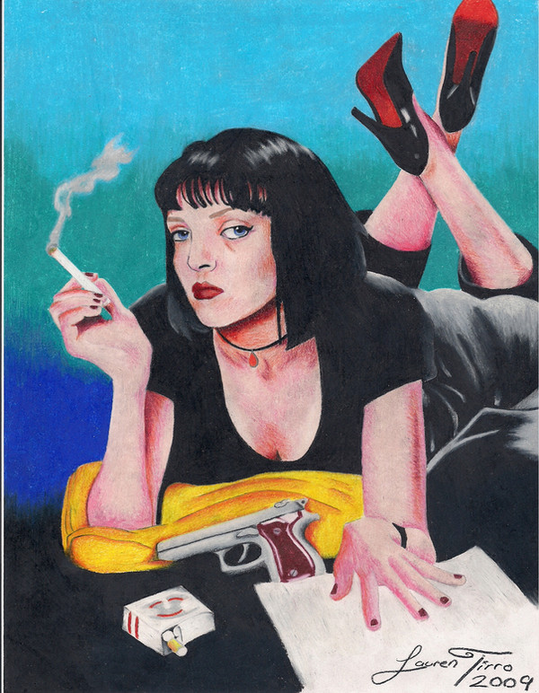
Comic version of the Pulp Fiction poster. Mixed media, marker, colored pencilRelated content


Comments: 135

I'm glad you like it, but I don't want you to loose sleep so I will change the discription. lol
👍: 0 ⏩: 1

Oh thank you, last night was so hard, tossing and turning and whatnot.
👍: 0 ⏩: 0

Nice, looks like a comic book cover, like if there was an official comic book of the fil. Very good.
👍: 0 ⏩: 1

Cool interpretation of the picture, I especially like the way you did the hand on the magazine. :up:
👍: 0 ⏩: 1
oh thank you very much. I'm glad you like it.
👍: 0 ⏩: 0

I love the fact that you shaded with cool colors, and chose not to stick just to black. Nice work here.
👍: 0 ⏩: 1

thank you very much. I really appreciate the

👍: 0 ⏩: 0


WOW thanks I'm glad you like it. Thanks for the
👍: 0 ⏩: 1


thank you for checking my stuff out
👍: 0 ⏩: 0

cool .... looks like is should be a cover for a comic book
👍: 0 ⏩: 1

Really great ")
👍: 0 ⏩: 1


lol dude I looove pulp fiction! this is really cool

👍: 0 ⏩: 1

very detailed and i like the way you did the hands. the nose looks a little strange but other than that this is pretty wicked!
👍: 0 ⏩: 1
thanks. yeah the nose is a little oversized  (Wink)")
👍: 0 ⏩: 0

this is really nice!! love the style, and the colors.
👍: 0 ⏩: 1


what a film!!!
and i love ur style!
gd work!
👍: 0 ⏩: 1

I think it looks awesome.
You captured it perfectly.
👍: 0 ⏩: 1
thank you. I'm glad you like it
👍: 0 ⏩: 0

I didn't like to movie but this very cool
👍: 0 ⏩: 0

This is really cool. I'm not a overly huge fan of the movie, but I'd watch the anime version
👍: 0 ⏩: 0


wow, nice! You really kept the athmosphere of Tarantino's movie (which is f****ing great by the way ^^), this "pop culture" feel through flashy colors.
I especially like the way you draw the hands and the eyes (god knows how hard it is to draw hands  (Smile)")
Maybe the nose looks a touch too large, and the chin is not round enough (in my humble opinion)
Great work anyway
👍: 0 ⏩: 1
that's a common critique. I agree. thanks for the comments
👍: 0 ⏩: 0

The nose is a little big. The outer edge of the nostril should line of with the inner edge of the eyeball. Also, her chin needs to be rounded off a little more.
👍: 0 ⏩: 1

thats really cool! it'd make an excellent alternative movie cover.
👍: 0 ⏩: 1

lol, class pic, and a class film ")
👍: 0 ⏩: 1
| Next =>