HOME | DD
 Dom- —
Logotype - SRForums
Dom- —
Logotype - SRForums
Published: 2008-03-08 22:19:32 +0000 UTC; Views: 25977; Favourites: 356; Downloads: 609
Redirect to original
Description
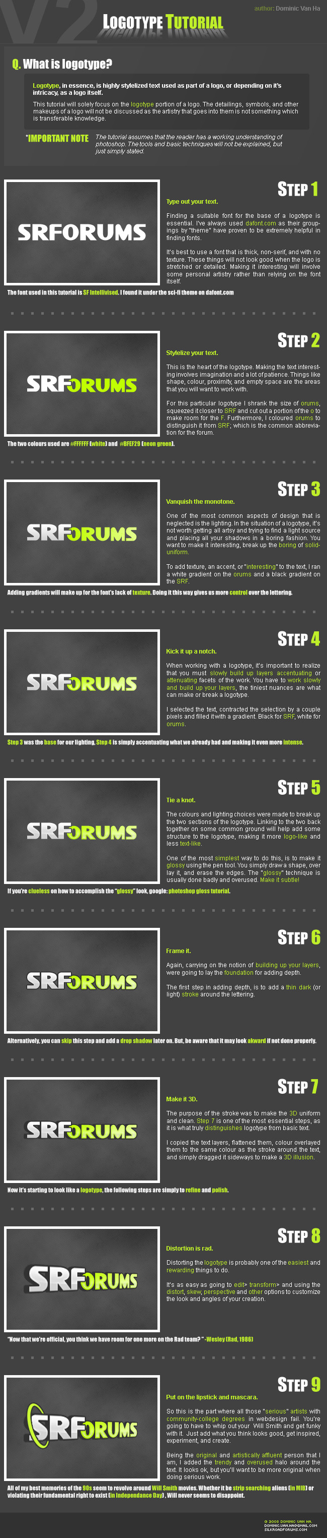
Simple tutorial, I made it for [link] ~ my first submitted tutorial.OMITTED STEP: TO FIX THE LOW QUALITY RESULT
As for some of the issues brought up: I realize the distortion results in a low quality logotype, I did not include the final step because of size constraints...but to fix it is simple: work at a much larger scale, when you finish up simply scale it down and it will get rid of the jaggies and make everything sharp again.
~~~~~~~~~~~~~~~~~~~~~~~
edit:
Wow I woke up this morning with my inbox filled, I clicked the piece and realized it got DD'ed - my very first ever!!!
Also, I made this for some friends @ silkroadforums.com, I didn't realize it would get so much attention, and i'm sorry for the jokes near the end.
Related content


Comments: 61

Na-na na na na-na na!
Na-na na na na-na!
Gettin' jiggy with it!
👍: 0 ⏩: 0

hm... Well, I consider that kind of work as web logo work. It is, right?
Anyway, I agree, vectors would have worked better but the bottom line is that you have come up with a nice methodology to build a logo and you shared it coherently and in a nice fresh way.
Congrats on the DD.
 (Smile)")
👍: 0 ⏩: 0

Very nice, ... what program did you use to make this typograhic work?
Mabe it would have been better if you made it with vectors ... 'cause you lost quite a bit of quality when distorting your logo.
👍: 0 ⏩: 0

very nice, the only thing wrong with distorting the text to do a perspective look like that, is the text becoming slightly pixilated before it's been rasterized (if that's what you're using at the time) at the part of the text that is supposed to look closer to you (in this image, the S, R and part of the F). Other than that, it's an awesome tutorial. just a suggestion, but try to work with shape layers as much as possible, to lessen the chances of getting pixels and gaining the freedom to scale the image
👍: 0 ⏩: 1

You're completely right, I should of added it into the tutorial:
When you make them you have to make them quite large, and scale it down to fit whatever you need. That way it smoothes everything out.
👍: 0 ⏩: 0


Bring out your Will Smith and GET JIGGY WITH IT
Just thought I should point that out
")
👍: 0 ⏩: 0


<= Prev |