HOME | DD
 Domain-of-the-Public — Revzo Tri-Bird!
Published: 2012-06-10 07:39:25 +0000 UTC; Views: 1176; Favourites: 11; Downloads: 17
Redirect to original
Description
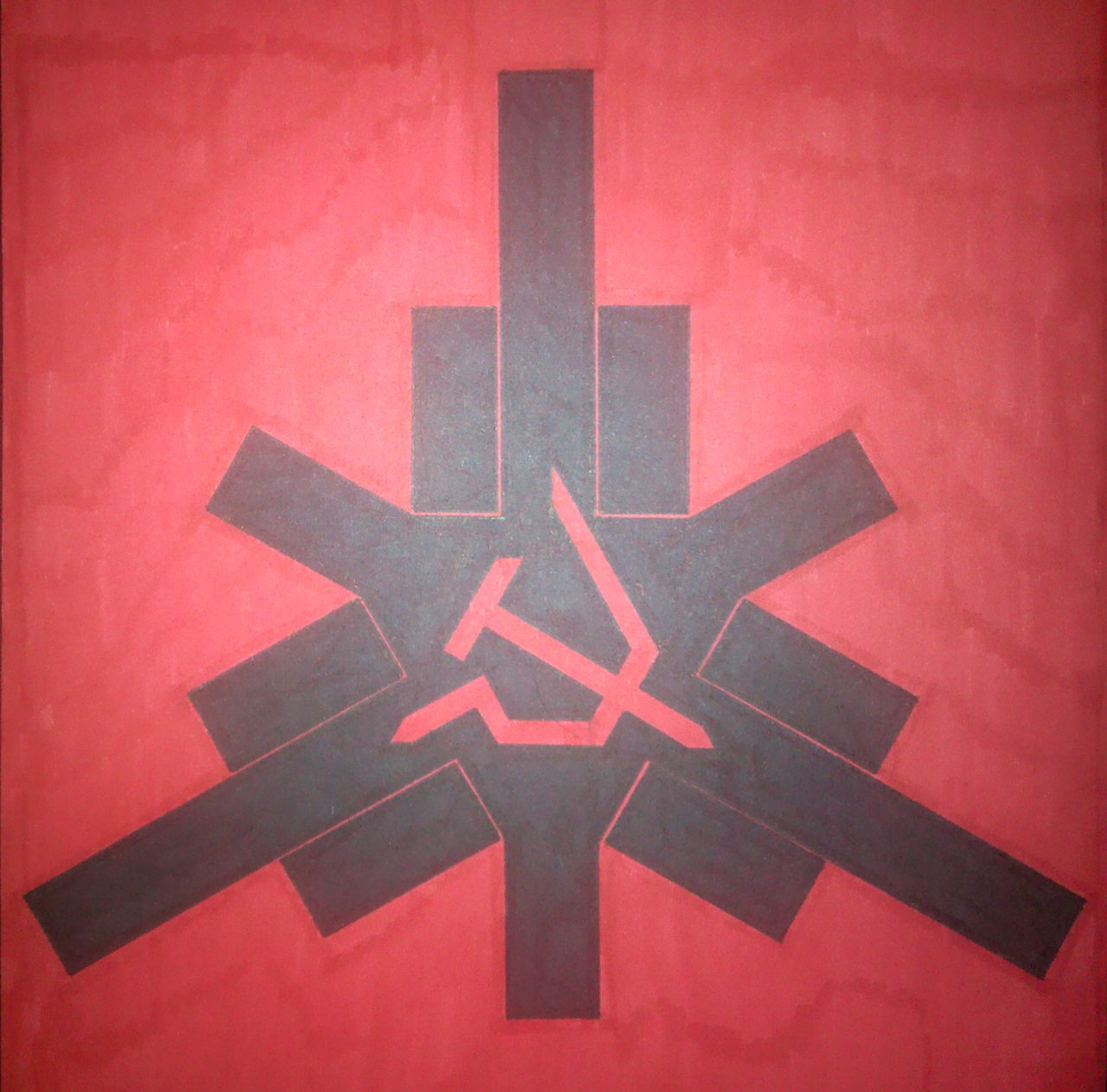
Lately I've been working on delving deeper into Hunter S. Thompson literature and such.One thing I found interesting was the 'Gonzo Fist', a fist with two thumbs and four fingers holding onto a peyote button.
So I decided, being the unoriginal bastard that I am, that I'd try something similar.
If you can't see it, let me explain this to you. There are three thumbs and 9 fingers in my version. No pinkies. Do you see it? If you do, you understand the other message behind the picture, as it is basically a juvenile triple "fuck you!".
It is in my non-trademark form of strict geometric shapes, which means I will soon easily make a digital version of this (this version was made for my wall).
Pressed for a name of the symbol, I've taken to calling it "Revzo", as a highly unoriginal combination of "Gonzo" and "Revolt".
What's great is the somewhat elegant sharp design makes it hard to notice that it started out entirely as an attempt to be three middle fingers. It instead looks like an hexagonal-esque hammer and sickle surrounded by a convoluted external structure meant only to exemplify the hexasickle further. Speaking of the sickle, it's actually within a star of david, with the three points touching ends while the inner sickle is formed on the intersecting lines of the two triangles.
Also, yes, I realize the sharp design as well as the red and black contrast give this a very dark, angry 'evil' look. And frankly, I don't care. Looks badass to me, wasn't made to impress.
Public Domain!
Related content


Comments: 5

this thing is awesome. Kind of reminds me of the Helghast symbol.
👍: 0 ⏩: 0

Id suggest switching the black to yellow, or perhaps make the black into red and the red into yellow. Black+red always smells of nazi imagery to many.
👍: 0 ⏩: 1

I prefer to avoid Soviet styled imagery now; red and yellow is far to cliche for a communist image. Those familiar with radical politics are well aware of the significance of red and black combinations among the anarchist communist sector of the ideology. That is what I aim to inspire.
The lack of white in this picture should be enough to differentiate, but the colours could also be reversed for a more black image as opposed to a mainly red standard.
I apologize but I do not plan to use yellow in any future deviations; I do not endorse the USSR and that colour combination strikes of that in a very boring way.
I'm also of this bias because of these colours being my absolute favourites, and this combination being a big personal preference.
I will not alter colours just to avoid a misunderstanding of something that should be obvious...
👍: 0 ⏩: 1
Thats fine, it's your art and you even had some pretty good reasons for your decision.
I'd not use red and yellow either to be honest, Most likely I'd do any political pictures in green and white because Im an environmentalist kind of guy.
👍: 0 ⏩: 1
I very much enjoy the use of colours for specific reasons as well, and have ysed greens and light blues as well as whutes to convey messages like peace and envirobmentalism,
 (Smile)")
👍: 0 ⏩: 0