HOME | DD
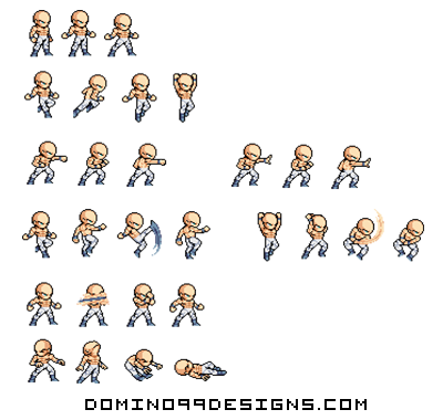
 domino99designs — DBZ Basic Base Sprite Sheet

Published: 2012-09-21 11:19:17 +0000 UTC; Views: 26071; Favourites: 105; Downloads: 0
Redirect to original
Description
To get a good version of the base go to:beyondhumanproject.com/
Related content
Comments: 11

There's no good quality version on the other end of that link.
👍: 0 ⏩: 0

Eh, not really that great to be honest. For starters, it looks like you tried to cram as much shading and detail into the torso as possible making the entire thing really squashed. The torso is also really small in comparison to the legs. An easy fix would be to either shorten the legs, or extend the length of the torso. The legs look really bad and the knee placement is off on most of the sprites. In fact, the entire emphasis for the legs seems to have went straight to the knees as if to let people know that that's where the knees are. The right leg (our left arm perspective) is a bit too thin, and should be widened at least a pixel to allow more detail, whereas the left leg (our right arm perspective) should be moved inward one pixel, but not the entire leg (just to where the knee on the leg is).
Overall, this sheet tries to have too much detail where it shouldn't. I recommend simplifying your shading on LSW sprites. They're small, and work better with less shading. I suggest observing Kojin's sprites, as his sprites are a good example of, "more is less" style shading. Also, this sheet doesn't really add anything new that isn't already on other, and quite honestly, better base sheets (i.e. Angryboy's or Luka's base sheets). I guess you weren't trying to go for anything to advanced, but I think that's partially why this sheet suffers so much. It would have been far better to make an LSW sprite sheet that consisted of entirely new sprites not seen on an LSW sprite sheet before, rather than seeing the same JUS-style edited sprites rehashed over and over.
👍: 0 ⏩: 1

Thanks man always appreciate your criticism but yea I have to admit i'm very rusty at spriting right now.
👍: 0 ⏩: 0

It's not bad dude, theres a few issues with the length of his arms on the punching poses and I'm not sure how the kick would look animated but it looks as though It's missing a frame. But as you said I'ts basic so i won't nitpick.
👍: 0 ⏩: 1

Thanks man for the feedback yea its missing a kick frame.
👍: 0 ⏩: 0


