HOME | DD
 doom-bees — How to get ahead, color WIP

Published: 2006-04-26 21:00:32 +0000 UTC; Views: 78; Favourites: 0; Downloads: 10
Redirect to original
Description
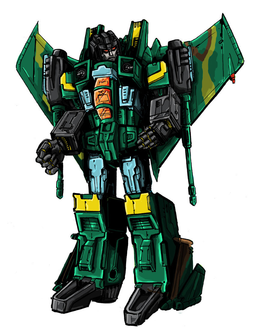
Going back to my original, messy style for this one. And yes, I am well aware of how cheesy those metallic shines look.But oy, I've started it like that, might as well finish.
Related content


Comments: 3

I, too, like the cheesy metallic shine, and the gradients, but they do seem to work better in some sections than others.
👍: 0 ⏩: 0

Already talked to you on 2k5 about the things I like. Desaturated purple and slate-ish blue for the win. The metallic glints and highlights really aren't bothering me, so much as the gradients. There are some areas that could benefit from slight blending. I do like the darker 'metal' for the face, yum. :>
👍: 0 ⏩: 0
