HOME | DD
 DoubleIIGemini — RoboSpaceBunny

#adoptable #black #bunny #digitalart #pink #robot #sketches #space #white
Published: 2016-12-08 23:19:27 +0000 UTC; Views: 90; Favourites: 3; Downloads: 1
Redirect to original
Description
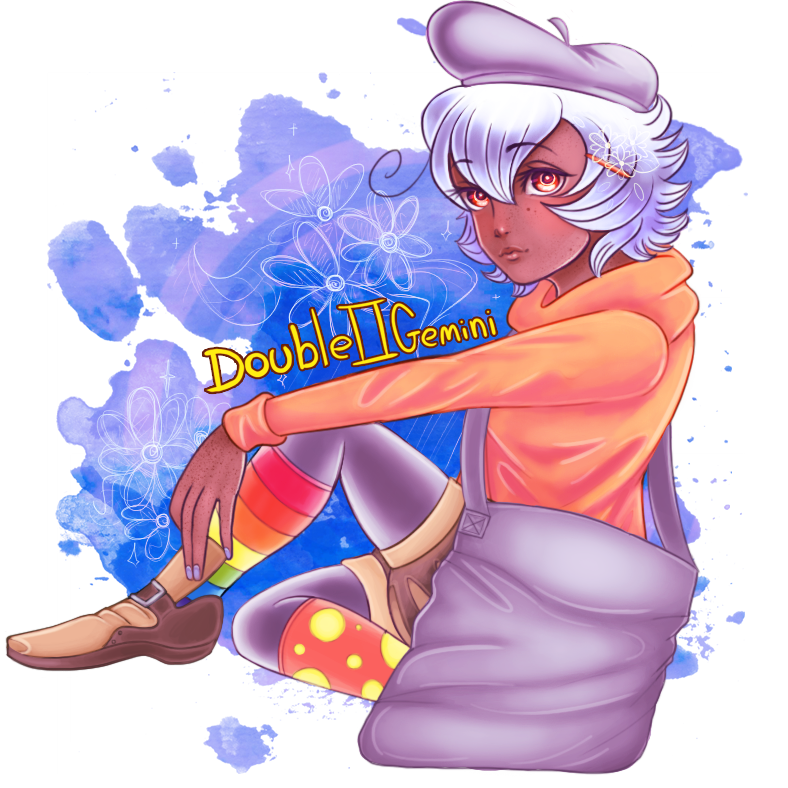
I ended up designing this character for the sake of entertainment, and in case you're curious to see how I came up with the design, I've added the original sketches on the left of the picture.\( ' v ' / )Originally, this character wasn't supposed to be evil, but rather, was supposed to be cutesy looking. Of course, that ended up changing drastically in the digitally drawn version as I ended up adding really heavy shading, and an evil look (As a quick note, without the shading, this character's colors would be pink and white). (; v ; )
Also, I'm not planning on using this character for anything in particular, so if anyone wants it, be sure to let me know in the comments! (^ v ^ )
Related content


Comments: 12

Love the design! Robot space bunny is a pretty good idea. Not sure how I feel about the rainbow lights on the arms and legs tho. It does look a bit more evil than cute, but still cute.
👍: 0 ⏩: 1

Thanks! Yeeah, the lights would've looked much better if I hadn't added all the shading. Since in the original with just the original pink and white colors, it actually worked really well surprisingly. (; v ; ) Ha ha ha, I suppose so! (^ v ^ )
👍: 0 ⏩: 1
I mean, to me, they're a bit too bright. If they weren't quite as bright, or if the body were a bit brighter, it'd be fine. But hey, what do I know. You're the artist. I still like it nonetheless.
👍: 0 ⏩: 1
Hmm, you might be right! I just did a slight adjustment to the lights in Photoshop, and now they look much better! Thanks for the input! (^ v ^ ) Honestly, I like hearing other peoples opinions about my art, it helps me know what to change, or add! \( ' v ' / )
👍: 0 ⏩: 1
Well, if you think it looks better, glad my input could help! At first, I was going to ignore it, but the longer I looked at it, the more it felt off to me, like it stick out a lot next to the darker colours.
👍: 0 ⏩: 1
Ha ha ha, well if you see anything else that is in need of fixing, feel free just to speak out! \(^ v ^ / ) Anyways yeah, it really did stick out, more so than it should've. (' v ' ) I'm just glad someone had caught that or else I would've presumed it to be fine. (; v ; )
👍: 0 ⏩: 1
I doubt I'll find much else, but if I do, I'll bring it up.
👍: 0 ⏩: 1
Okay! Thanks again! \(> v < )
👍: 0 ⏩: 1
