HOME | DD
 DouglasEltz — Fenixround

Published: 2009-12-27 04:30:54 +0000 UTC; Views: 15415; Favourites: 167; Downloads: 795
Redirect to original
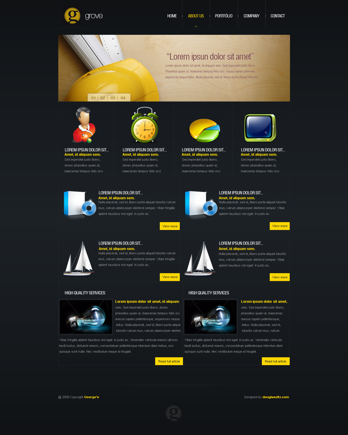
Description
...I would say thanks to ~Nomadi for help with ideas of names
 (Smile)")
Related content


Comments: 72

love the simple approach as well as the color choices. Very easy on the eyes.
👍: 0 ⏩: 0


The headings right above the Lorem filler are a little light for me.
Not a lot of contrast with the background, or anything else near it.
Maybe you were trying to push the eyes towards the slightly more contrasting text, which in essence, is the most important thing there, but nothing on the page should really be "difficult" to look at like they are.
otherwise, very nice. Very clean, and good use of white space for the welcome. The nav links could use a little more padding, though.
👍: 0 ⏩: 0

Very nice and very smooth.
What was the font you used for the "FenixRound" at the top?
👍: 0 ⏩: 1


Yep. Add me on msn douglas-eltz@hotmail.com
or mail me at douglas-eltz@hotmail.com
bye
👍: 0 ⏩: 0

Hello there!
Very inspiring and beautiful web-design I must admit!
I showcased it in my website here - 55 Trendy Web Design Interfaces From Deviantart.
Let me know if everything is okay, or maybe you don't like to be featured, just tell me and I will take it off. Let me know and thanks for your time!
👍: 0 ⏩: 1


What is the font you used in the header and welcome text?
Helvetica?
👍: 0 ⏩: 1
")
You don't have to say sorry. The layout is posted to receive feedbacks, So...
It's your time to tell me what is wrong in design
👍: 0 ⏩: 1

You are great webdesigner, but try to be creative in next projects. Cheers.
👍: 0 ⏩: 0


I really like the Navigation with the subtitles, but the subs could be a little darker.
The Footer-Navigation is a bit useless because height is only around 1000px.
Great work anyway dude.
👍: 0 ⏩: 1


 (Wink)")

i dont like the menu and the text under the menu i mean like u dont know what to place there and u place a giant text with effects i dont like it...too simple
👍: 0 ⏩: 1

very bright for me, but love the fonts, and structure
👍: 0 ⏩: 1

I really like the three info boxes and footer, very nicely done
The nav is a tad bright for my liking.. & the text is a bit hard to read.
Overall, a good design
👍: 0 ⏩: 1


")

Amazind imo, love it so much.You have a really unique style mate, so keep it up.
👍: 0 ⏩: 1


| Next =>