HOME | DD
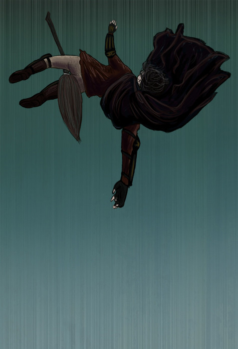
 DoujimaYurika — The Fall
Published: 2007-04-24 23:00:06 +0000 UTC; Views: 1320; Favourites: 44; Downloads: 21
Redirect to original
Description
Experimenting again.... Wanted to do something not so symmetrical and static, with implied movement. Also, screwing around with perspective, so I'm aware that it may look like an awkward position.Did I succeed in my experiment? No idea. But I thought I'd share.
 (Smile)")
Related content


Comments: 28


Looks very nice perspective-it really looks like he is in free-fall.
👍: 0 ⏩: 0

I like this one a lot. Great coloring and abstract-ness. xD And awesome perspective and foreshortening. Bravo!
👍: 0 ⏩: 1

Thank you so much! 
👍: 0 ⏩: 0


the perspective isn't perfect, but it's good you are experimenting! there are some people (cough, me) who are too afraid of screwing up that they don't even try, lest they get bad comments. they stick to the safe side, to what they know, which, although is guaranteed to look good, won't help with improving at all. you're a good example for us
👍: 0 ⏩: 1

👍: 0 ⏩: 0

I admire your bravery to try something this complicated. o_O Indeed the perspective is a tad bit off (his right arm is too long and the broom randomly bends), but I really like the colors and mood you inspired with this. How, may I ask, did you do all those lines in the background? That really helps the sense of falling - I like it.
👍: 0 ⏩: 1
Yeah, the perspective is off, I've noticed. I think the colors work pretty well together. As for the lines in the background, I made a separate background layer behind Harry and used the Noise filter in Photoshop, and then I used the Motion Blur filter to make it look like vertical lines. I didn't have to draw a single straight line!
👍: 0 ⏩: 1
Oh, you are clever. 
👍: 0 ⏩: 0

Oh, that is very good! The vertical lines make it look much more like he's falling no floating.
Great job!
👍: 0 ⏩: 0

It's really beautiful....it totally captures the feeling of when Haqrry falls. It almost makes me nervous for him.
👍: 0 ⏩: 0


Very very cool.I love how you depicted the movement of the fall in the background.The coloring and the shades is superb")
👍: 0 ⏩: 1
Yeah, that whole right arm is off, but I'm glad nothing else was glaringly out of proportion. I like the background too. I did a version with a snitch flying by, but I'm not sure if I like if more than this version or not.
Thanks for the kind comment and honest crit!
👍: 0 ⏩: 1
no problem at all
👍: 0 ⏩: 0


I like the coloring and the way it looks like it's falling.
👍: 0 ⏩: 1
Thanks! It's nice to try something a little different.
👍: 0 ⏩: 0

Nice. It's very stark and dramatic, which I like, a lot.
👍: 0 ⏩: 1
👍: 0 ⏩: 0

perspective really is hard to do. i like the concept of this one.
👍: 0 ⏩: 1

OMG you just gave me this fantastic idea for original art. THANKS. WELL DONE.
👍: 0 ⏩: 1
Yay for inspiration bunnies!
👍: 0 ⏩: 1