HOME | DD
 doze-ifk — ERIZO-dock

Published: 2006-05-02 05:35:47 +0000 UTC; Views: 3078; Favourites: 45; Downloads: 111
Redirect to original
Description
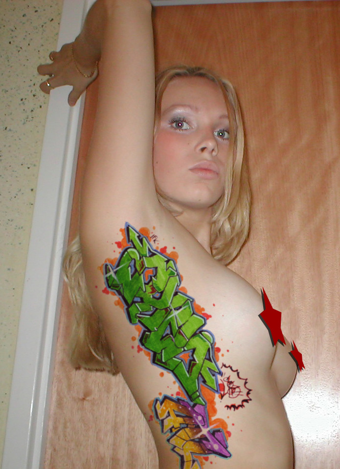
erizo made some ill shit on a dock... i was bored and started doodling on wood with some paint markers i have.. it ended up looking nice..leave comments.. peace..!!
Related content


Comments: 43

this is sic dude.
i wish i was this goood with anything other than a pencil
lol i wish i was this good
XD
great job homie
👍: 0 ⏩: 1

haha.. thanks man..
i wish i was as good at photography as you..
but i guess its just practice with everything.. and a good camera.. haha.
👍: 0 ⏩: 1
i wish i could draw graff like that
👍: 0 ⏩: 1
not too long.. bout two years or so.. but its not that hard.. do you draw at all..?
👍: 0 ⏩: 1
yea i do
ive been doin it for like 1 year
but the thing is i have to copy everyone elses style
i cant visualize it in my head
👍: 0 ⏩: 1
i know what your saying.. but choose one style.. and develope your own letters from there.. like me..i like the oldschool look.. so i make my own letters for diffrent words.. and whatnot..
your always getting influence from other artist.. but you have to make it your own..
👍: 0 ⏩: 1
see the thing is i cant seem to make it my own style
i cant visualize it my own
👍: 0 ⏩: 1
dont know what to say.. im lookin like the little guy in your avatar..
👍: 0 ⏩: 1
haha i know thaas me all the time
👍: 0 ⏩: 0


")

Thats real nice man. Those are some sick letters, good shit.
👍: 0 ⏩: 0

great! i like the lettering... i like the idea... i like all!!

👍: 0 ⏩: 1


Choice lil sketch you got going here. I like that you left the fill open showing the wood grain. Very tasteful.
Keep it up fella, take ease.
👍: 0 ⏩: 1
thanks a lot.. and i like your gallery very much.. keep em comming..
oh and thanks for the fav..
👍: 0 ⏩: 1
No worries. Credit given, where credit's due.
👍: 0 ⏩: 0

that is seriousy pretty awesome, good colors and good background with the deck
👍: 0 ⏩: 0

letter style and tech-aspect reminds me a lot of the stuff KLOR from the 123klan does. nice job on cleanliness though.
👍: 0 ⏩: 0


Es muy bueno encontrar talento mexicano por aqui, esta magnifico los contrastes son perfectos, felicidades erizo
👍: 0 ⏩: 0


 (Smile)")

wow, that is very cool, very nice. A favourite for sure!
👍: 0 ⏩: 0
thanks.. i want to paint this already!! damn..!!
👍: 0 ⏩: 1

it would look bad ass in some bright ass colors..
👍: 0 ⏩: 0

thanks ... its on wood.. i think it looks good..
👍: 0 ⏩: 1

yeh me 2. I meant the color wood  (Wink)")
👍: 0 ⏩: 0

i love it, the light blue really just does it for me, ive never seen any grafitii that small and detailed, its usualy a throwie, which i hate because throwies are lame shit, keep it man, this rocks
👍: 0 ⏩: 0

thank you all... and the \i/ is somekind of heart.. something a little oldschool.. " i tried.." haha
👍: 0 ⏩: 0

i love it y0...thats real sick
im new to the whole graffiti scene..but i plan on starting to do my own stuff..(ill be sure to take picS)
i love this style, its AWESOME
anyone got any tips for me?
👍: 0 ⏩: 0

Nice nice.... but why I is like \I/ <-- somekind of flower ?
👍: 0 ⏩: 0


