HOME | DD
 DR4WNOUT — HTTYD - Toothless Color Tests

Published: 2012-10-18 16:39:06 +0000 UTC; Views: 946; Favourites: 1; Downloads: 0
Redirect to original
Description
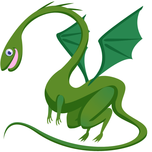
So once again, for my Visual Development class, I'm redesigning the book version of How To Train Your Dragon, and so these are my redesigns of Toothless. This isn't my final design, but more-so for color exploration, and that being said, which one do you think works best? The book describes Toothless as being a "Common Green or Brown" so either color scheme works. Also, he DOES have one tooth at the beginning of the book, but it gets knocked out.Related content


Comments: 5


Personally I am a fan of the bottom left one. THe right ones seem a bit too dark.
Also, I think the brownish color makes his eyes clearer.
👍: 0 ⏩: 1

Well the book describes him as Green, of a Common Green Or Brown Variety, so I might keep him green
👍: 0 ⏩: 1