HOME | DD
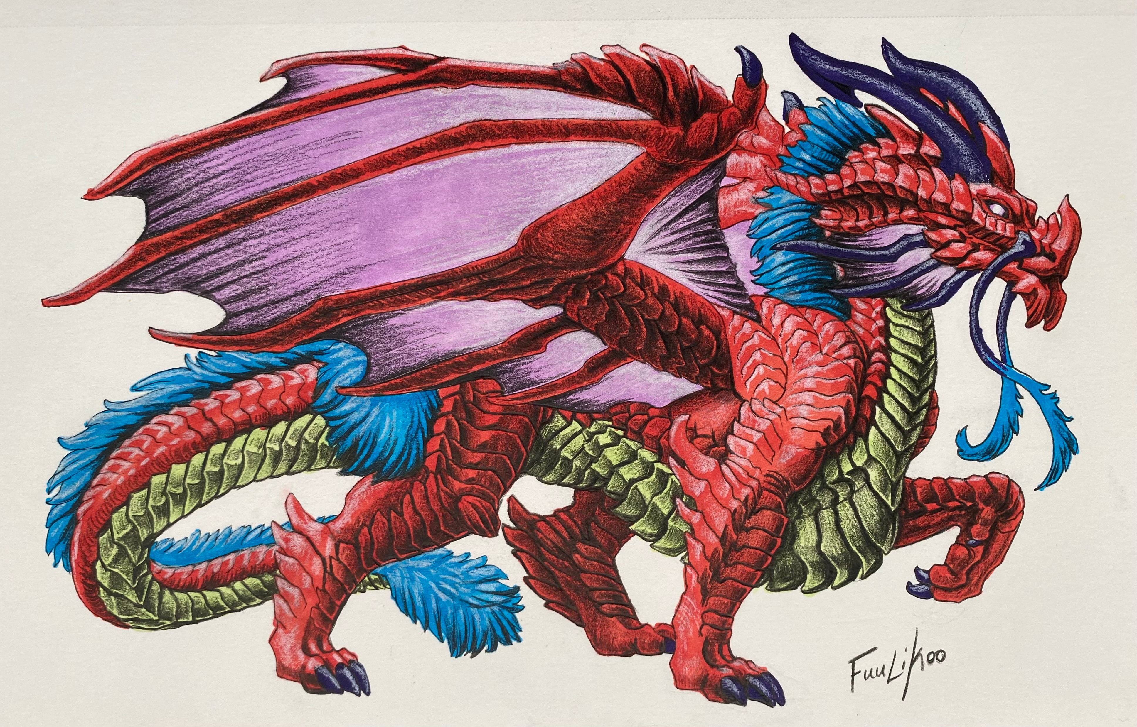
 Dragonmistral — Back in Bronze

Published: 2011-07-16 20:42:20 +0000 UTC; Views: 1107; Favourites: 34; Downloads: 22
Redirect to original
Description
Taking a BRILLO PAD to that rust! Finally finished my Mistral portrait, it was a real therapy session to draw her again.I'd really like some C/C on this one - there's a lot I'm not very happy with, but what do you all think? What things should I improve on?
I'm also thinking of adding a simple bacground to this, or maybe something kind of Mucha-style since I went a little Nouveau-ish with the outline. Forest? Sunset? Autumn leaves?
Mistral and Art are © me
Related content


Comments: 8

This is amazing! You are a master of colored pencils ")
👍: 0 ⏩: 1

Aww, thanks Silva!  (Smile)")
Your art is wonderful, don't put yourself down like that!
👍: 0 ⏩: 0

This is beautiful! Her pose is striking in this picture.
Greylight S.
👍: 0 ⏩: 0

I agree with the idea of doing a Mucha style background, I'd love to see you do a frame with that.
👍: 0 ⏩: 0

The thing that stands out most to me (*waves btw, been a while
👍: 0 ⏩: 1
*wavewave* Hi Windseeker! Too long, I think
I agree that the wrists and toes need work, and that the shading could be more intensified. This would prevent the need to outline as heavily I did in this piece, as well.
Thank you for the C/C!
👍: 0 ⏩: 0

This is beautiful! I'd love to give you some specific critic on it, but I am not so great at breaking down stuff that is so very much better then my own (and from an artist I have always admired...) But I'll try... something about the front leg is bothering me, it almost seems like there is a joint too many in the lower leg, that or perhaps I think the paw looks to small, particularly in proportion to the head. (When I think of paw/hand size I always think about how much of my face I can cover with my hand.)
Oh my goodness though. Your colouring skills, they never cease to amaze me.
👍: 0 ⏩: 1
Thanks so much Jaspenelle, that's so sweet
Thanks for the C/C!
👍: 0 ⏩: 0