HOME | DD
 Dragonsanddaffodils — Rob is going to Forks
Published: 2009-03-30 22:56:30 +0000 UTC; Views: 17318; Favourites: 269; Downloads: 1559
Redirect to original
Description
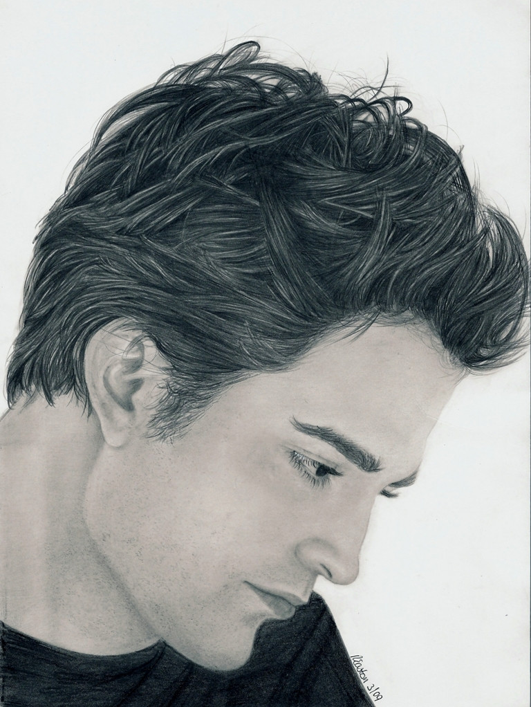
Yaaaaay!Just found out that my drawing was accepted to be auctioned off at the Twilight Symposium in Forks on the 28th of June (my birthday!) to help raise money for Forks Art Department!!!!!!!!!!!
(They can't display it in the gallery over the weekend though cos it was drawn from the Movie companion - copyright issues).
How cool! My drawing is going to Forks!!!!!
**Update!**
Here is a link to a twitpic of it on the stage!!! [link]
Robert Pattinson
My other Twilight drawings:
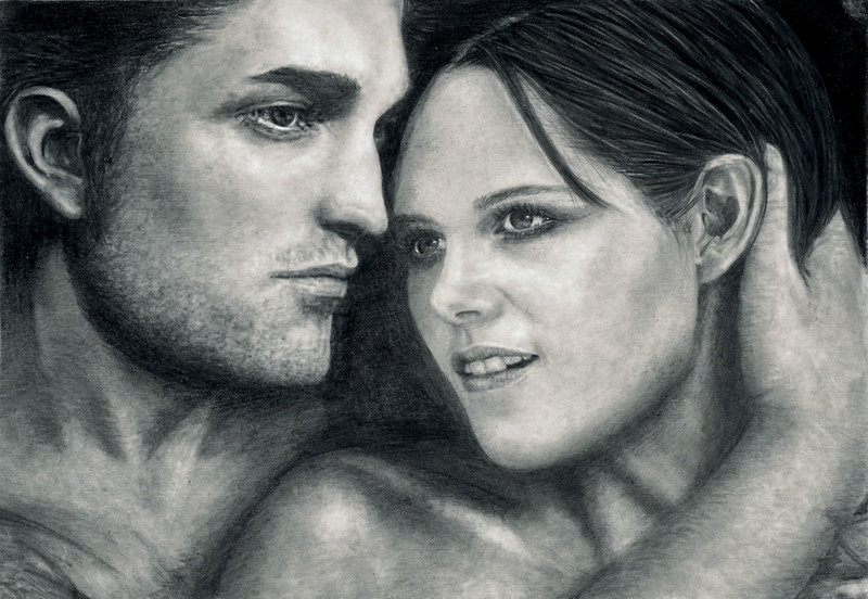
Edward and Bella [link]
Rob's Eyes [link]
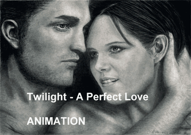
Twilight - A Perfect Love [link]
Jacobs Stare [link]
Dr Carlisle Cullen [link]
wow! Look what did to my drawing! Click this link! [link]

Did you know that he co-wrote and performed songs for the sound track of Twilight?
some of the songs
"Never Think" is Rob singing solo and playing guitar on the soundtrack and in the film is playing in the restaurant when he and Bella have dinner. (Link to you tube video) [link]
"Let me Sign" is playing when they are in the dance studio and he is trying to save Bella's life. (link to you tube video ) [link]
He also performed on piano for two hours for them to use as background music for the film and for Bella's Lullaby before Carter Burwell wrote the Lullaby used in the film. Rob still performs it in the film though.
If you search, there are loads more and some life performances too!
About the drawing
Time taken 23 hours Used mostly mechanical pencils, tissues, putty rubber, sharp rubber and a 2h for the skin. Drawn on A4 Bristol Board
Here is the ref pic I drew from, not brilliant, but I loved the pic [link]
Image ref (C) Summit and Stephenie Meyers I do not own rights or claim ownership
A huge thank you to for featuring my Rob in her journal

Thank you for the feature
Related content


Comments: 163

 (Smile)")
👍: 0 ⏩: 1


But in a couple of weeks, I have got more free time, and my hand is itching to draw!!!!!!!!!!!!!!!! I am having withdrawal symptoms!
Think I am going to have to get some of my other drawings done first, plus I am keeping an eye on the internet to see if any new Twilight pics of Peter are released


👍: 0 ⏩: 1
8 WEDDINGS!!? WoW..But hey you could do some scheches
👍: 0 ⏩: 1
Definitely! I have a small sketch of a dog to do, perhaps that might fit the bill
👍: 0 ⏩: 1
Haha..I've done some drawings also, but I take pictures of them and then put them onto the computer, but the my camera is having her moment of stubborness XD So I'm just posting some pictures of Iceland and photoshopped pics by me while my uncle is fixing my camera.
👍: 0 ⏩: 1
That must be really frustrating, hopefully he will fix it soon for you
👍: 0 ⏩: 1
yeah I hope so too..
But where did you learn how to draw so P-E-R-F-E-C-T-L-Y-?
👍: 0 ⏩: 1
Aw, you are lovely!
Just here on DA.
In my scraps are the two drawings that I did when I joined of Kieran and Matthew.
The Kate Bush drawing somewhere in my gallery was the last thing I drew 21 years ago.
DA is fab for drawing!
👍: 0 ⏩: 1
Really?
Ok, I'll take a look at thoes drawings
👍: 0 ⏩: 0

The detail in the hair is incredible! *jaw drops* Awesome work!!
👍: 0 ⏩: 1
Thank you so much, glad you like it.
Your avatar is great! Alice is such a great character
👍: 0 ⏩: 0

You made him very handsome ")
👍: 0 ⏩: 1

....The hair....
....The eyes....
....The face....
Everything is just so perfect!
Amazing.....
👍: 0 ⏩: 1
Thank you!
👍: 0 ⏩: 1
faved for SURE!!
You are so welcome...
👍: 0 ⏩: 0

Wow! MY GOD - his hair and his eyes are perfect!
You are so good! If I happen to get my wish and travel to the UK next year, we HAVE to meet up. 
👍: 0 ⏩: 1
Oh thank you so much
I can't believe you could want me to show you anything, your art is beautiful! We could meet up though! That would be fun
👍: 0 ⏩: 0

👍: 0 ⏩: 1

No I won't! XDDDDD He will come for my smell! XDDDDDDDDDDDDDD
👍: 0 ⏩: 1


I love this guy SO much! I think I love his character edward more though.....
👍: 0 ⏩: 1
👍: 0 ⏩: 1
I am, I haven't read the books though -oh the embarrassment- so I'm hoping there's more edward mystique to come! I think I have worked out that this is what I am attracted to! haha
Are you?
I'm watching twilight right now.....
👍: 0 ⏩: 1
I am a book lover, so I must admit, I found them as a result of seeing all the drawings on DA, but I read all four in one weekend.......stunning!
You would love him in the books then, so romantic.
Just putting Flightless bird on my phone for my ringtone (it is the song they dance to at the prom)
(ps I love the shame emoticon you used! Fantastic!)
👍: 0 ⏩: 1
I wasn't sure if that would come up! glad it did, haha
I love the song spotlight but muse math.. its played when edward and bella get out the car at school and everyone's staring... the bit when he throws his arm over her shoulder makes me want to diiiiiie! oh and that song when they're up in the trees is lovely.
Sorry, I could talk about Twilight all day!
👍: 0 ⏩: 1
Its gonna make me sound old, but that is my sons favourite bit!
The one in the trees, is my my husbands favourite....and my eldest sons....bit of a twilight family!
👍: 0 ⏩: 1
ha! Well I'm clearly in with your family and their favourite parts! Bring a twilight family sounds good...
Oh, and another song I like is the one that Rob pattinson wrote... Love it, infact.
Do you have a favourite bit? Or do you leave that down to just the men in your house? ha
👍: 0 ⏩: 1
I don't need a favourite, I am sad to say that I could sit and watch it again and again, I know films have their faults, and this one does too, but it is just so lovely.
I suppose the bit in the woods where she says "I know what you are" - cliche I know, but that really got me.
And the bit getting out of the car at the school "well, since I'm going to hell anyway!
👍: 0 ⏩: 0

HOLY CRAP THIS IS AMAZING!!!!!!!!!!!
👍: 0 ⏩: 1
Your Welcome!! He's awesome and amazing!!!!!!!
👍: 0 ⏩: 0

hey you did an amazing job! that's a great drawing! I wish i could draw like you! but i think the picture is better than the real rob pattinson [link]
Really...robert in your drawing is more handsom than reality [link]
And ofcourse I like this more
👍: 0 ⏩: 1
Wow! Thank you! REally glad you like it!

👍: 0 ⏩: 0

You did a wonderful job here, the detail is great and the expression is priceless. I wish you good luck for the contest, though Robert Pattinson is not the first name that comes to my mind when thinking of musicians
Anyways, you asked for detailed critique so here it goes. Please keep in mind that I spend a long time looking at the drawing and the reference side by side on my screen and searched for things to point out. Pretty much like those "find the flaws" pictures for kids
First there are some areas where the shape is off a little bit. It might help to first do the lineart, let it rest for a day and then come back and compare it closely to the reference (big advantage if you have it scanned, because you can zoom in or change the contrast and stuff). Turn it upside down, to the side, look at it in a mirror - anything that helps you to see the shape and form instead of "oh, that's a nose!".
Which brings us right to our first victim ;
His nose is very very difficult because it has a quite unique shape. You came pretty close, but if you look closely, there's a little bump and an short but almost straight part below that. Your nose's shape is a bit softer and rounder. The shading over the nostril on the other hand doesn't seem soft enough. Notice that it reaches almost to the tip of the nose and blends out very lightly. The nostril itself is one of the things which I thought looked off, but it looks pretty much the same in the reference, so... on to the mouth
There's a tiny tiny bump right above his upper lip that is missing in your drawing. The shape of his lower lip is a little off at the corner of his mouth (it needs to be a little wider) and the tip is a bit too round but other than that you really nailed the shape down. Just notice that the lip seems to blend in with the shading below the lower lip. The contrast in your drawing is a little too high there (same for the upper lip at the corner of the mouth).
There's a little shape issue with his chin, it's quite roundish and a bit wider than you drew it, especially right below the rim of his shirt. Similar for the jawline right below the ear, yours is a bit too steep. Also notice that this is one of the lightest parts of the skin, just a tad darker than the shiny parts of the ear. Speaking of the ear, I think it could use a little more contrast. Make the dark parts darker and erase some of the highlights. If you want to go detailcrazy, erase a thin line along the outer curve of the ear. There are some minor shape issues here, but since I don't know the names of all the parts and it's not really that important, I'm gonna skip those. I bet you'll find them without my help anyways
Which leaves the eyes... the one in the back looks good, it even has more details than the reference. I think you might have missed a little of his cheek there, but it's very hard to tell...
The eye in the front is very well done, too, but the shape could need a bit tweaking. It's a bit too slender and the shape of the pupil is off. It's too round and wide compared to the reference. But that's pretty much everything and you did a very nice job on the highlights there
This was the nitpicky part (and I feel really horrible now, since they're just some minor variations which probably nobody else noticed) so on to some more general advice. I think you could try to exaggerate the shading on the face a bit. Right now it looks a bit like a uniform plane of grey, although I know you drew in the shadows and stuff, it's just not that contrasted in the reference in the first place. If you play around with contrast and brightness in Photoshop you can distinguish light and dark parts easier. I would darken the part around his eye, nose, jaw and top of the forehead. Not much but just enough to enhance the tonal variations.
I know you didn't have as much time as you would have liked for the hair, but you did a really good job with all the details. One thing I would do is to blend the hair with a tortillion or cotton bud, because you have many highlights which are more of a light grey in the reference and then erase just the lightest strands (most of them at the back) to pure white again. There's a light source coming from behind him so that should be apparent in the lighting of his hair, too. Again, if you manipulate the reference with photoshop a bit, you will see that the darkest part is at the middle and front with some very dark strands thrown in behind his ear. You could also draw in some very soft and light grey hair at the hairline. Yours are a bit too dark, a 2H or H pencil should work well.
And that's it. This got really long and most of it is just tiny details, but it was really hard to find things to point out. You did a great job here. I think I should critizise my own drawings in such detail, that might get me over this "I'm not getting better" stage  (Wink)")

👍: 0 ⏩: 1
Oh wow! How can I thank you!
That is incredible.
You have such an eye!!!! I wish I had got you to do this before I handed it in, but I think I wuld still be working on it now!
Seriously! THANK YOU!
That has given me loads to go on, I could see bits that were wrong, but my eye is not ready enough to work out how to fix them!
Thank you again!
👍: 0 ⏩: 1
No problem
If you want me to look over your next work (maybe when you've done the lineart, I think that is more helpful since things are easier to fix) just let me know! I normally don't go over something in such detail unless asked, because I know it can seem a bit, I dunno... well some people might take it wrong and think I don't like their work or I'm trying to make them look bad or something. So I'm really glad that you're glad if that makes any sense

👍: 0 ⏩: 1
Look out! I might take you up on that!
I have got another twilight drawing I want to do for , but I have been really busy with cakes, so have only got until the 15th
I think you are right with the line art.
Don't want to shrink the grid though cos it should get bigger with practise right?
I used to draw without a grid, but spent so long readjusting the lineart that I got too despondent. Then I read information on how she draws and thought I would try using a grid.
But I think the size of the grid I use (1 inch square) means that there is room for error, I will keep practising though.
I liked your advice about using a mirror and turning it upside down, that sort of thing.
I drew Robs hair upside down and I wonder if that made it easier actually. I will try using that to check my lineart as I go on.
See! Brilliant advice!
Why don't more people do this!!!!!
I did think of one thing though, are you supposed to put it in the critique box or the comment box. Doesn't matter to me either way cos I am just so pleased to get it! But it gives you good publicity for the amazing critique you gave me! And you deserve it!!
👍: 0 ⏩: 1
Well that's why I offered
Actually my grid is even smaller.. I use a 2 centimeter grid which is someting about 0.8 inches. But I'm planning on making it a bit bigger in the future. But I think it also depends on what kind of picture you're drawing, if it's just one portrait, a bigger grid should suffice, but if you draw a whole scene where the people are only a small part, I would probably use a finer grid for their faces. So an one inch grid doesn't sound too bad, but if you think a smaller grid would be better, go use a smaller one. I really don't think it matters 
I think the upside down thing is really useful, it happens so often that I draw something and don't really pay attention to what the shape actually looks like, but rather what I know the object looks like. So I end up with something that doesn't look and feel right but I'm usually not able to put my finger on it (I think that's what happened with the pupil in your drawing
I was wondering about that, too, but I'm not sure whether I'll actually use the new feature. Especially not for my nitpicking
")

👍: 0 ⏩: 1
Well, we'll see how it goes with the new critique thing. Perhaps some people won't really want to hear the critiques, but are expecting nothing but praise. I don't imagine that will go down well.
I know what you mean about the rating bit.
I have already decided I won't critique anything other than cakes because I feel I can offer some actually useful information there, but am still learning with the drawing far too much to be able to comment. I don't know any special drawing techniques, I just try to draw what I see, but I am not even really ready to do that yet, still training up the eye, but thats okay.
Thats not a bad idea shrinking the grid. Funnily enough, I used a quarter of an inch grid for the faces for my Edward and Bella drawing cos I felt a 1 inch was far too big for such a small drawing. Perhaps for certain parts of a ref I could shrink the grood.
The pupil was a monster in the Rob drawing, cos once I realised it was wrong, I tried to change it, but there was too much marking left behind when I erased. So I combined two reference pics instead (didn't bother mentioning that, cos I knew I had had to alter it)
The next drawing is using one main ref, but using 3 or 4 other references, cos I want Bella with her eyes closed instead of shut and not smiling, and him looking down at her instead. It will be a challenge, but I think it will be a good learning tool. Haven't tried doing anything like that yet.
I think it would be good to have the critique section divided into different mediums so we can find the right categories. We'll see.
👍: 0 ⏩: 1
Hey I didn't even notice your cakes before ")
I hate it when I find a flaw but can't correct it because the paper is already stained... I don't like to keep working if I know something's wrong
I'm working with two different references, too, I'm redrawing a very very old picture of Keira Knightley (done 2003 when the Pirates movie came out) for the Kick your own @ss contest. And since the reference I used back then wasn't too good, I'm combining it with a different photograph from Keira where I can see aaaaall the details. Maybe I'll try to work on the details in the skin this time. I have no idea how to do it though
👍: 0 ⏩: 1
Thank you! I must admit, I am having problems getting as excited as the cakes cos most of them are just orders. I only have the most fun when I get to design them for exhibitions or magazine articles.
I was hugely excited about the DD though, wow! Never expected that!
I am learning to be a little lighter of hand and am getting less blemishes, so am able to correct more now, but I fluffed it with the eye and it was too late.
Your Keira is looking amazing! The eye is so detailed, I love the depth in the eyelashes and eyebrows and the roundness of the white of the eye.....fab!
Skin is my biggest bug bear. Rob was so pale in this shot, I need to learn how to use photoshop to alter the depth as you suggested, so I have chosen a reference pic to draw next with a lot of depth to try that out.......just realised, I can't ask you to look at the line art first, cos I forgot you are a judge for Marions competition and that will be my second entry, so I will go it alone for this one, and get you to critique it for me after the competition closes. Can't be accused of monopolising you then!
I haven't bothered switching it on for my other entry [link] cos I know what lots of my mistakes are, and I can't correct it now after I have submitted it to Marion already.
👍: 0 ⏩: 1
I can relate, that's why I never wanted to make art my career. I just don't think I'd handle it too well if it becomes an obligation, rather than something I do for fun. (Plus I have large periods of time where I just can't draw at all
Yup, always better to put many light layers rather than one dark one
Thanks for the compliments and sorry I can't help you on your next piece 
👍: 0 ⏩: 1
Absolutely! I have officially closed my diary to birthday cakes until September! Woo hoo! Can concentrate on Weddings now (which was my interest in the first place), but they are still what the customer ordered rather than 100% my ideas. They always want something added that I would rather not put on there, and in that respect, I have to respect their choices (within reason)
I've only got Photoshop elements. It is quite basic, but I can sort out contrast and lighting.
When I drew my Grampy, I darkened and lightened and raised and lowered contrast to get different images to compare to, but Rob was drawn just from the photograph, perhaps that is why I felt he was a little 2 dimensional. I did put in certain shading, but felt that the original was smoother, so I think when I lightly shaded over to smooth it out, I smoothed it over a little too much!
I didn't realise I could alter my Edward and Bella when it was already submitted. Might fiddle around with it a little, time allowing. I really want to draw this new piece, it is really growing on me,

Anyway, I have to finish writing this "how to" article for the cake mag ready to email off tomorrow (only a cake in the shape of an apple - how do you make that sound interesting and fill a number of pages!) , and I have to finish off a birthday cake for tomorrow too..............I am such a night owl!
👍: 0 ⏩: 1
Photoshop Elements is quite sufficient. Contrast and brightness can be quite useful, but somewhere above them should be a thing called Levels which is what I use most of the time (I hope Elements has it). It gives me finer control and is also great to adjust a scanned image so it looks like the original on screen. Basically it shows you a black and white gradient and which of those shades are represented in your image. You can see whether the image is balanced or whether there are many dark tones and little light tones and so on. If your image is mostly greay tones with little or no pure whites and blacks, you can move the sliders beneath the image to change that. The right one decides where on the gradient is the pure white. If you move it to the left, the whole gradient will adjust and light grey will become pure white, darker grey will become light grey and so on. Black will still stay black unless you move the slider on the left. The one in the middle is for the midtones. Just play around with it a bit and you'll see what it can do, it's quite useful. and you can also decide that your colour range should only go from white to dark grey or something with the sliders on the bottom.
I find it a lot more comfortable to draw from the screen, not only because I can change the levels, but because I can zoom in on details. I can put a gradient over the image to show me which shades of grey are the same. I can put two images together in photoshop and create my own reference (which might be helpful for your next twilight drawing
I really don't see why not as long as you edit it before the deadline. Yeah, I'm very much looking forward to seeing Blaclerias work. It has such amazing detail in the skin... I have to find out how it's done
I have no idea how to makes anything-shaped cakes, really (except for the regular ones) so dont ask me... it does sound interesting, though, but probably more because I'd try to get the right pattern on the surface to make it look realistic
👍: 0 ⏩: 1
Wow! When you type............YOU TYPE!
This is why I don't go on instant messenger much, cos I am writing replies like yours in the time my sister in law writes 3 lines!
That photoshop info is amazing.
I will try doing that. I have never even thought of a gradient going over the image to check the grey scales, although, funnily enough, I was wondering about making a chart with my pencils to compare against my drawings after you mentioned one part being lighter than I had shaded............got me thinking that I should compare the shading of one area to the other to make sure the contrast is right. See I am listening!
I know what you mean about the colours looking different from different angles. I made a mistake with one drawing and had to re-do quite a few sections cos I didn't realise I had sunk down in my chair while drawing, sat up straight and it looked completely different!
I only started Rob from the photo cos we were away at a cake show for a weekend and I took my pencils, pad and the ref and drew in the evenings while the family snored in front of the tv. Managed to get a lump of him down in the 2 evenings, then finished it off back at home.
Making cakes is a real weird job. Some people think a complicated cake is normal shape with a figure on top, while others ask for complete realism. They usually haven't got a clue what is involved in making a cake. I always go for freshness and good flavour and as flawless a finish as possible. But the customers often ask you to do something that messes up the finish and that is what I hate about commercial cake making. Even articles can be disappointing too. I just wrote an article at the request of the magazine, they just wanted a large apple-shaped cake. It was so hard to make the article interesting, so instead, I concentrated on carving techniques as that is something my students usually panic about.
The only ones I am sorry that are cut are the ones with loads of sugar flowers on, cos the hotels usually just rip them off the cake and I know the Bride and Groom want to keep them. I get them to the venue un-damaged and the hotel wreck them!
The craziest cake....hmm..........Definitely the rag worm cake in my gallery. It was two foot long, I hand painted it to match the real creature and I covered it with piping gel to make it look like it was slimey. My assistant wouldn't even come in the room while it was in there cos she said it grossed her out. [link]
I always start cakes on a Monday ready for Saturday, and usually make 5 or 6 weddings a week if myself and my husband are working, (plus a few birthday cakes too) 8 - 12 a week if I have the assistants in. To be honest, I have cut down the number of cakes I am doing cos my teaching commitments are growing, plus the magazine want more cake articles and I love writing anyway. My assistant is a bit busy with her husband at the moment, cos he had heart surgery a week ago, and we knew he was going to have it, so I left the diary quieter.
I never knew the Luis Vuitton bag cake was going to go so nuts on here. I spent a day on it for my friends Mum and was pleased with it, but I knew I had to rush the painting design so was never that happy with it. Never would have believed it would get a DD.
Joined DA to draw and discovered the ARtisan craft area, so submitted a few cakes, then people started asking for more pics. I've done about 1300 - 1400 weddings cakes and more birthday cakes, so I have lots of pictures!!!
Right then, off to deliver a cake
Forgot to say thanks for the info on photoshop. I am really green where that is concerned, so that is appreciated!
I have my favourites for the Twilight contest, but as always the truly incredible ones usually appear right at the end! So I can't wait to see what will come!
👍: 0 ⏩: 1
Haha sorry for that, can't contain myself. I hope you understand my gibberish, if I start typing away I usually mix up english words with german grammar and conotation
The gradient is great, it's under Image > Adjustements > gradient map and I usually set it to something extremely colourful. It's helpful to get the right tones because our eye adjusts the way we see colours. For example if you look at a white sheet of paper it will appear white to you, no matter whether it is out in the sun or in a shaded corner. There's this amazing picture of a chess board somewhere which shows what I mean... found it: [link] Isn't it great?
That chart thing is a good idea
That's why I change my positin every once in a while
That's what I sometimes wonder, whether all those fancy cakes actually taste good
well that's really bad... don't they listen when you tell them not to wreck your cake?
OMG, that thing is so gross... I saw it in your gallery but didn't click it because I thought that was not something I really wanted to see... and I was right
Business is good then, aye?
No problem, if you want to know anything else just ask, I'm no expert, but I've experimented a lot with Photoshop when I was younger (doin animated Avatars and banners and such things).
I'm don't know whether I'm looking forward to the whole judging thing. I guess I am, but it's gonna be so so hard. I don't know how Witchi's gonna do it, whether we rate each picture or just tell her our Top 5 or something, so I'm very curious about it. It's my first time as a judge
So, this is gonna be very hard, but lots of fun I hope. I was planning on writing a critique to each of the entries, but seeing as there are so many of them I don't know whether I'll be able to do that...

")
👍: 0 ⏩: 2
ps Can't believe you worry about your English, its not as if I could write in any language! Thanks for the gradient image too
I have saved all your advice into a word document for future use!
👍: 0 ⏩: 1
hehe no problem
👍: 0 ⏩: 1
| Next =>