HOME | DD
 dragowlfly — Albinerah (Redlines Please?)

Published: 2012-03-01 07:18:00 +0000 UTC; Views: 829; Favourites: 26; Downloads: 269
Redirect to original
Description
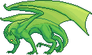
Albinerah why do you hate me?If I had to choose one character design that I never seem to draw right... Rah's would be it. In my mind he is sinister and severe and heavily built, but whenever he comes out on paper it is simply... wrong. The result is delicate and light and kind of ridiculous. I've tried to rework his head to get more of a predatory shape to it... and his anatomy in general... but it hasn't been working out.
It's a shame, because I am so fond of my mental composition of him, and I don't think I'll ever achieve the feeling I want from him. (See this is why I wish I could picture things in my head, instead of having to draw them out to get an idea of what they actually look like.)
I'd love some crits/redlines on this sucker, I'll be honest it's 3 am and I gave up on his far limbs... and the colouring is kind of slap-dash... arg I'm tireeed.
And a quick fun fact! Albinerah is not an Albino. He's Amelanistic (No black pigment) and Hypoerythristic (reduced red pigment.)
Related content


Comments: 20

Overall

Vision
Originality
Technique
Impact

This has a very sleek and minimal design, and it complements the colouring you've chosen. I like the thin and precise linework you've used, as well as the overall build of this dragon.
However, if you'd like my advice, I think that there are a few anatomy hiccups in this piece.
I feel that the front left arms' fingers are off. The closest finger seems dramatically monger than the furthest away. I have not seen any other versions of this OC, but it does look a bit awkward.
The depth of the chest works well with the body, but it seems a little heavy for the front arms to hold it up if they are that thin.
My only other critique is that the tail tip is a little too sudden to end so thinly. I think it'd make more sense if the tail were longer.
Other than that this dragon is very well done. As you mentioned, the colouring could maybe be a little more interesting, but a simple design does compliment this sleek creature.
👍: 0 ⏩: 1

Thank you very much for taking the time to write this critique for me! I will take your crits into consideration when I edit the lineart... the thick tail and arm issues are particularly helpful, so thank you very much!
👍: 0 ⏩: 1
No worries.
If anything, I'm a bit jelly at your skill.
 (Smile)")
👍: 0 ⏩: 0

Are you still looking for a redline for this? I meant to get it done weeks ago but life smacked me in the face. ;_;
👍: 0 ⏩: 1
Yeah, I still haven't had time to retouch this guy yet, so if you have recommendations I'd love to see them!
👍: 0 ⏩: 2
Awesome, thank you so much! I'm sorry for taking so long to respond, it's been a rough couple of weeks... I'll be uploading the edited ref soon, hopefully.
👍: 0 ⏩: 1
No worries, I understand! Can't wait to see it!
👍: 0 ⏩: 0

You should note *V-3RT1G0 , she always does great redlines. ouo
👍: 0 ⏩: 1
Done! Thank you very much for recommending her, her art looks spectacular.
👍: 0 ⏩: 0
Please do! I feel like just having someone else's perspective on him will really help.
👍: 0 ⏩: 1

Fff now if I could just find the time to do so LOL. -horse stuff all weekend-
👍: 0 ⏩: 0

I agree with the one below this!
Maybe make the arms/graspers a bit bigger and stiffer. They don't really look like they could support that bod very well
really cool though~
👍: 0 ⏩: 1
Thank you very much! Someone pointed out that his wrists are in a weak position, so hopefully fixing that up will help to make his arms look more stable and secure. Again, thanks for taking the time to comment, I really appreciate it.
👍: 0 ⏩: 1
my pleasure! It's a cool concept~
👍: 0 ⏩: 0

I think he looks pretty good, personally, but if you want to give him a more "sinister and severe and heavily built" look, I think you should give him some more angles. Make his head a little bigger maybe. Make him more muscular but still thin like he hunts for days without a catch. Let his eyes show his dark side, maybe a longer tail could help him a little bit or you could put him in a dark background.. Just my humble opinion :3 I think you have a good idea though. Good luck figuring it out
👍: 0 ⏩: 1
Thank you very much for your thoughtful comment! I think I spend too much time drawing cute things, which is why he came out so rounded... I will work on getting more clean angles into his anatomy. Musculature has always been a struggle for me, so I will work on that too. Again, thanks so much for commenting, I really appreciate it. :3
👍: 0 ⏩: 1
You're welcome ")
👍: 0 ⏩: 0