HOME | DD
 drahomira — Forget
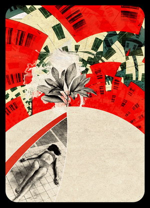
Published: 2003-07-01 21:11:11 +0000 UTC; Views: 3858; Favourites: 106; Downloads: 837
Redirect to original
Description
?..Related content


Comments: 69

You've used my favorite subject : the barcode
I think that's our society could be resumed with this simple symbol..
Symbol of capitalism (your buildings), money .. and death (your girl here)
So, well done !
( et en plus les couleurs sont comme d'hab : originales et bien choisies )
👍: 0 ⏩: 0

the colors and the objects fits very well !
and plant is special!!!
👍: 0 ⏩: 0

wonderful collage - i like the conrtrast between red, beigh and black [red is my favcolor] - that's why i'm gonna fav this!!
you are an great deviant!!!
👍: 0 ⏩: 0

I love the kaleidoscopic quality of the representation --> that semblance of turning through distortion and pattern, and then, that surprising moment of clarity --> which is even more compelling because of the blurring between death and leisure that the image seems to suggest. Debord would have something to say about that --> and, your spectacle is "written out" in my favourite colours.
👍: 0 ⏩: 0

You're R*I*G*H*T >>> What we need is to forget all the crap we'been thru and and to paint our future in bright red ! "bark bark buzz - sez the future dog"
👍: 0 ⏩: 0


like this! the multiple perspective , seeing down and up at once and it is merged well.
👍: 0 ⏩: 0

omg, if I could obtain a print of this the size of the side of a building I would.
+fav
👍: 0 ⏩: 0

you're a goddess.
i ADORE the rounded edges.
and i know why it works. the lines and contrast and shapes make this sort of depth..
and the angle of her form makes these blunt abstractions seem real.
fav.
and on a side note, did you go to school for this[art, design, what]?
👍: 0 ⏩: 0

*I don't know either, but I know it works. Extremely gorgeous design. Nice even flow and grunge effect.
👍: 0 ⏩: 0

Sterally great design. as if you climbed into shapes and bent them at ur will on a beach made of conrete crackers. nice everything. great touches. B E U T I f u L!
👍: 0 ⏩: 0

wow, mega trip... nice... doesnt look so cuadricular... and thats a big change... love it draho
👍: 0 ⏩: 0

Great ideas...always great ideas...haha Very nice colours and well layed out. I don't think I have to say too much about this one.
👍: 0 ⏩: 0

WOW, a grat effect the one of the buildings...it seems like being cutted by the inexperts hands ofa a child. It remind me the grerman expresionist cinema. I feel like watching Nosferatu...or The Cabinet of Dr. Caligary...it could be for the strange use or perspectives.
See ya!
👍: 0 ⏩: 0

amazing...
my god.
you just pump out the amazing artwork dont you drah
fabulous use of color again....phenomenal lines and shape....its smooth...
killer work!!!
+fav
👍: 0 ⏩: 0

You are too good. Lots of motion in this, like vertigo or something. Those windows look like barcodes.
👍: 0 ⏩: 0
spaceron [2003-07-01 21:45:11 +0000 UTC]
Now this is just like music! I feel like an amateur next to this (oh I am)... the rythm, the shapes and waves merging in with each other, the simple colourscheme, but really that space!
👍: 0 ⏩: 0

My pc is messed or something.
At times I can see this and other times this deviation is invalid.
I guess da forgot Forget.
Anyway,
I love the colors and the movement.
There is so much going on here that one can't help but be grabbed by it.
👍: 0 ⏩: 0